library(tidyverse)
library(janitor)Final Analysis
Goals of this notebook
The purpose of this notebook is to combine Maria and Olivia’s analyses into one easily digestible notebook. For a closer look at what each of us did, you can look at our individual cleaning notebooks.
We worked together to answer these questions:
- Who is being arrested?
- Who is doing the arresting?
- What kinds of crimes are being committed?
- How many are drug crimes?
- What kind of drugs? Is it fentanyl like Abbott says?
Let’s get into it.
Setup
We’ll load our libraries.
Importing cleaned data
Then we’ll import our cleaned data from our combined data sets.
olsdata <- read_rds("data-processed/02-combine.rds")

olsdata
Categorizing charges
The first thing we want to do is create categories for these charges. We won’t use them immediately to answer our demographics questions, but it will come in handy later when we look into each race and the charge breakdowns within them. We’ll also use them later to break down specific charge categories, like smuggling and drug arrests.
Within Operation Lone Star, there are 490 different types of charges. Therefore, we decided to break down the charges into 11 different categories. Here’s a key that describes each category.
Operation Lone Star Charge Category Key:
- Drug: Any charge relating to the possession, manufacturing, storage, or sale of drugs. This category also includes “drug/weapon” offenses.
- Weapon: Any charge relating to possession/use of unauthorized firearms or weapons.
- Warrant/Conspiracy: Any charge relating to legal authorization of arrest or conspiracy to commit a crime.
- Smuggling/Trafficking of Persons: Any charge relating to human trafficking or smuggling. This category includes charges for smuggling both persons and firearms.
- Trespassing: Any charge relating to trespassing.
- Immigration Other: Any charge relating to immigration.
- Evasion/Fleeing: Any charge relating to evading or fleeing from authority.
- Tampering: Any charge relating to tampering with evidence.
- Organized Crime: Any charge relating to groups that engage in organized illegal activity (fraud, robbery, cargo theft).
- Unauthorized Use of Vehicle: Any charge relating to operating another person’s vehicle without their consent.
- Money Laundering: Any charge relating to acquiring or concealing illegally obtained money.
Creating categories
cat_ols <- olsdata |>
  mutate(
    charge_cat = case_when(
      str_detect(
        charge,
        "Drug|CS|Cs|Mari|DRUG|MARI|Marj|MARJ|Man|Subs|Stash|Chem"
      ) ~ "Drug",
      str_detect(
        charge,
        "Smugg|SMUGG|Trafficking|TRAFFICKING|Trans|Bringing In"
      ) ~ "Smuggling/Trafficking of Persons",
      str_detect(charge, "Firearm|FIREARM|gun|GUN|Amm|Arm|Weapon|WEAPON") ~ "Weapon",
      str_detect(charge, "Launder|LAUNDER") ~ "Money Laundering",
      str_detect(charge, "Trespass|TRESPASS") ~ "Trespassing",
      str_detect(charge, "Alien|ALIEN|Visa|VISA|IMMIGRATION|Immigration") ~ "Immigration Other",
      str_detect(charge, "Evad|EVAD|Flee|FLEE") ~ "Evasion/Fleeing",
      str_detect(charge, "Organized|Enterprise") ~ "Organized Crime",
      str_detect(charge, "Tamp|TAMP") ~ "Tampering",
      str_detect(charge, "Unauth") ~ "Unauthorized Use of Vehicle",
      str_detect(charge, "Warrant|WARRANT") ~ "Warrant",
      str_detect(charge, "Conspiracy|CONSPIRACY") ~ "Conspiracy"
    ,
    .default = "Other"
  ))

cat_ols |>
  count(charge_cat, charge)
Then we’ll do a quick group_by, summarize, arrange to see the categories and allow us to visualize it in a second.
cat_chart <- cat_ols |>
  group_by(charge_cat) |>
  summarise(charge_num = n()) |>
  arrange(desc(charge_num))

cat_chart
Now that we’ve got that, let’s make a chart to visualize it. We’ll use ggplot, pull cat_chart back up, and create a simple bar chart. We reordered the bars so that the category is on the y axis so the readability is better. Then we adjusted the number labels so you can read them better and gave the bars a color. Now we can see which categories are the most prolific.
ggplot(cat_chart, aes(x = charge_num, y = reorder(charge_cat, charge_num))) +
  geom_col(fill = "#0AB7F7") +
  geom_text(aes(label = charge_num, hjust = ifelse(charge_num > 1967, 1.1, -.1)),
  color = "black") +
  labs(
      title = "What is Operation Lone Star Actually Doing?",
      x = "Number of Charges",
      y = "",
      subtitle = str_wrap("This chart looks at the different types of charges  under Operation Lone Star. Notably, the most popular type of charge is drug-related.", width = 70),
      caption = "Source = Operation Lone Star Data",
      )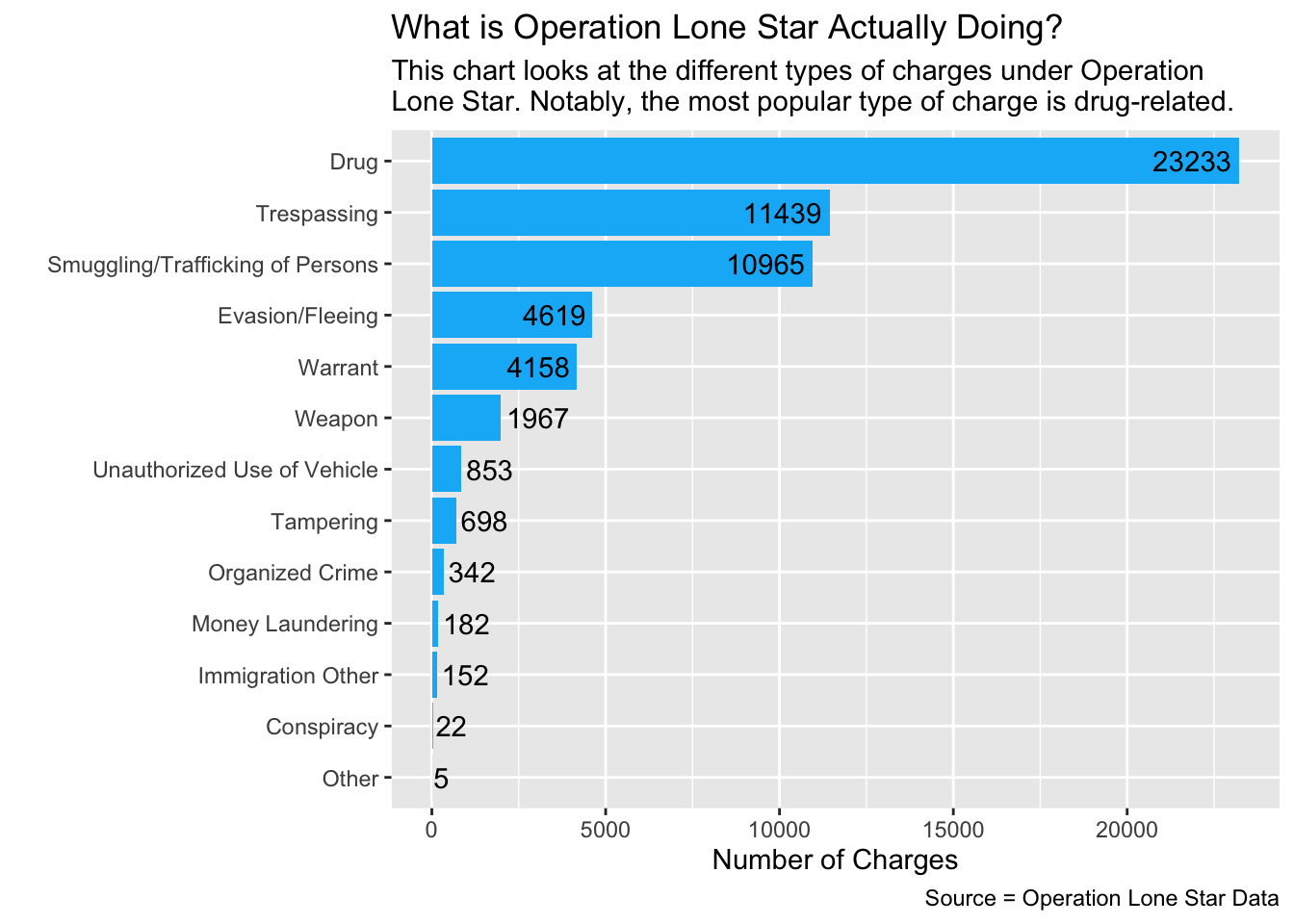
From this simple chart, we can see a couple preliminary takeaways:
- At least 23,233 charges under Operation Lone Star are drug-related.
- Categories like money laundering, tampering with evidence and unauthorized use of vehicle are more common than immigration related charges.
Now that we have that for later, we’ll get into the demographics data.
Demographics
The first set of questions we want to answer look at demographics - who is being arrested under OLS and who is doing that arresting.
Who is being arrested?
Let’s look at sex, ethnicity, age, and race.
Sex:
We call our data, group by the arrested person’s sex, then summarize and arrange that so we can see it in descending order. We’ll put that into a bucket so we can refer to it later in our visual component. We also filtered out the NA and Unknown inputs because they aren’t really helpful in our visualization and the cases were so few that it was insignificant to include.
olsgender <- olsdata |>
  filter(person_gender_abbr == "M" | person_gender_abbr == "F") |>
  group_by(person_gender_abbr) |>
  summarise(appearances = n()) |>
  arrange(desc(appearances))

olsgender
We can see that there’s an overwhelming majority of males being arrested under Operation Lone Star.
Creating a graph for sex demographics
ggplot(olsgender, aes(x = reorder(person_gender_abbr, appearances), y = appearances, fill = person_gender_abbr)) +
  geom_col(stat = "identity", width = 0.6) +
  geom_text(aes(label = appearances, hjust = 1.9), color = "white") +
  coord_flip() +
  labs(
    title = "Operation Lone Star arrests by sex",
    subtitle = str_wrap("Operation Lone Star is a program launched by Texas Governor Greg Abbott to increase safety at the southern border of the state. Arrest data from the program shows that the number of males arrested is much higher than the number of females since the programs' inception in 2021."),
    caption = "By Olivia Dilley",
    x = "",
    y = "Number of arrests"
  ) +
  scale_fill_manual(values = c(
    "M" = "#FF6347",
    "F" = "#40E0D0")) +
    theme(legend.position = "none")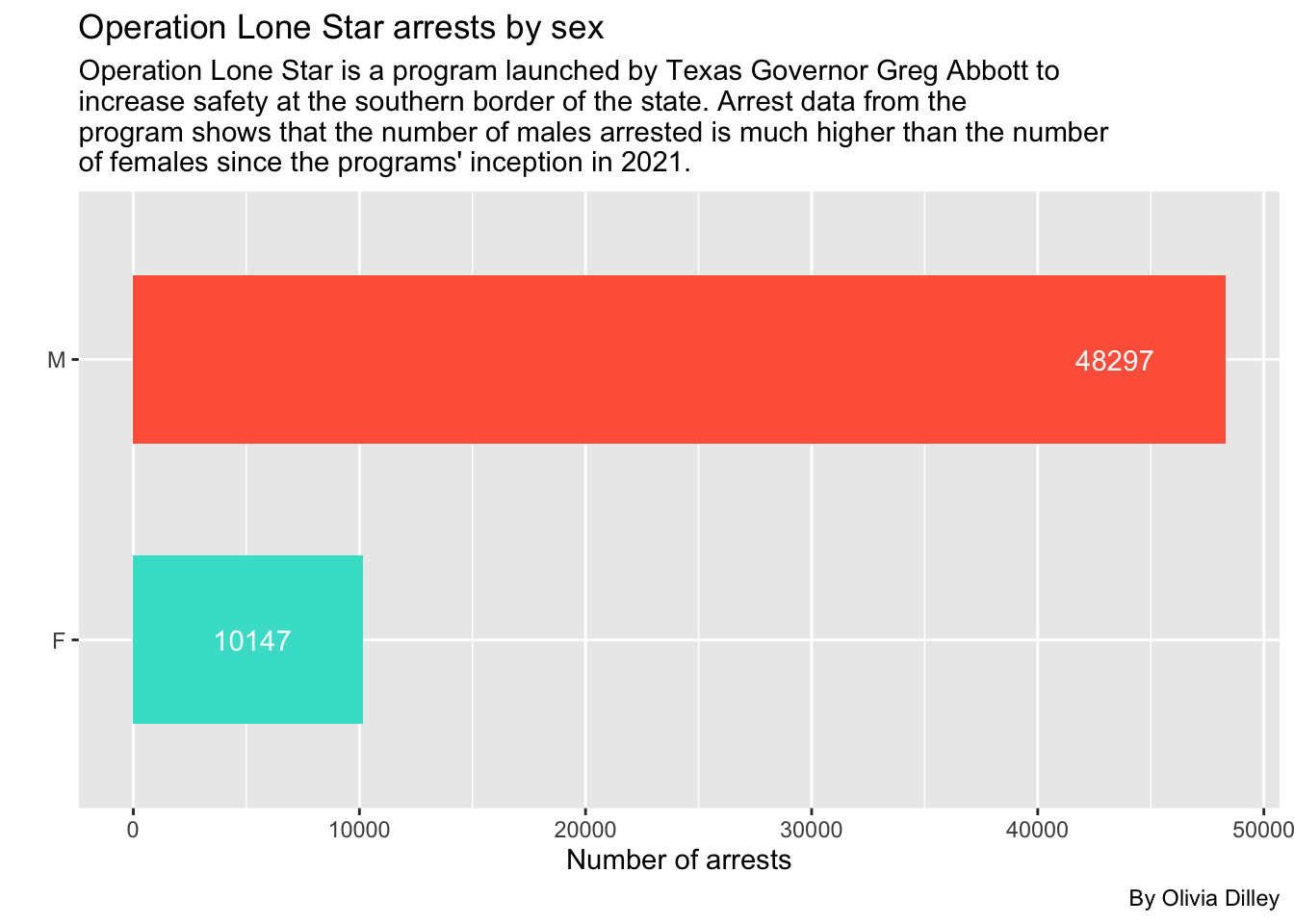
Ethnicity:
We’ll do the same procedure except using the ethnicity of the arrested person.
olsethnicity <- olsdata |>
  filter(ethnicity != "U") |>
  group_by(ethnicity) |>
  summarise(appearances = n()) |>
  arrange(desc(appearances))

olsethnicity
We filtered out the small amount of unknown ethnicity cases and the data from the SPURS system, before they tracked ethnicity as a separate category from race, meaning this data is just looking at VERSA arrest data. For these cases, the majority of arrested people were Hispanic.
Creating a graph for ethnicity demographics
ggplot(olsethnicity, aes(x = reorder(ethnicity, appearances), y = appearances, fill = ethnicity)) +
  geom_col(stat = "identity", width = 0.6) +
  geom_text(aes(label = appearances, hjust = 1.9), color = "white") +
  coord_flip() +
  labs(
    title = "Operation Lone Star arrests by ethnicity",
    subtitle = str_wrap("Arrest data from Operation Lone Star shows that the number of Hispanics arrested is much higher than the number of non-Hispanics since the programs' inception in 2021."),
    caption = "By Olivia Dilley",
    x = "Ethnicity of arrested individual",
    y = "Number of arrests"
  ) +
  scale_fill_manual(values = c(
    "H" = "#FF6347",
    "N" = "#40E0D0")) +
    theme(legend.position = "none")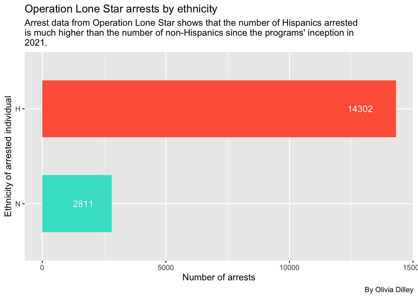
Age:
First we’ll call olsdata and group by the person’s age, summarize by appearances, and arrange in descending order to see what age’s have the most arrest instances. Then we’ll put that in a new bucket, olsage, for later reference.
olsage <- olsdata |>
  group_by(person_age) |>
  summarise(appearances = n()) |>
  arrange(desc(appearances))

olsage
Now, if you click through the data, you’ll see some obvious entering errors, like ages that are in the negatives and people that are between 1 and 943 years old. Because of this, we’ve decided to filter ages to between 10 and 100 to only incorporate cases that were most likely entered accurately for age.
olsagerefined <- olsage |>
  filter(between (person_age, 10, 100))

olsagerefined
Creating a graph for age demographics
Once we have this data, we’ll make a simple scatter plot with it using ggplot and geom_point.
ggplot(olsagerefined, aes(x = person_age, y = appearances)) +
  geom_line() +
  geom_point() +
  labs(
    title = "Operation Lone Star arrests by age",
    subtitle = str_wrap("Arrest data from Operation Lone Star shows that younger people are arrested more frequently, with a peak at 22 years old. After that age, arrests begin to drop off significantly."),
    caption = "By Olivia Dilley",
    x = "Age of arrested individual",
    y = "Number of arrests"
  )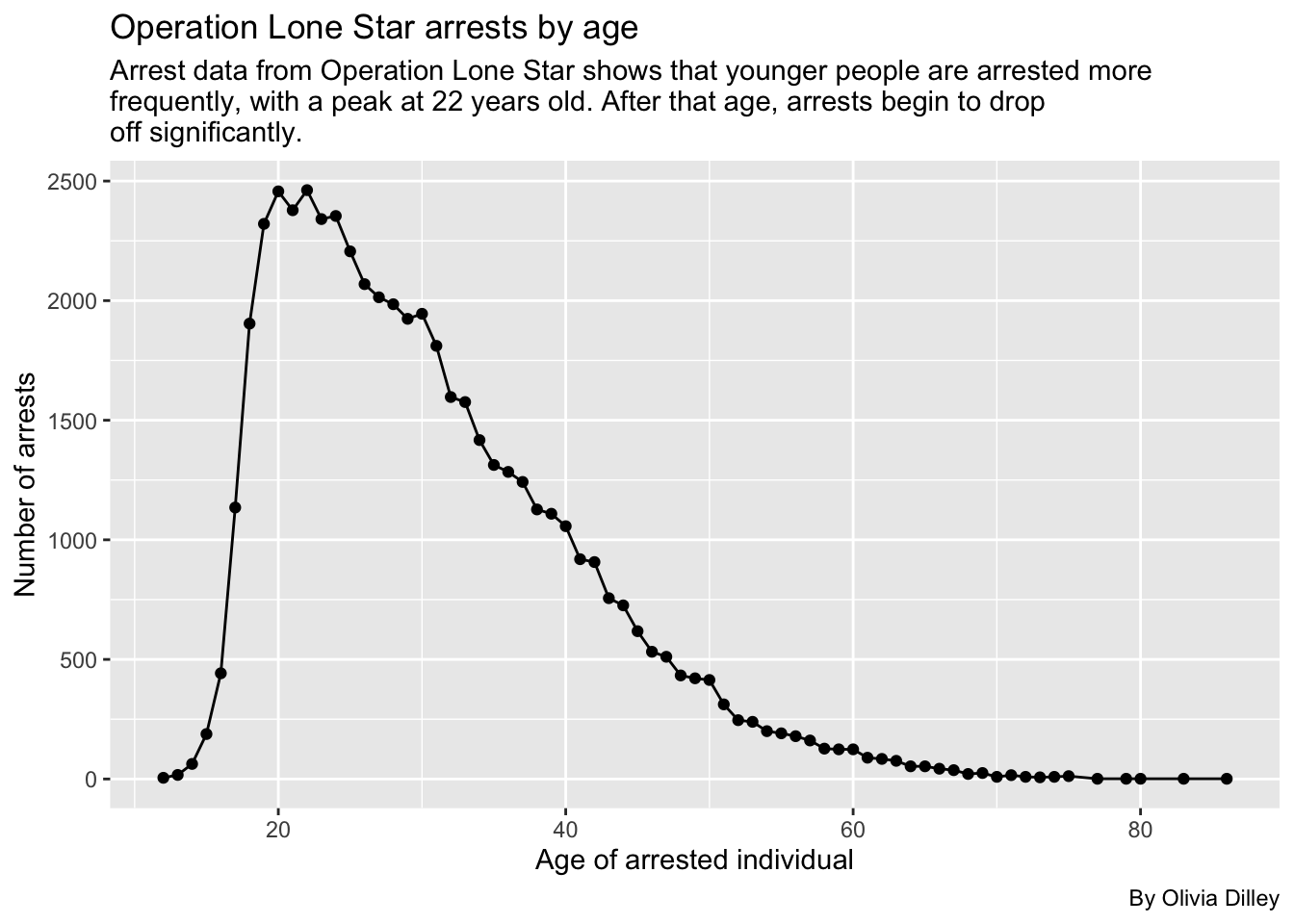
What’s interesting about this graph is that it closely reflects the age-crime curve which shows the rate of criminal activity as it corresponds with age.
Race:
Lastly for basic demographics, we’ll look at the race of people arrested in OLS.
olsrace <- olsdata |>
  filter(person_race_abbr != "NA", person_race_abbr != "U") |>
  group_by(person_race_abbr) |>
  summarise(appearances = n()) |>
  arrange(desc(appearances))

olsrace
Creating a graph for race demographics
Now we’ll make a bar chart to check this out visually.
ggplot(olsrace, aes(x = reorder(person_race_abbr, appearances), y = appearances)) +
  geom_col(stat = "identity", fill = "#f1948a") +
  geom_text(aes(label = appearances, hjust = ifelse(appearances > 4186, 1.3, -.1)), color = "black") +
  coord_flip() +
  labs(
    title = "Operation Lone Star arrests by race",
    subtitle = str_wrap("Arrest data from Operation Lone Star shows that the number of Hispanics arrested is much higher than any other race since the programs' inception in 2021."),
    caption = "By Olivia Dilley",
    x = "Race of arrested individual",
    y = "Number of arrests"
  ) +
    theme(legend.position = "none")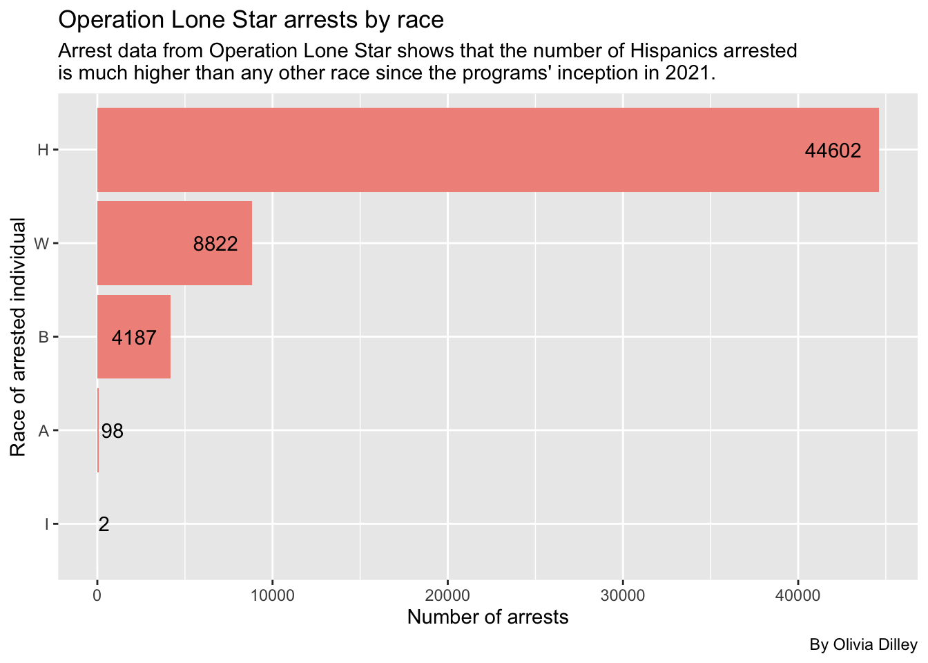
We can see Hispanics are still the most arrested in the OLS database.
Let’s break these down by each race to see what crimes are being committed the most.
Breaking down offenders’ charges by races
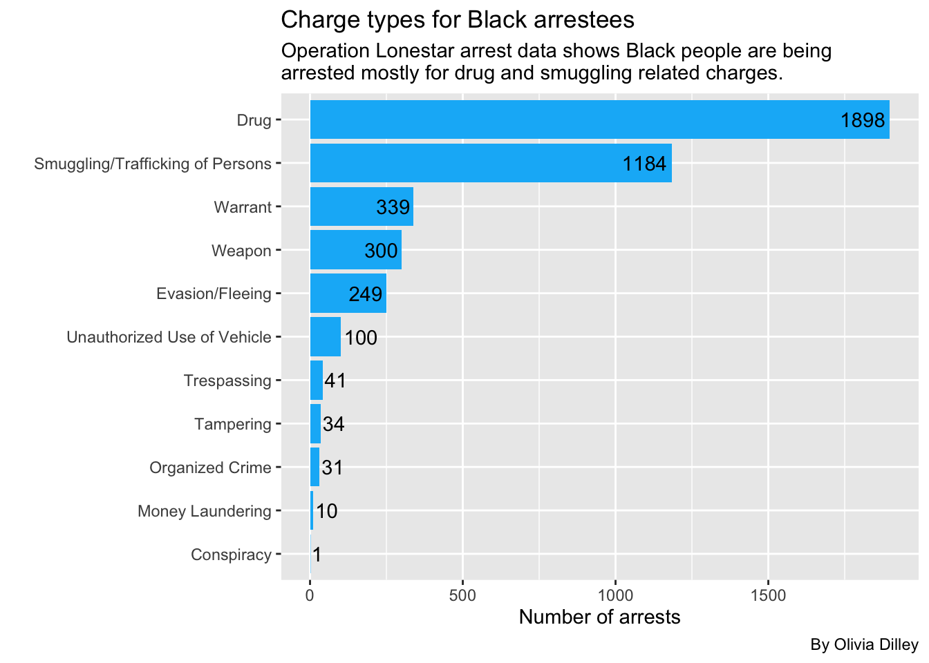
We’ll start with Black arrestees
blackarrests <- cat_ols |>
  group_by(person_race_abbr, charge_cat) |>
  filter(person_race_abbr == "B") |>
  summarise(appearances = n()) |>
  arrange(desc(appearances))

blackarrests
So Black people are most commonly getting arrested under OLS for drugs, then smuggling. Let’s make this a graph.
ggplot(blackarrests, aes(x = reorder(charge_cat, appearances), y = appearances)) +
  geom_col(fill = "#0AB7F7", stat = "identity") +
   geom_text(aes(label = appearances, hjust = ifelse(appearances > 248, 1.1, -.1)),
  color = "black") +
  coord_flip() +
  labs(
    title = "Charge types for Black arrestees",
    subtitle = str_wrap("Operation Lonestar arrest data shows Black people are being arrested mostly for drug and smuggling related charges.", width = 65),
    caption = "By Olivia Dilley",
    x = "",
    y = "Number of arrests"
  )
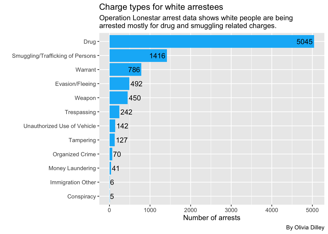
Now White arrests
whitearrests <- cat_ols |>
  group_by(person_race_abbr, charge_cat) |>
  filter(person_race_abbr == "W") |>
  summarise(appearances = n()) |>
  arrange(desc(appearances))

whitearrests
So white people are also most commonly getting arrested under OLS for drugs. Let’s make this a graph.
ggplot(whitearrests, aes(x = reorder(charge_cat, appearances), y = appearances)) +
  geom_col(fill = "#0AB7F7", stat = "identity") +
  geom_text(aes(label = appearances, hjust = ifelse(appearances > 492, 1.1, -.1)),
  color = "black") +
  coord_flip() +
  labs(
    title = "Charge types for white arrestees",
    subtitle = str_wrap("Operation Lonestar arrest data shows white people are being arrested mostly for drug and smuggling related charges.", width = 65),
    caption = "By Olivia Dilley",
    x = "",
    y = "Number of arrests"
  )
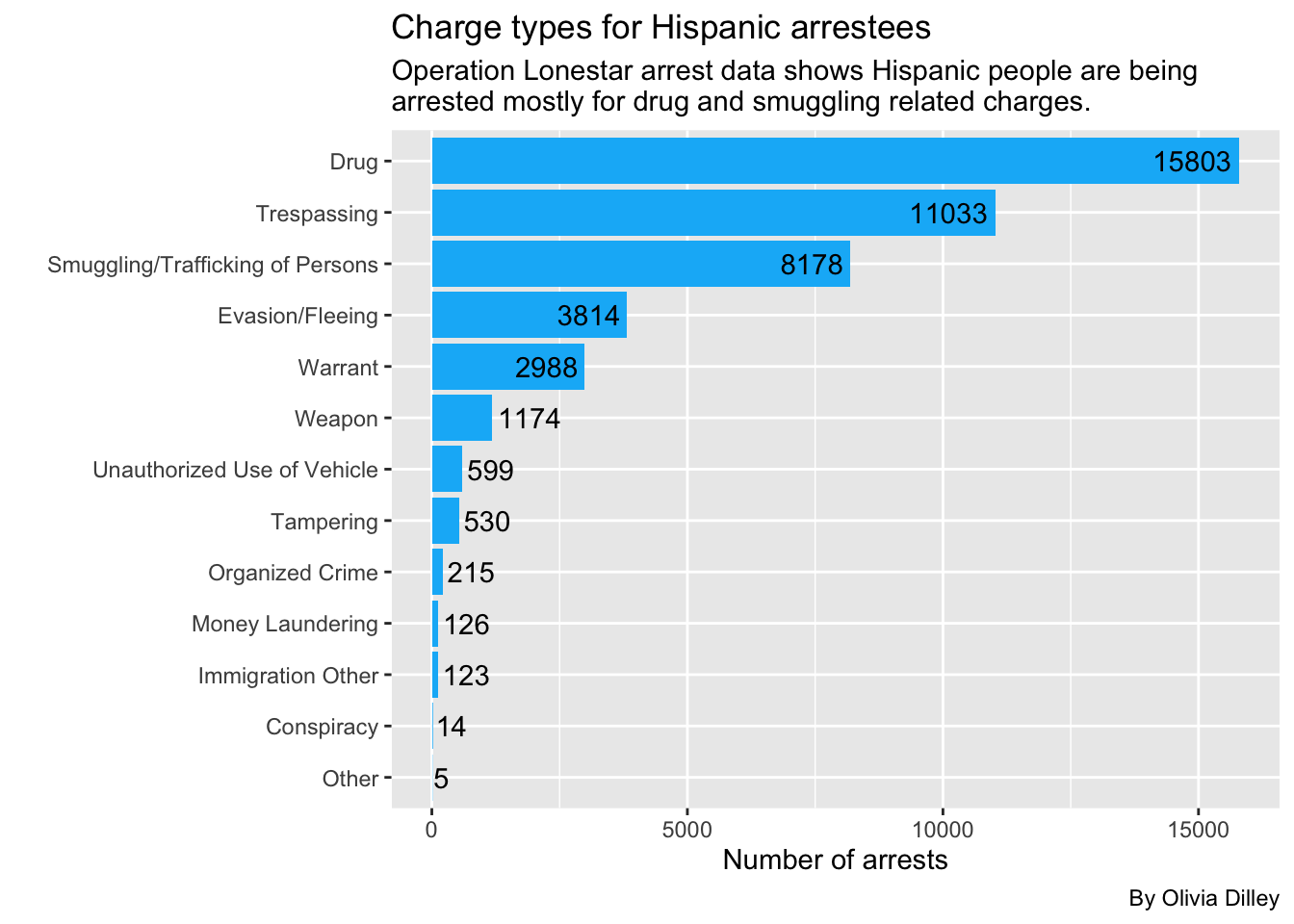
Now Hispanic arrests
hispanicarrests <- cat_ols |>
  group_by(person_race_abbr, charge_cat) |>
  filter(person_race_abbr == "H") |>
  summarise(appearances = n()) |>
  arrange(desc(appearances))

hispanicarrests
Again, Hispanic people are most commonly getting arrested under OLS for drugs. Let’s make this a graph.
ggplot(hispanicarrests, aes(x = reorder(charge_cat, appearances), y = appearances)) +
  geom_col(fill = "#0AB7F7", stat = "identity") +
  geom_text(aes(label = appearances, hjust = ifelse(appearances > 1174, 1.1, -.1)),
  color = "black") +
  coord_flip() +
  labs(
    title = "Charge types for Hispanic arrestees",
    subtitle = str_wrap("Operation Lonestar arrest data shows Hispanic people are being arrested mostly for drug and smuggling related charges.", width = 65),
    caption = "By Olivia Dilley",
    x = "",
    y = "Number of arrests"
  )
Now Asian arrests
asianarrests <- cat_ols |>
group_by(person_race_abbr, charge_cat) |>
filter(person_race_abbr == "A") |>
summarise(appearances = n()) |>
arrange(desc(appearances))
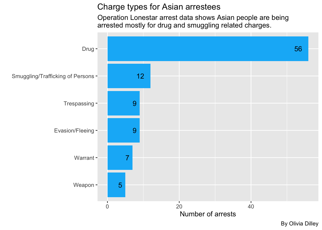
asianarrestsOnce again, Asian people are also most commonly being arrested under OLS for drugs. Let’s make this a graph.
ggplot(asianarrests, aes(x = reorder(charge_cat, appearances), y = appearances)) +
  geom_col(fill = "#0AB7F7", stat = "identity") +
  geom_text(aes(label = appearances, hjust = 1.8)) +
  coord_flip() +
  labs(
    title = "Charge types for Asian arrestees",
    subtitle = str_wrap("Operation Lonestar arrest data shows Asian people are being arrested mostly for drug and smuggling related charges.", width = 65),
    caption = "By Olivia Dilley",
    x = "",
    y = "Number of arrests"
  )
Now we’ll look at who is doing the arresting and where?
We’ll look into officers, ID, and county.
olsofficers <- olsdata |>
  group_by(arresting_officer, officer_id, arrest_county) |>
  summarise(appearances = n()) |>
  arrange(desc(appearances))

olsofficers
We can see that the top 3 officers are not identified by name, meaning they are from the VERSA data set (which removed officer name identification). It’s possible that some of the officer IDs, a column from the newer VERSA program, represent some of the same arresting officers named in the SPURS data set. Unfortunately, there’s no way for us to check that without further public information requests since the identities are hidden by the officer ID in the new program.
Categories
Now we’ll be using those categories we made to look into the smuggling and drug categories.
Drug
Operation Lone Star focused heavily on stopping drugs from crossing the border. Lauren wanted us to look at what types of drug-related charges were happening. Because the discourse around OLS was heavily focused on Fentanyl, we focused on that to see whether or not what Abbott’s administration was saying about what OLS was accomplishing was true.
What kind of drug charges are happening? Are many fentanyl-related like Abbott claims?
Let’s look at the drug charge category and break it down by type of drug. We used drug statute codes from the Texas’ Health and Safety Code and the Drug Enforcement Agency to categorize each drug.
drug_ols <- cat_ols |>
  group_by(charge) |>
  filter(charge_cat == "Drug") |>
  mutate(
    drug_type = case_when(
      str_detect(charge, "Mari|MARI|Marj|MARJ") ~ "Marijuana",
      str_detect(charge, "Fent|FENT|1-B") ~ "Fentanyl",
      str_detect(charge, "Cocaine|COCAINE") ~ "Cocaine",
      str_detect(charge, "Meth|METH") ~ "Crystal Meth",
      str_detect(charge, "1a|1-A|LSD")  ~ "LSD",
      str_detect(charge, "Heroin|HEROIN") ~ "Heroin"),

    default. = NA,

    fentanyl = case_when(
      str_detect(charge, "Fent|FENT|1-B|Schedule Ii/") ~ "YES"),

    default. = NA,

    marijuana = case_when(
        str_detect(charge, "Mari|MARI|Marj|MARJ|Drug Test|Schedule I/") ~ "YES"),

    default. = NA,

    drug_weapon = case_when(
          str_detect(charge, "DRUG/WEAPON") ~ "YES"),

    default. = NA   )

drug_ols |> count(drug_type, fentanyl, marijuana, drug_weapon)
Originally, we tried categorizing the charges by type of drug, but this doesn’t work out well because of the different codes used to separate each drug. So we decided to focus on any charges that could be related to fentanyl (as some are unclear) to answer our question. We also focused on marijuana charges, one of the more recurring drug offenses. Then we made a column called drug_weapon for all charges under the drug category that could also be weapons charges.
Key for Drug Categories:
- Poss Cs Pg: Possession of Controlled Substance in Penalty Group
- Fentanyl: Group 1-B (any type of fentanyl)
- Drug schedule: Can refer to a group of drugs (for example, fentanyl can be found in schedule II drugs)
- 1-A: LSD as well as any of its salts, isomers, and salts of isomers.
- OFFENSE: FALSIFICATION OF DRUG TEST RESULTS: Can refer to failing an authorized marijuana drug test Under Sec. 481.133., we noted that as “YES” under the marijuana column.
Let’s count the amount of drug charges that can be related to fentanyl or marijuana:
drug_ols_analysis <- drug_ols |>
  ungroup() |>
  mutate(drug_charge = case_when(
    str_detect(fentanyl, "YES") ~ "Fentanyl",
    str_detect(marijuana, "YES") ~ "Marijuana",
    .default = "Other"   ))

drug_ols_analysis_new <- drug_ols_analysis |> count(drug_charge) |>
    rename(charge_count = n)

drug_ols_analysis_new
Then we decided to make a simple bar graph to show the amount of charges that can be related to fentanyl or marijuana.
ggplot(drug_ols_analysis_new,
  aes(x = charge_count, y =  drug_charge, fill = drug_charge)
) +
  geom_col(width = .6) +
  geom_text(aes(label = charge_count),
            hjust = 1.2,
            color = "white") +
    labs(
    title = "What types of drugs does Operation Lone Star target?",
    x = "Number of charges",
    y = "Type of drug charge",
    subtitle = str_wrap("This analysis looked at fentanyl and marijuana related drug charges. Most drug charges were not related to either fentanyl or marijuana. Because drug charges are recorded differently in each data set, further anaylsis is needed to determine if this analysis reflects the most accurate number for each type of drug."),
    caption = "Source = Operation Lone Star Data"
    ) +
  scale_fill_manual(values = c(
    "Other" = "#2471a3",
    "Marijuana" = "#27ae60",
    "Fentanyl" = "#cb4335"
  )) +
      theme(legend.position = "none")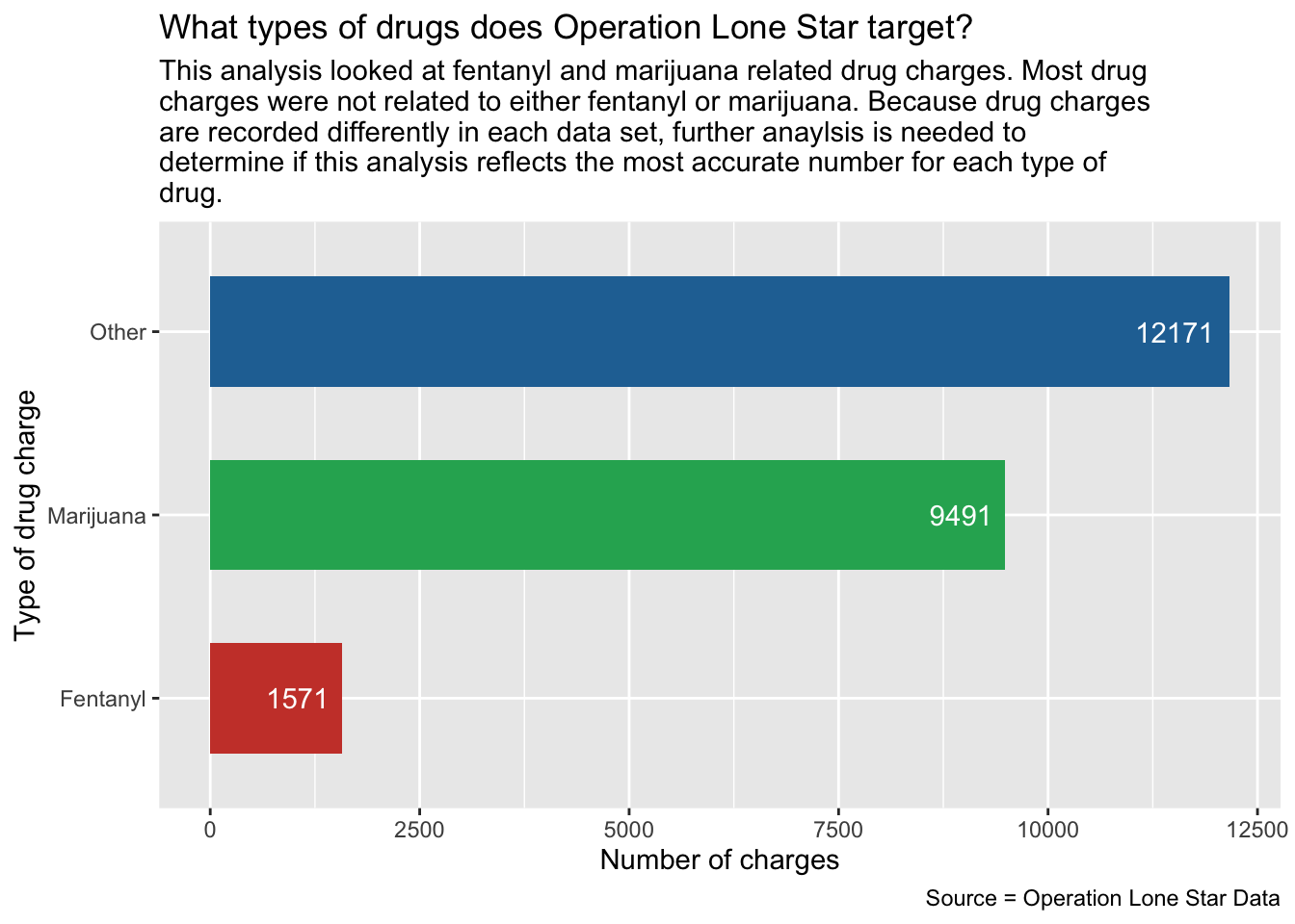
Data Takeaways for Drug Charges
At least 1,571 charges in both OLS data sets are related to possession/manufacturing of fentanyl. This is lower than the amount of charges related to marijuana, which are at least 9,491.
Overall, fentanyl charges identified in this analysis account for little over 6% of all drug charges, while marijuana charges account for little over 40% of the drug charges (from the total 23,233 drug charges identified).
Solo Drug Charges
When talking to Lauren about the importance of drug charges within Operation Lone Star, she mentioned separating solo drug charges from the data set. To do this, we filtered and looked at single drug charges in order to look at what drugs were being associated to each charge. This helps us narrow down drug charges in the analysis.
Now let’s look at the individuals being charged for drug charges:
cat_ols |> filter(charge_cat == "Drug") |> count(charge_count)Data Takeaways for Solo Charges
- Most charges are solo charges.
Now let’s look at the solo charges and what drugs they are related too.
solo_drug_ols <-
  cat_ols |>   group_by(charge, charge_count) |>   filter(charge_cat == "Drug") |> mutate(
    fentanyl = case_when(
      str_detect(charge, "Fent|FENT|1-B|Schedule Ii/") ~ "YES"),
    marijuana = case_when(
      str_detect(charge, "Mari|MARI|Marj|MARJ|Drug Test|Schedule I/") ~ "YES"),
    default. = NA,) |>
  filter(charge_count == "1")


solo_drug_ols |>
  count(charge, charge_count, fentanyl, marijuana)
Now we’ll group by what type of drug.
solo_drug_type <-
  solo_drug_ols |>   ungroup() |>   mutate(
    drug_charge_s = case_when(
      str_detect(fentanyl, "YES") ~ "Fentanyl",
      str_detect(marijuana, "YES") ~ "Marijuana",
      .default = "Other"
    )
  )

solo_drug_type_chart <- solo_drug_type |>   count(drug_charge_s) |>
  rename(charge_count = n)

solo_drug_type_chart
Now we’ll make a chart to look at this data.
ggplot(solo_drug_type_chart,
  aes(x = charge_count, y =  drug_charge_s, fill = drug_charge_s)
) +
  geom_col(width = .6) +
  geom_text(aes(label = charge_count),
            hjust = 1.3,
            color = "white") +
  labs(
    title = "What do solo drug charges look like under Operation Lone Star?",
    x = "Number of charges",
    y = "Type of drug charge",
    subtitle = str_wrap(
      "This analysis looked at fentanyl and marijuana related drug charges. Most drug charges were not related to either fentanyl or marijuana. Because drug charges are recorded differently in each data set, further anaylsis is needed to determine if this analysis reflects the most accurate number for each type of drug."
    ),
    caption = "Source = Operation Lone Star Data"
  ) +
  scale_fill_manual(values = c(
    "Other" = "#2471a3",
    "Marijuana" = "#27ae60",
    "Fentanyl" = "#cb4335"
  )) +
  theme(legend.position = "none")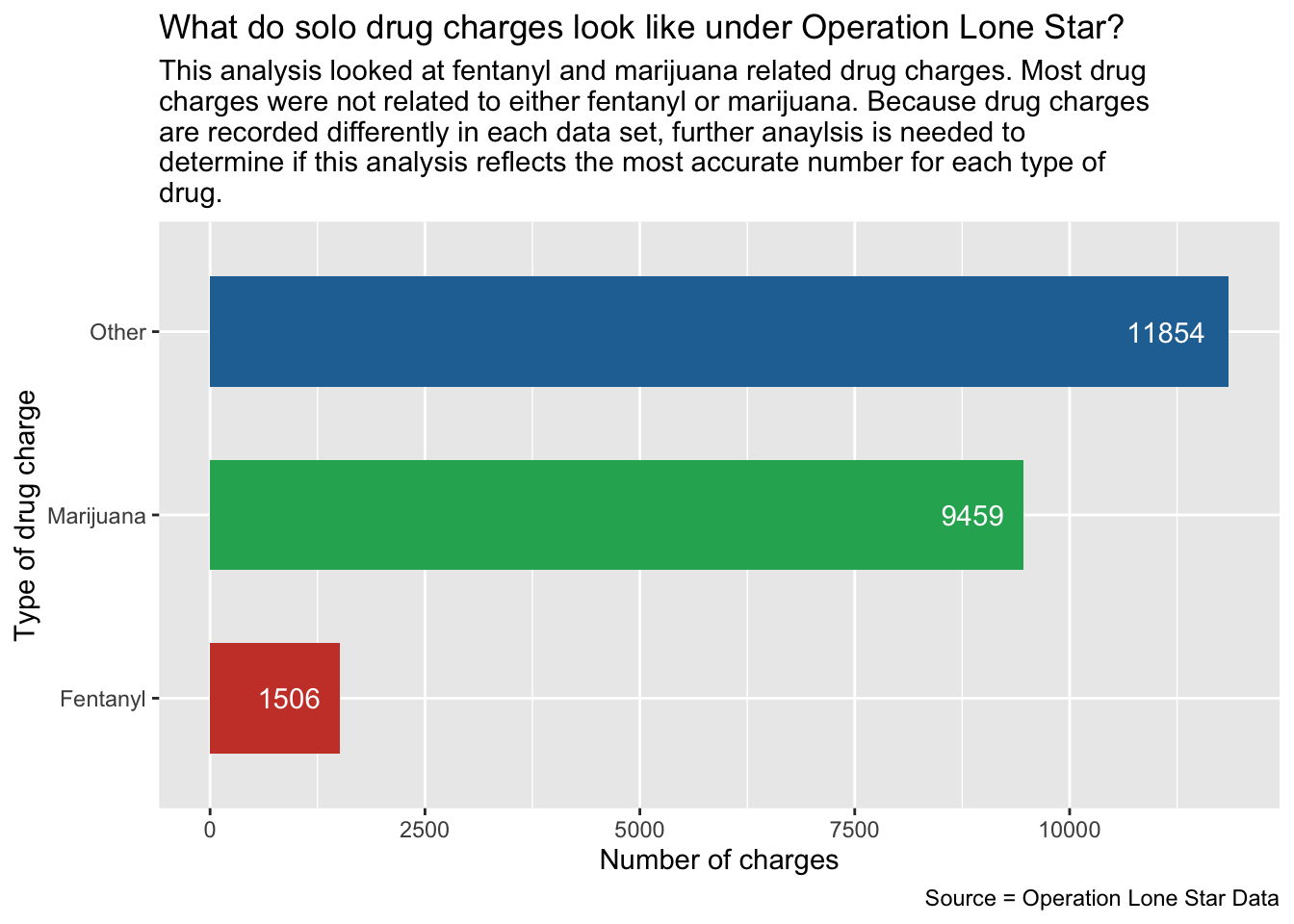
Where are solo drug charges located?
solo_drug_ols |>
  group_by(arrest_county) |>
  summarise(appearances = n()) |>
  arrange(desc(appearances))
Let’s look at Ector, the 6th county with the most solo drug charges not on the border.
ector_example <-
  solo_drug_ols |>   ungroup() |>   filter(arrest_county == "Ector") |>   mutate(
    drug_charge_s = case_when(
      str_detect(fentanyl, "YES") ~ "Fentanyl",
      str_detect(marijuana, "YES") ~ "Marijuana",
      .default = "Other"
    )
  )

ector_example |>   count(drug_charge_s)
Data Takeaways for Solo Charges
- Most of the solo drug charges in Ector county are unrelated to fentanyl. Notably, Odessa is part of Ector county.
Smuggling
Breaking down the Smuggling charge category
Lauren has a theory that Black people in areas like Houston are being tricked into smuggling people across the border. We want to look at the smuggling category and break down how many offenses are from Black people and where those offenses took place so we can test that theory.
First we’ll look at the smuggling charges for all races and tally them to see who is getting arrested for smuggling the most.
cat_ols |>
  group_by(person_race_abbr, charge_cat) |>
  filter(charge_cat == "Smuggling/Trafficking of Persons") |>
  summarise(appearances = n()) |>
  arrange(desc(appearances))
Lauren thinks this number of Black smuggling offenses is still substantial for Texas’ population demographics, despite it only being 3rd highest behind Hispanic and White.
Smuggling by county and race
Let’s look at all races smuggling charges by county to see how many smuggling charges there are for each race in each specific county.
smuggle_ols <- cat_ols |>
    group_by(person_race_abbr, charge_cat, arrest_county) |>
    summarise(appearances = n()) |>
    arrange(desc(appearances)) |>
    filter(charge_cat == "Smuggling/Trafficking of Persons") |>
    select(!charge_cat)

smuggle_ols
Data Takeaways for Smuggling Charges
- The most common is Hispanic people smuggling in areas near the border, like Kinney and El Paso county.
- Black smuggling in Kinney is also in the top 10.
Breaking down the Black smuggling category by county to test Lauren’s theory
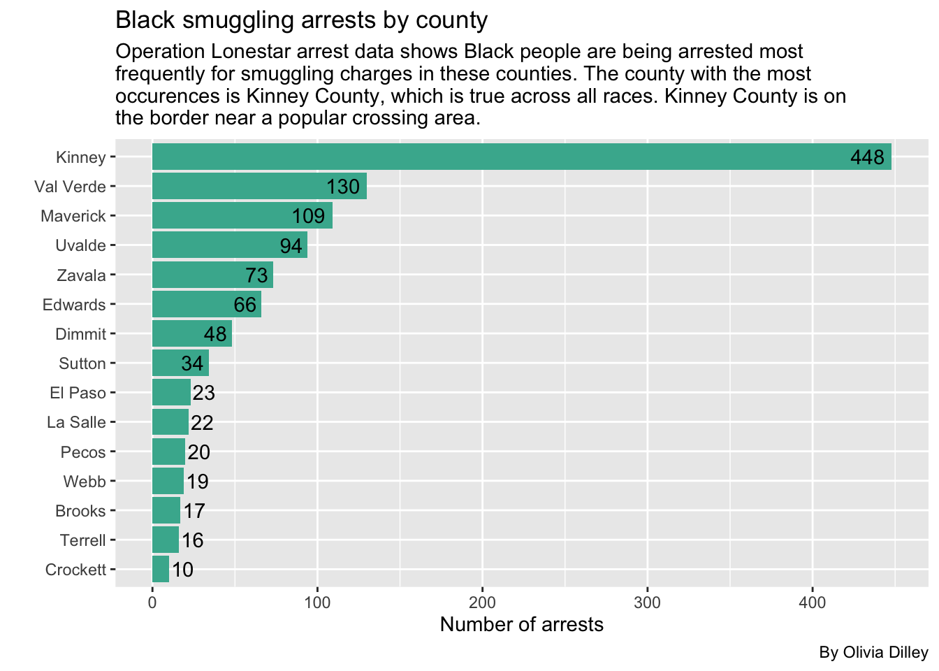
Let’s break down the smuggling category by county for Black offenders to see where they are most commonly being arrested (not where they are from necessarily). We’ll also filter for any counties where there were more than 10 arrests of Black people for smuggling charges so we can ignore the counties where it only happened a few times.
b_smuggling <- cat_ols |>
  group_by(arrest_county, arrest_state, person_race_abbr, charge_cat) |>
  filter(person_race_abbr == "B", charge_cat == "Smuggling/Trafficking of Persons") |>
  summarise(appearances = n()) |>
  arrange(desc(appearances))

b_smuggling_filtered <- b_smuggling |>
  filter(appearances > 9)

b_smuggling_filtered
We’ll make a graph for this to visualize it better.
ggplot(b_smuggling_filtered, aes(x = reorder(arrest_county, appearances), y = appearances)) +
  geom_col(stat = "identity", fill = "#45b39d") +
  geom_text(aes(label = appearances, hjust = ifelse(appearances > 23, 1.2, -.1)),
  color = "black") +
  coord_flip() +
  labs(
    title = "Black smuggling arrests by county",
    subtitle = str_wrap("Operation Lonestar arrest data shows Black people are being arrested most frequently for smuggling charges in these counties. The county with the most occurences is Kinney County, which is true across all races. Kinney County is on the border near a popular crossing area."),
    caption = "By Olivia Dilley",
    x = "",
    y = "Number of arrests"
  )
Now let’s see the breakdowns for other races, starting with white smuggling arrests.
We’ll also filter for any counties where there were more than 10 arrests of white people for smuggling charges so we can ignore the counties where it only happened a few times.
w_smuggling <- cat_ols |>
  group_by(arrest_county, arrest_state, person_race_abbr, charge_cat) |>
  filter(person_race_abbr == "W", charge_cat == "Smuggling/Trafficking of Persons") |>
  summarise(appearances = n()) |>
  arrange(desc(appearances))

w_smuggling_filtered <- w_smuggling |>
  filter(appearances > 9)

w_smuggling_filtered
And we’ll make a plot for this too.
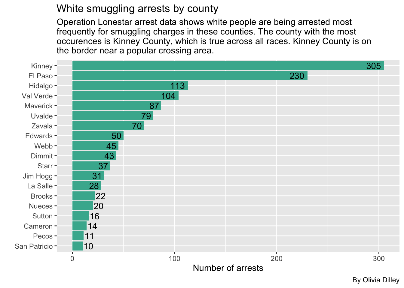
ggplot(w_smuggling_filtered, aes(x = reorder(arrest_county, appearances), y = appearances)) +
  geom_col(stat = "identity", fill = "#45b39d") +
  geom_text(aes(label = appearances, hjust = ifelse(appearances > 22, 1.2, -.1)),
  color = "black") +
  coord_flip() +
  labs(
    title = "White smuggling arrests by county",
    subtitle = str_wrap("Operation Lonestar arrest data shows white people are being arrested most frequently for smuggling charges in these counties. The county with the most occurences is Kinney County, which is true across all races. Kinney County is on the border near a popular crossing area."),
    caption = "By Olivia Dilley",
    x = "",
    y = "Number of arrests"
  )
Now let’s see the Hispanic breakdown.
Because there are so many arrests of Hispanic people for smuggling, we’ll have to filter this to any county with more than 100 arrests.
h_smuggling <- cat_ols |>
  group_by(arrest_county, arrest_state, person_race_abbr, charge_cat) |>
  filter(person_race_abbr == "H", charge_cat == "Smuggling/Trafficking of Persons") |>
  summarise(appearances = n()) |>
  arrange(desc(appearances))

h_smuggling_filtered <- h_smuggling |>
  filter(appearances > 100)

h_smuggling_filtered
Now we’ll make a plot.
ggplot(h_smuggling_filtered, aes(x = reorder(arrest_county, appearances), y = appearances)) +
  geom_col(stat = "identity", fill = "#45b39d") +
  geom_text(aes(label = appearances, hjust = 1.2),
  color = "black") +
  coord_flip() +
  labs(
    title = "Hispanic smuggling arrests by county",
    subtitle = str_wrap("Operation Lonestar arrest data shows Hispanic people are being arrested most frequently for smuggling charges in these counties. The county with the most occurences is Kinney County, which is true across all races. Kinney County is on the border near a popular crossing area."),
    caption = "By Olivia Dilley",
    x = "",
    y = "Number of arrests"
  )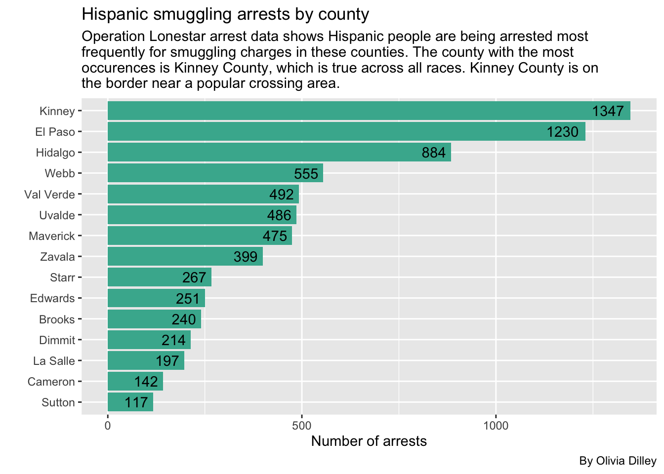
Data Takeaways for Smuggling by County
- Across the board, Kinney has the highest smuggling arrests in each race, so it doesn’t seem like Black arrests are more common there than any other race.
Regardless, we looked into the breakdown of arrests in Kinney county for Black people charged with smuggling crimes just to see if anything stuck out.
kinney_b_smuggling <- cat_ols |>
  group_by(arrest_county, arrest_state, person_race_abbr, charge_cat) |>
  filter(arrest_county == "Kinney", person_race_abbr == "B", charge_cat == "Smuggling/Trafficking of Persons") |>
  arrange(desc(charge_count))

kinney_b_smuggling_filtered <- kinney_b_smuggling |>
  filter(charge_count > 1)

kinney_b_smuggling_filtered
We can make a plot to look into the arrests over time to see if any dates had a much higher number of arrests than others. Since this data is very granular and there are days with no arrests, the original line is jagged. We decided to use a linear regression to determine if there was a trend over time in the relationship of Black smuggling arrests throughout time.
ggplot(kinney_b_smuggling_filtered, aes(x=charge_date, y=charge_count)) +
  geom_line(color = "black", alpha = 0.5) +
  geom_smooth(se = FALSE, color = "red") +
  labs(
    title = "Black smuggling arrests over time in Kinney County",
    subtitle = str_wrap("Operation Lonestar arrest data shows Black people are being arrested in Kinney for smuggling charges 4x as much as in any other county in OLS parameters. This breakdown shows those arrests over time."),
    caption = "By Olivia Dilley",
    x = "Date",
    y = "Charges"
  )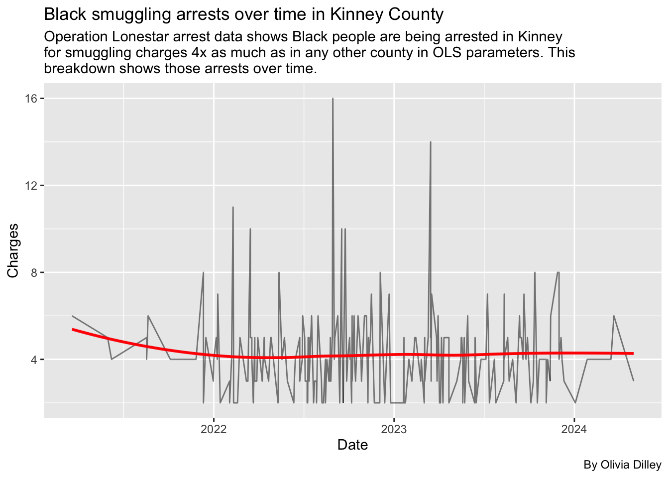
Data Takeaways for Kinney County Smuggling Arrests
- Because Kinney is the highest across all races, and the Black smuggling arrests don’t very super significantly over time, we didn’t see anything stand out from the data.
- The linear regression that we used in our analysis also didn’t show any major trend over time, suggesting there’s no period where charges for smuggling were significant for Black arrestees.
Let’s compare percentages of arrests by races with tabyls
We’ll make some tables where we can look at percentages of arrests by race for each county, officers, etc.
County and race tabyl
In this table, we’ll look at arrest county and race to see if any counties have higher percentages of Black arrests in general (not just smuggling arrests).
olsdata |>
  tabyl(arrest_county, person_race_abbr) |>
  adorn_percentages() |>
  adorn_pct_formatting() |>
  adorn_ns()
Data Takeaways for County and Race Percentages
- Most of the Black arrests in these counties seem on par with other races.
- Hispanic arrests are typically the highest percentage in every county.
- A few of the percentages of Black arrests are greater than 25% of all arrests in a county, but the number of arrests in those counties aren’t super high, so it doesn’t seem like there is any one county that is arresting more Black people than other races at a significant rate.
Smuggling arrests by race and county %
We’ll now look specifically into the percentages of smuggling arrests to see if any county is arresting Black people for smuggling more than other races.
cat_ols |>
  filter(charge_cat == "Smuggling/Trafficking of Persons") |>
  tabyl(person_race_abbr, arrest_county) |>
  adorn_percentages("col") |>
  adorn_pct_formatting() |>
  tibble()
Looking into specific officers
Let’s see if any officers stick out as arresting more Black people than other races. We’ll filter their arrests to be more than 100 so we can ensure that there are a large number of arrests by a specific officer in general. (Otherwise, our findings wouldn’t be very significant.)
olsdata |>
  tabyl(arresting_officer, person_race_abbr) |>
  adorn_totals("col", name = "col_total") |>
  adorn_totals("row") |>
  tibble() |>
  arrange(desc(col_total)) |>
  filter(col_total > 100)
Data Takeaways for Officers
- Any time an officer has a high number of Black arrests, they also have a high number of Hispanic arrests.
- Most officers have the highest number of arrests of Hispanic people.
- There’s a large number of officers which are listed as NA which is due to the fact that the newer VERSA program hides identities behind officer ID numbers.
- Overall, this analysis doesn’t look super indicative of any one officer arresting more Black people than any other race.
Main takeaways and Conclusion
- Demographics: When it comes to the demographics of those arrested under Operation Lone Star, Hispanics are overwhelmingly the most arrested. Those arrested tend to be males between late teenage to young adult ages (18-27). The most common type of charge across all races is drug-related.
- Drugs: The data itself is hard to read because the types of drugs and the way charges are documented isn’t consistent throughout time or programs. Therefore, among the drug charges we were able to categorize and identify, we can’t determine if the majority of those charges are fentanyl or marijuana related. However, there were instances where we were able to determine a specific drug, and in those cases, marijuana charges overwhelmingly surpassed fentanyl charges. The same was true for solo drug charges.
- Percentage Proportionality: Percentage-wise, most of the Black arrests in any specific county are on par with other races. Typically, Hispanic people are the most arrested in any county. Though some counties have percentages of Black arrests higher than 25%, the amount of people being arrested in those counties is so low that it doesn’t stand out. Additionally, when an officer has a high number of Black arrests, they have higher numbers of Hispanic arrests too, meaning Black people aren’t being singled out. Overall, the analysis doesn’t indicate that any officer or county is arresting more Black people than any other race.