Plots Part 1
In this JedR Trial, we’ll be exploring the ggplot2 skills. Like in all our previous exercises, we’ll be using the starwars data in the tidyverse packages.
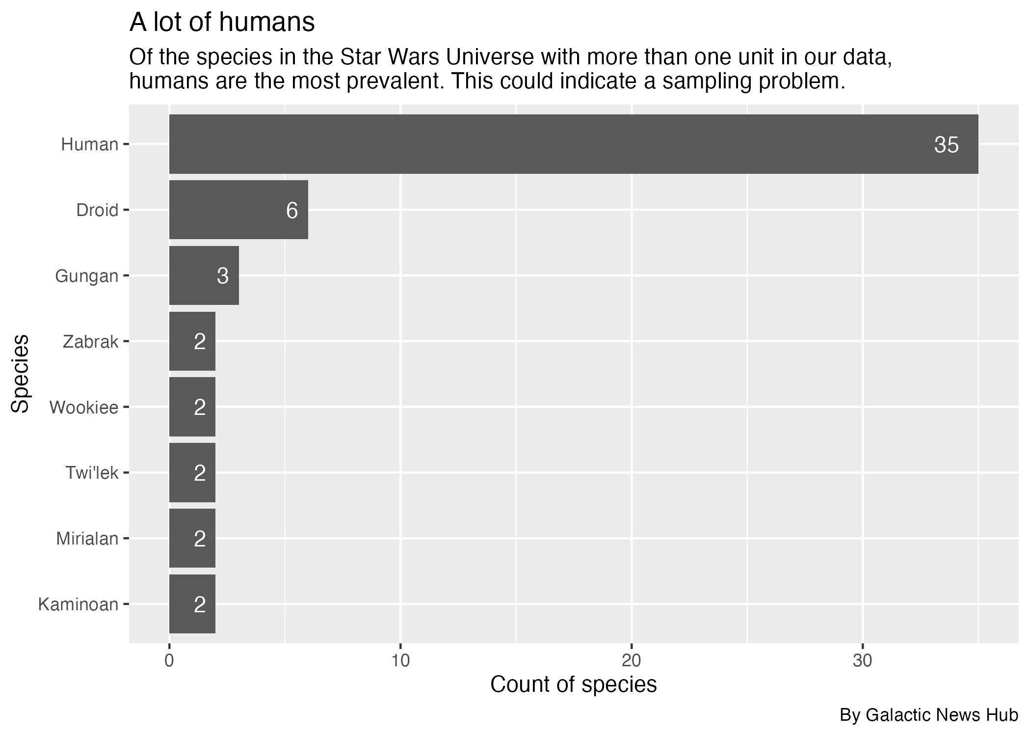
Your humanoid robot editor (J-327D) has asked to see how many characters there are for the most common species in the starwars data. He has asked you to make a bar chart from this data. It should look like this:

But know we’ll build this one piece at a time, taking advantage of ggplots layering methods.
As a reminder, here is the starwars data:
Prepare the data
As you may recall in your training, making a chart usually takes two steps: Preparing the data, then plotting the data.
To prepare this data for your plot, you need to:
Group_byspecies andsummarizethe number of rows. Name the new variablecount_species.- Arrange the result so the highest count is at the top.
- Drop any NA values.
- We are saving the result into a new dataframe called
species_data. We print that out at the end.
species_data <- starwars |>
  group_by(species) |>
  summarize(count_species = n()) |>
  arrange(desc(count_species)) |>
  drop_na()

species_data
species_data <- starwars |>
  group_by(species) |>
  summarize(count_species = n()) |>
  arrange(desc(count_species)) |>
  drop_na()

species_dataJ-327D notes this is a typical GSA summary, using group_by(), summarize() and arrange(). We count rows using the n() function.
There is one more unusual function here to remove rows with NA values.
Starting our plot
Plotting the chart
Now that you have prepared your data in species_data, you need to plot your data as a column chart, ordered so the species with the most characters is at the top.
A couple of things that J-327D and the code checker are persnickety about:
- We are starting with
species_databut filtered to results with more than onecount_species. You’ll start with species that have more than one result in the data so we don’t have a super long chart. - You should set the x axis to the characters and y axis to species. You’ll need to reorder the species.
- We’ll deal with chart titles and such later.
species_count |>
  filter(count_species > 1) |>
  ggplot(aes(
    x = count_species,
    y = species |> reorder(count_species))
  ) +
  geom_col()
species_count |>
  filter(count_species > 1) |>
  ggplot(aes(
    x = count_species,
    y = species |> reorder(count_species))
  ) +
geom_col()J-327D notes there are only two variables to choose from the data, species and count_species. This is a column chart, which is a type of bar chart so you should be able to figure it out from the geom lists.
To be continued …
The galaxy is lucky to have someone as strong and brave as you.
Once you’ve completed the exercises above, move to the next part of this trial.