Expand this to see code
library(tidyverse)
library(janitor)
library(DT)We want to analyze the Cesarean delivery rate for “uncomplicated” births, as defined by IQI 21 Cesarean Delivery Rate, Uncomplicated in 2025:
“Cesarean deliveries without a hysterotomy procedure per 1,000 deliveries. Excludes deliveries with complications (abnormal presentation, preterm delivery, fetal death, multiple gestation, or breech presentation).”
Loading libraries for this analysis.
library(tidyverse)
library(janitor)
library(DT)We previously created a data set that flagged Cesarean deliveries following the IQI indicator in the Categorization notebook. We will import that data in order to do analysis with it.
tx_deliveries_csec <- read_rds("../data-processed/cesarean.rds")Additionally, since our breakdown involves breaking down these rates by hospital, we need some of the lists that we created in the Stored Lists notebook.
# list of Texas Medical Center hospitals
tmc_list <- read_rds("../data-published/technical-specs/tmc.rds") |> pull(name)

# brand and unaffiliated lists
harris_health_list <- read_rds("../data-published/technical-specs/harris_health.rds") |> pull(name)
hca_list <- read_rds("../data-published/technical-specs/hca.rds") |> pull(name)
houston_methodist_list <- read_rds("../data-published/technical-specs/houston_methodist.rds") |> pull(name)
memorial_hermann_list <- read_rds("../data-published/technical-specs/memorial_hermann.rds") |> pull(name)
unaffiliated_list <- read_rds("../data-published/technical-specs/unaffiliated.rds") |> pull(name)Here I’m going to define some functions that will help us to make some graphs with varying parts of the data.
First, we’ll make a function that allows us to add the Cesarean delivery rate.
add_csec_calc <- function(.data, num_del) {
  .data |>
    summarize(CNT = n()) |>
    pivot_wider(names_from = CSEC, values_from = CNT) |>
    rename(
      NON_CSEC_CNT = "FALSE",
      CSEC_CNT = "TRUE"
    ) |>
    mutate(
      TOTAL = NON_CSEC_CNT + CSEC_CNT
    ) |>
    filter(
      TOTAL > 30
    ) |>
    mutate(
      # this gives us the percentage of total deliveries that are CSEC
      CSEC_RATE = round_half_up((CSEC_CNT / TOTAL) * 100, 1)
    ) |>
    mutate(
      # we want to create a column that will use the rate we previously
      # calculated to give us a number out of how many deliveries would appear
      # as CSEC -- use an adjustable value so I don't have to change this
      # if we decide on a different number
      CSEC_DEL_PER = round_half_up((CSEC_CNT / TOTAL) * num_del, 1)
    )
}
This makes it simple to add the Cesarean rate despite changing what data is included, like race, individual hospital names, etc.
We are also investigating the outcomes of births with Medicaid. We will also make a function that adds a rate of Cesarean deliveries using Medicaid.
add_medicaid <- function(.data, num_del) {
  .data |>
    group_by(YR, CSEC_MC_CATEGORY) |>
    summarize(CNT = n()) |>
    pivot_wider(names_from = CSEC_MC_CATEGORY, values_from = CNT) |>
    mutate(
      TOTAL_MC = NONCSEC_MC + CSEC_MC,
      TOTAL_NONMC = NONCSEC_NONMC + CSEC_NONMC
    ) |>
    filter(TOTAL_MC > 30 | TOTAL_NONMC > 30) |>
    mutate(
      MC_DEL_PER = round_half_up((CSEC_MC / TOTAL_MC) * num_del, 1),
      NONMC_DEL_PER = round_half_up((CSEC_NONMC / TOTAL_NONMC) * num_del, 1)
    ) |>
    pivot_longer(
      cols = c(MC_DEL_PER, NONMC_DEL_PER),
      names_to = "DEL_PER_TYPE",
      values_to = "DEL_PER"
    )
}Let’s also make a function that provides a template for what the individual hospital graphs will look like.
create_hosp_graph <- function(.data) {
  .data |>
    ggplot(aes(x = YR, y = CSEC_DEL_PER)) +
    geom_col() +
    scale_y_continuous(limits = c(0, 450)) +
    geom_text(aes(label = CSEC_DEL_PER), vjust = 1.5, color = "white", size = 3) +
    facet_wrap(~ FAC_NAME, ncol = 2) +
    theme(
      legend.position = "bottom"
    )
}We can make our lives so much easier by making a function for each individual graph, similar to the one above, that also includes race.
First let’s define some colors that we’ll use for the race graphs. We want these colors to be consistent across all of the plots. We are using colors based on a Washington Post article on the subject.
race_colors <- c(
  "Hispanic" = "#ab4a3c",
  "American Indian" = "#a6cea2",
  "Asian or Pacific Islander" = "#3e5298",
  "Black" = "#dc9658",
  "White" = "#a1cbea",
  "Other" = "#f4e56c"
)
Now we can build a function to create the race graphs using our specified colors.
 create_race_graph <- function(.data) {
   .data |>
     ggplot(aes(x = YR, y = CSEC_DEL_PER)) +
     geom_point(aes(color = MOD_RACE)) +
     geom_line(aes(color = MOD_RACE, group = MOD_RACE)) +
     scale_y_continuous(limits = c(0, 500)) +
     scale_color_manual(values = race_colors, name = "Race") +
     facet_wrap(~ FAC_NAME, ncol = 2) +
     theme(
       legend.position = "bottom"
     )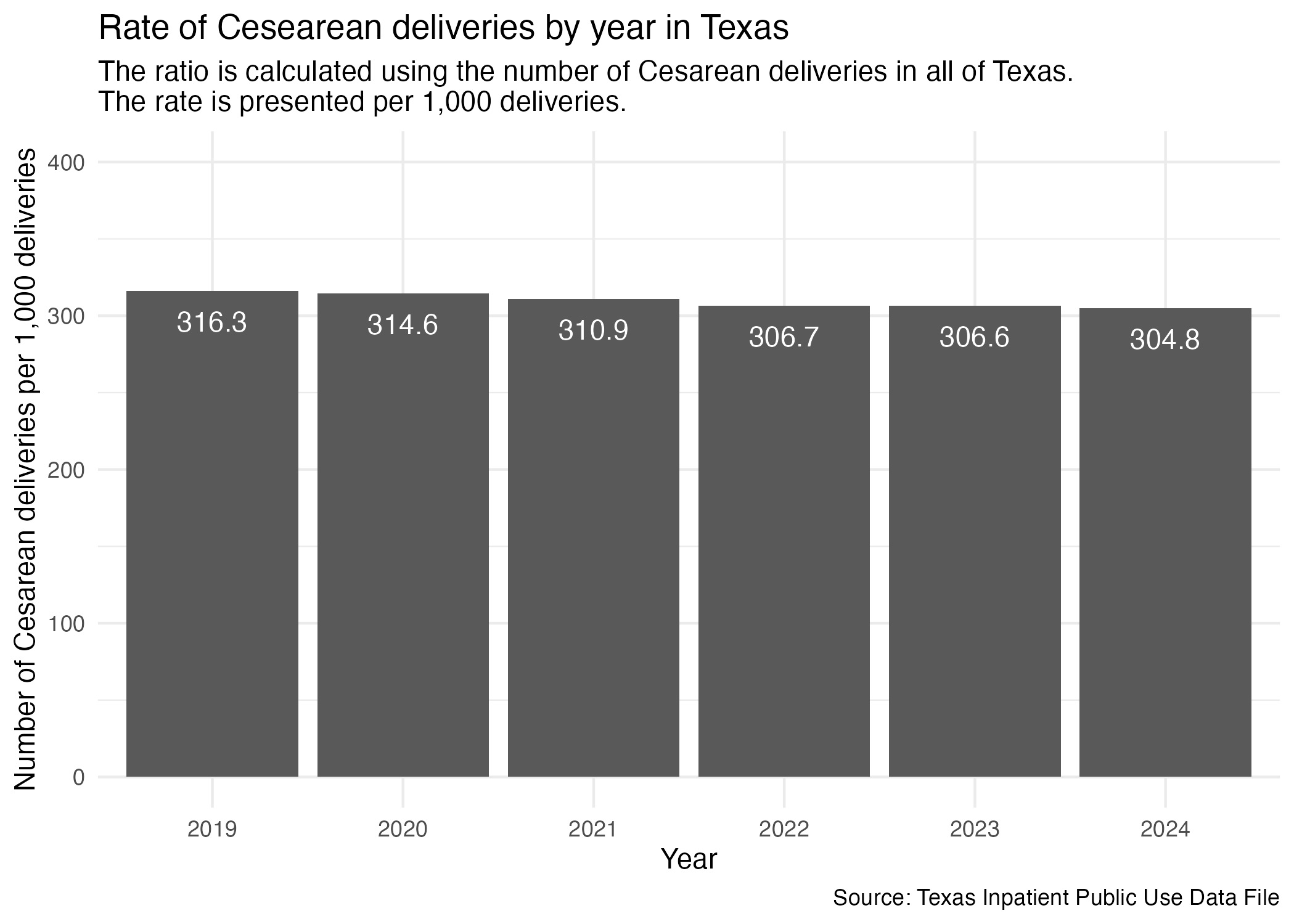
}In order to showcase the data visually, there are some things we have to do to the data set in order to prepare it to be plotted/shown in a table. This includes making a column for the rate per year. We will do this by hospital, but this might not be relevant to certain tables.
The rate will be expressed as number of Cesarean deliveries per 1,000 deliveries to remain consistent with the IQI indicator specifications.
ahrq_csec_rate_tx <- tx_deliveries_csec |>
  group_by(YR, CSEC) |>
  add_csec_calc(1000)

ahrq_csec_rate_txcsec_yr_tx_plot <- ahrq_csec_rate_tx |>
ggplot(aes(x = YR, y = CSEC_DEL_PER)) +
geom_col() +
geom_text(aes(label = CSEC_DEL_PER), vjust = 2, color = "white") +
scale_y_continuous(limits = c(0, 400)) +
labs(
title = "Rate of Cesearean deliveries by year in Texas",
subtitle = str_wrap("The ratio is calculated using the number of Cesarean deliveries in all of Texas. The rate is presented per 1,000 deliveries."),
x = "Year", y = "Number of Cesarean deliveries per 1,000 deliveries",
caption = "Source: Texas Inpatient Public Use Data File"
) +
theme_minimal()
ggsave("../data-published/figures/csec/csec-yr-tx.png")Saved Version:
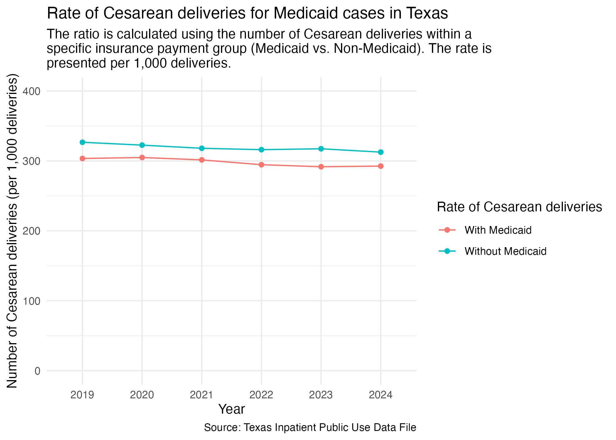
We want to know how many mothers that paid with Medicaid also had a Cesarean delivery and compare it to mothers that did not pay with Medicaid. First, we need to add the percentage of patients that paid with Medicaid for their procedures before we can plot by year. We will express this rate as per 1,000 deliveries within the resulting plot.
csec_mc_tx <- tx_deliveries_csec |>
  add_medicaid(1000)

csec_mc_tx
This data describes: Of those that paid with Medicaid and those that did not, what ratio had a Cesarean delivery?
Now, plot for year.
csec_mc_tx_plot <- csec_mc_tx |>
  ggplot(aes(x = YR, y = DEL_PER, group = DEL_PER_TYPE)) +
  geom_point(aes(color = DEL_PER_TYPE)) +
  geom_line(aes(color = DEL_PER_TYPE)) +
  scale_y_continuous(limits = c(0, 400)) +
  scale_color_discrete(labels = c("With Medicaid", "Without Medicaid"), name = "Rate of Cesarean deliveries") +
  labs(
    title = str_wrap("Rate of Cesarean deliveries for Medicaid cases in Texas"),
    subtitle = str_wrap("The ratio is calculated using the number of Cesarean deliveries within a specific insurance payment group (Medicaid vs. Non-Medicaid). The rate is presented per 1,000 deliveries."),
    x = "Year", y = "Number of Cesarean deliveries (per 1,000 deliveries)",
    caption = "Source: Texas Inpatient Public Use Data File"
  ) +
  theme_minimal()

ggsave("../data-published/figures/csec/csec-mc-tx.png")
Saved Version:
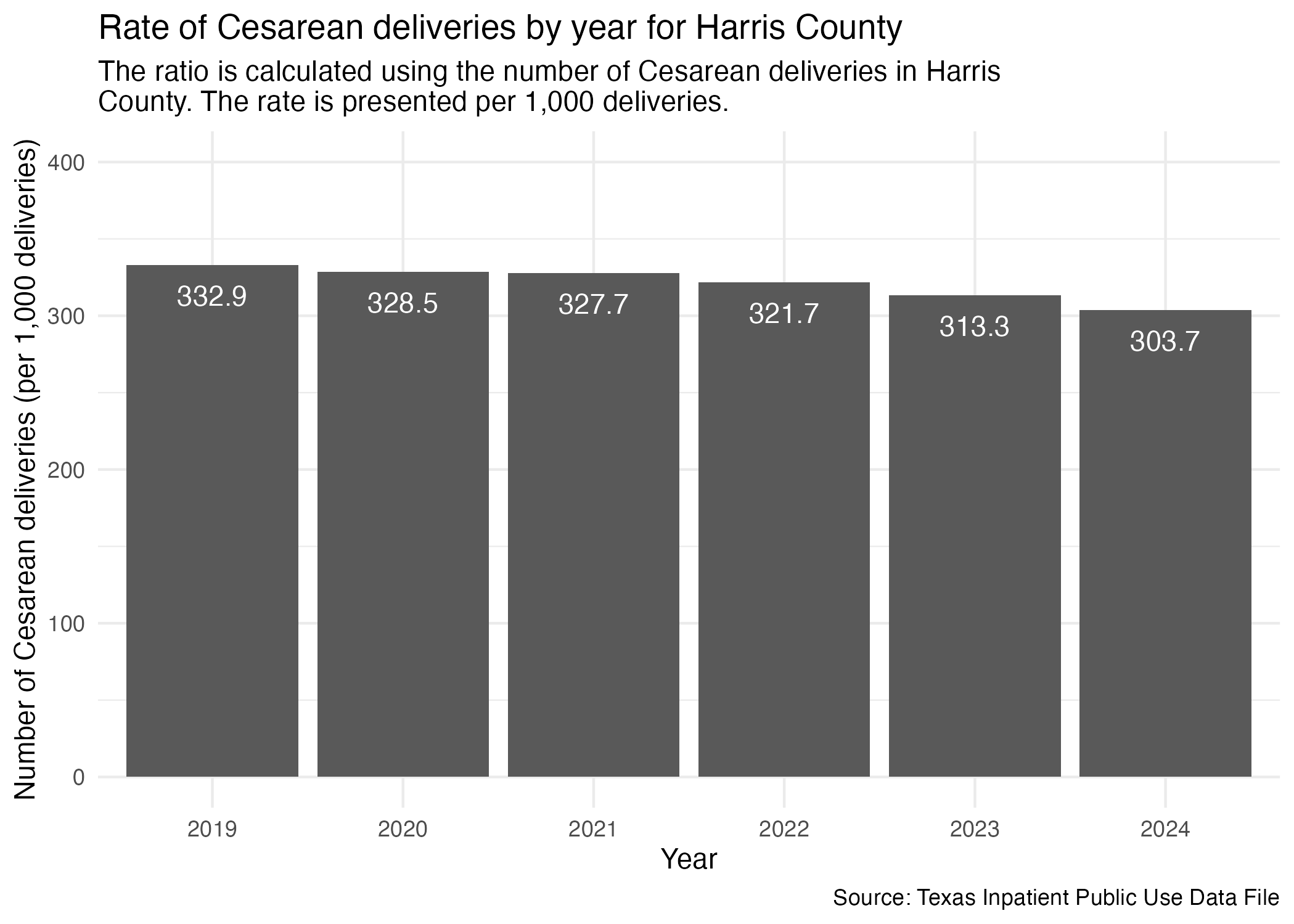
Need to limit the statewide data to just Harris County like we had done in the cleaning notebook.
ahrq_csec_rate_harris <- tx_deliveries_csec |>
  filter(FAC_CNTY == "Harris") |>
  group_by(YR, CSEC) |>
  add_csec_calc(1000)

ahrq_csec_rate_harris
We can now plot it similar to how we did statewide (and looking at the values is also very similar in conclusion).
csec_yr_harris_plot <- ahrq_csec_rate_harris |>
  ggplot(aes(x = YR, y = CSEC_DEL_PER)) +
  geom_col() +
  scale_y_continuous(limits = c(0, 400)) +
  geom_text(aes(label = CSEC_DEL_PER), vjust = 2, color = "white") +
  labs(
    title = "Rate of Cesarean deliveries by year for Harris County",
    subtitle = str_wrap("The ratio is calculated using the number of Cesarean deliveries in Harris County. The rate is presented per 1,000 deliveries."),
    x = "Year", y = "Number of Cesarean deliveries (per 1,000 deliveries)",
    caption = "Source: Texas Inpatient Public Use Data File"
  ) +
  theme_minimal()

ggsave("../data-published/figures/csec/csec-yr-harris.png")
Saved Version:
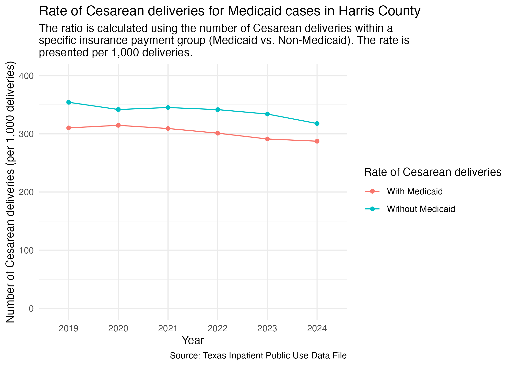
Similar to how we looked at Cesarean deliveries paid for by Medicaid for the state of Texas, we want to focus on this rate for Harris County specifically.
First, we need to prep the data but filtering specifically for Harris County.
csec_mc_harris <- tx_deliveries_csec |>
  filter(FAC_CNTY == "Harris") |>
  add_medicaid(1000)

csec_mc_harris
Now, plot.
csec_mc_harris_plot <- csec_mc_harris |>
  ggplot(aes(x = YR, y = DEL_PER, group = DEL_PER_TYPE)) +
  geom_point(aes(color = DEL_PER_TYPE)) +
  geom_line(aes(color = DEL_PER_TYPE)) +
  scale_y_continuous(limits = c(0, 400)) +
  scale_color_discrete(labels = c("With Medicaid", "Without Medicaid"), name = "Rate of Cesarean deliveries") +
  labs(
    title = str_wrap("Rate of Cesarean deliveries for Medicaid cases in Harris County"),
    subtitle = str_wrap("The ratio is calculated using the number of Cesarean deliveries within a specific insurance payment group (Medicaid vs. Non-Medicaid). The rate is presented per 1,000 deliveries."),
    x = "Year", y = "Number of Cesarean deliveries (per 1,000 deliveries)",
    caption = "Source: Texas Inpatient Public Use Data File"
  ) +
  theme_minimal()

ggsave("../data-published/figures/csec/csec-mc-harris.png")
Saved Version:
Let’s compare the Cesarean delivery rate across different hospitals in Harris County. We’ll prep the data so that it includes the facility’s name and ID.
ahrq_csec_rate_hosp <- tx_deliveries_csec |>
  filter(FAC_CNTY == "Harris") |>
  group_by(YR, THCIC_ID, FAC_NAME, CSEC) |>
  add_csec_calc(1000)

ahrq_csec_rate_hosp |> datatable()
Now we can plot all of the individual hospitals into separate graphs. We’ll group up individual graphs by brand and by location.
First, let’s look at the individual graphs by brand.
ahrq_csec_rate_hosp |>
  group_by(FAC_NAME) |>
  summarize(CNT = n()) |>
  arrange(FAC_NAME)
Here are the brands of hospitals found in the Harris County data:
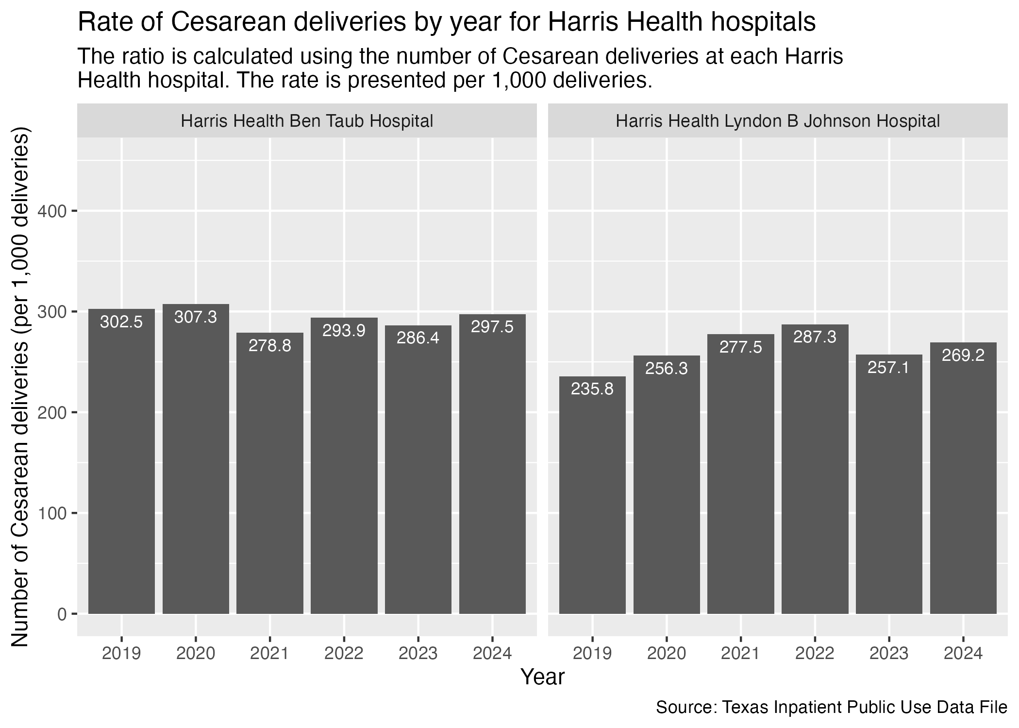
Let’s take a look at the Harris Health hospitals.
csec_hosp_harris_health <- ahrq_csec_rate_hosp |>
  filter(
    FAC_NAME %in% harris_health_list
    ) |>
  create_hosp_graph() +
  labs(
    title = str_wrap("Rate of Cesarean deliveries by year for Harris Health hospitals"),
    subtitle = str_wrap("The ratio is calculated using the number of Cesarean deliveries at each Harris Health hospital. The rate is presented per 1,000 deliveries."),
    x = "Year", y = "Number of Cesarean deliveries (per 1,000 deliveries)",
    caption = "Source: Texas Inpatient Public Use Data File"
  )

ggsave("../data-published/figures/csec/csec-hosp-harris-health.png")
Saved Version:
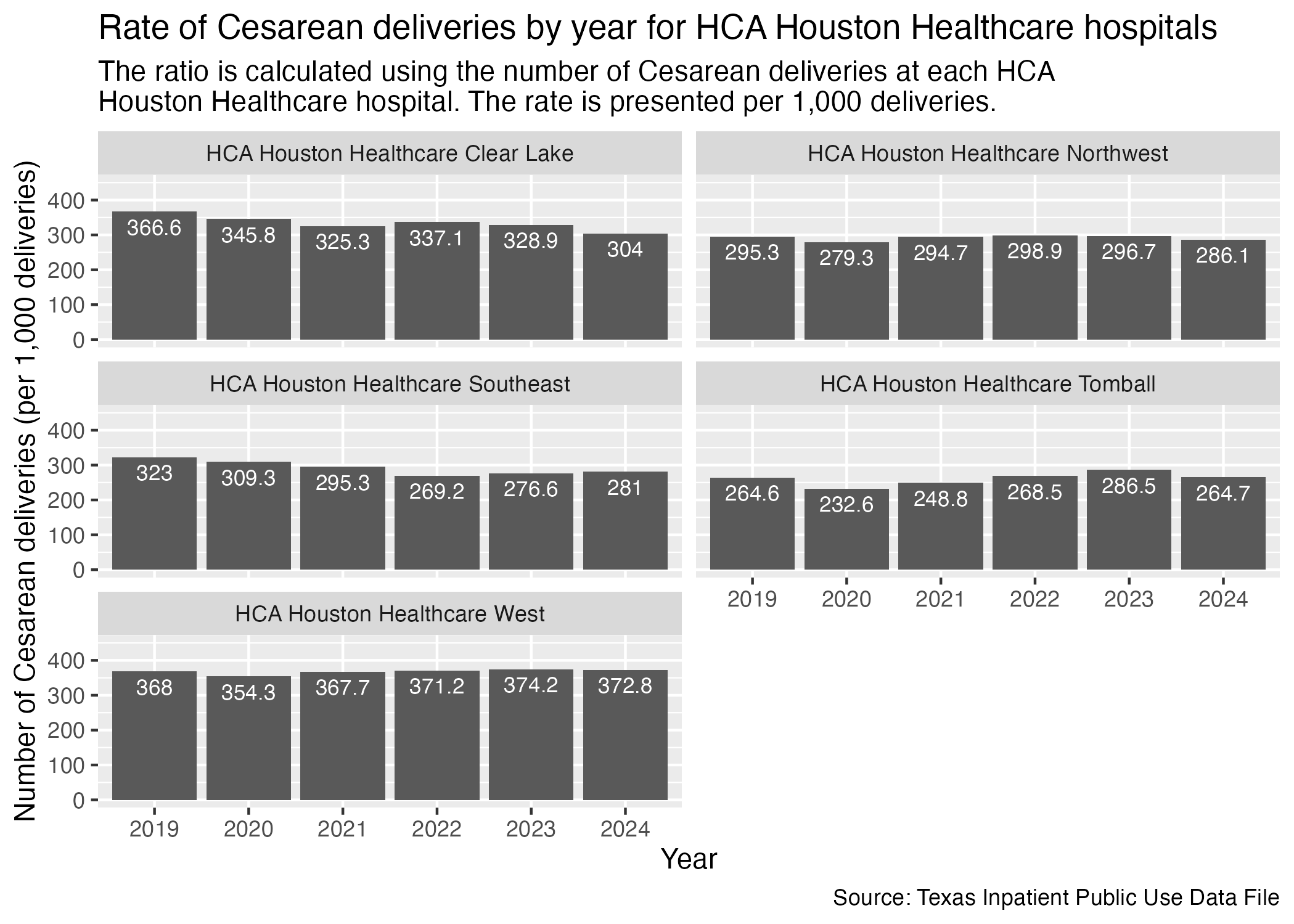
Same with HCA Houston Healthcare hospitals.
csec_hosp_hca <- ahrq_csec_rate_hosp |>
  filter(
    FAC_NAME %in% hca_list
    ) |>
  create_hosp_graph() +
  labs(
    title = "Rate of Cesarean deliveries by year for HCA Houston Healthcare hospitals",
    subtitle = str_wrap("The ratio is calculated using the number of Cesarean deliveries at each HCA Houston Healthcare hospital. The rate is presented per 1,000 deliveries."),
    x = "Year", y = "Number of Cesarean deliveries (per 1,000 deliveries)",
    caption = "Source: Texas Inpatient Public Use Data File"
  )

ggsave("../data-published/figures/csec/csec-hosp-hca.png")
Saved Version:
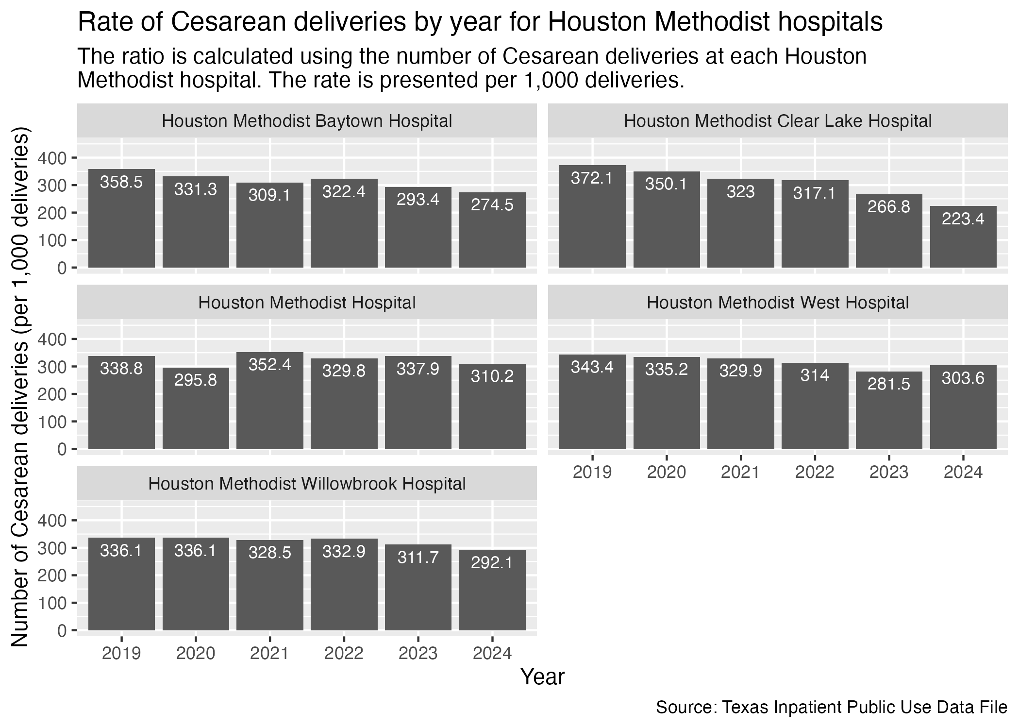
Houston Methodist hospitals next.
csec_hosp_houston_methodist <- ahrq_csec_rate_hosp |>
  filter(
    FAC_NAME %in% houston_methodist_list
    ) |>
  create_hosp_graph() +
  labs(
    title = "Rate of Cesarean deliveries by year for Houston Methodist hospitals",
    subtitle = str_wrap("The ratio is calculated using the number of Cesarean deliveries at each Houston Methodist hospital. The rate is presented per 1,000 deliveries."),
    x = "Year", y = "Number of Cesarean deliveries (per 1,000 deliveries)",
    caption = "Source: Texas Inpatient Public Use Data File"
  )

ggsave("../data-published/figures/csec/csec-hosp-houston-methodist.png")
Saved Version:
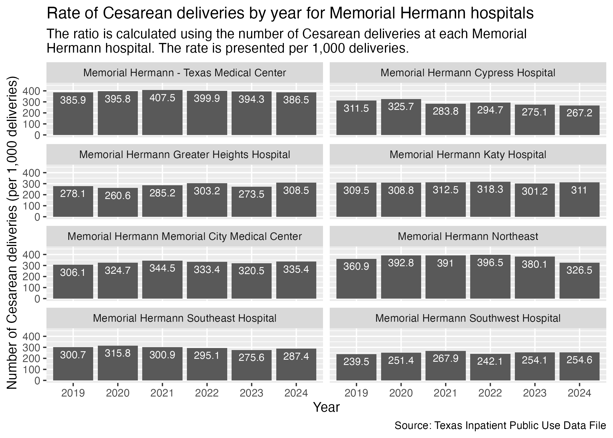
Finally, Memorial Hermann hospitals.
csec_hosp_memorial_hermann <- ahrq_csec_rate_hosp |>
  filter(
    FAC_NAME %in% memorial_hermann_list
  ) |>
  create_hosp_graph() +
  labs(
    title = "Rate of Cesarean deliveries by year for Memorial Hermann hospitals",
    subtitle = str_wrap("The ratio is calculated using the number of Cesarean deliveries at each Memorial Hermann hospital. The rate is presented per 1,000 deliveries."),
    x = "Year", y = "Number of Cesarean deliveries (per 1,000 deliveries)",
    caption = "Source: Texas Inpatient Public Use Data File"
  )

ggsave("../data-published/figures/csec/csec-hosp-memorial-hermann.png")
Saved Version:
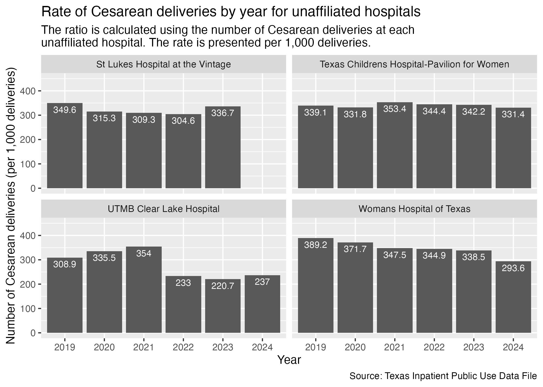
There are some hospitals in Harris County that don’t have other affiliated hospitals across the county. We will put them all into another set of graphs.
csec_hosp_unaffiliated <- ahrq_csec_rate_hosp |>
  filter(
    FAC_NAME %in% unaffiliated_list
  ) |>
  create_hosp_graph() +
  labs(
    title = "Rate of Cesarean deliveries by year for unaffiliated hospitals",
    subtitle = str_wrap("The ratio is calculated using the number of Cesarean deliveries at each unaffiliated hospital. The rate is presented per 1,000 deliveries."),
    x = "Year", y = "Number of Cesarean deliveries (per 1,000 deliveries)",
    caption = "Source: Texas Inpatient Public Use Data File"
  )

ggsave("../data-published/figures/csec/csec-hosp-unaffiliated.png")
There was no 2024 data provided for St. Lukes Hospital at the Vintage as of 11/11/2025
Saved Version:
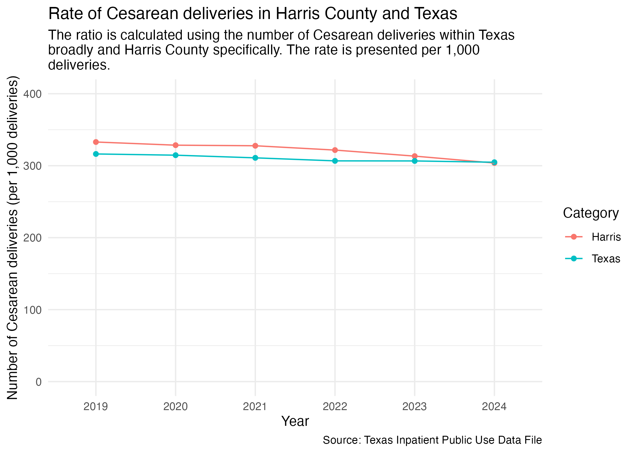
If we want to look at the data for Harris and Texas in one graph, we can plot Harris and Texas as two separate lines.
First, we need to put the Texas and Harris data into one data frame.
ahrq_csec_rate_combined <- ahrq_csec_rate_harris |>
  add_column(CATEGORY = "Harris") |>
  bind_rows(ahrq_csec_rate_tx) |>
  # at this point, any unfilled category entry is a Texas entry
  mutate(
    CATEGORY = if_else(is.na(CATEGORY), "Texas", CATEGORY)
  )

ahrq_csec_rate_combined
Now we can plot with the grouping being determined by the CATEGORY value.
csec_harris_tx <- ahrq_csec_rate_combined |>
  ggplot(aes(x = YR, y = CSEC_DEL_PER)) +
  geom_point(aes(color = CATEGORY)) +
  geom_line(aes(color = CATEGORY, group = CATEGORY)) +
  scale_y_continuous(limits = c(0, 400)) +
  scale_color_discrete(name = "Category") +
  labs(
    title = "Rate of Cesarean deliveries in Harris County and Texas",
    subtitle = str_wrap("The ratio is calculated using the number of Cesarean deliveries within Texas broadly and Harris County specifically. The rate is presented per 1,000 deliveries."),
    caption = "Source: Texas Inpatient Public Use Data File",
    x = "Year", y = "Number of Cesarean deliveries (per 1,000 deliveries)",
  ) +
  theme_minimal()

ggsave("../data-published/figures/csec/csec-harris-tx.png")
Saved Version:
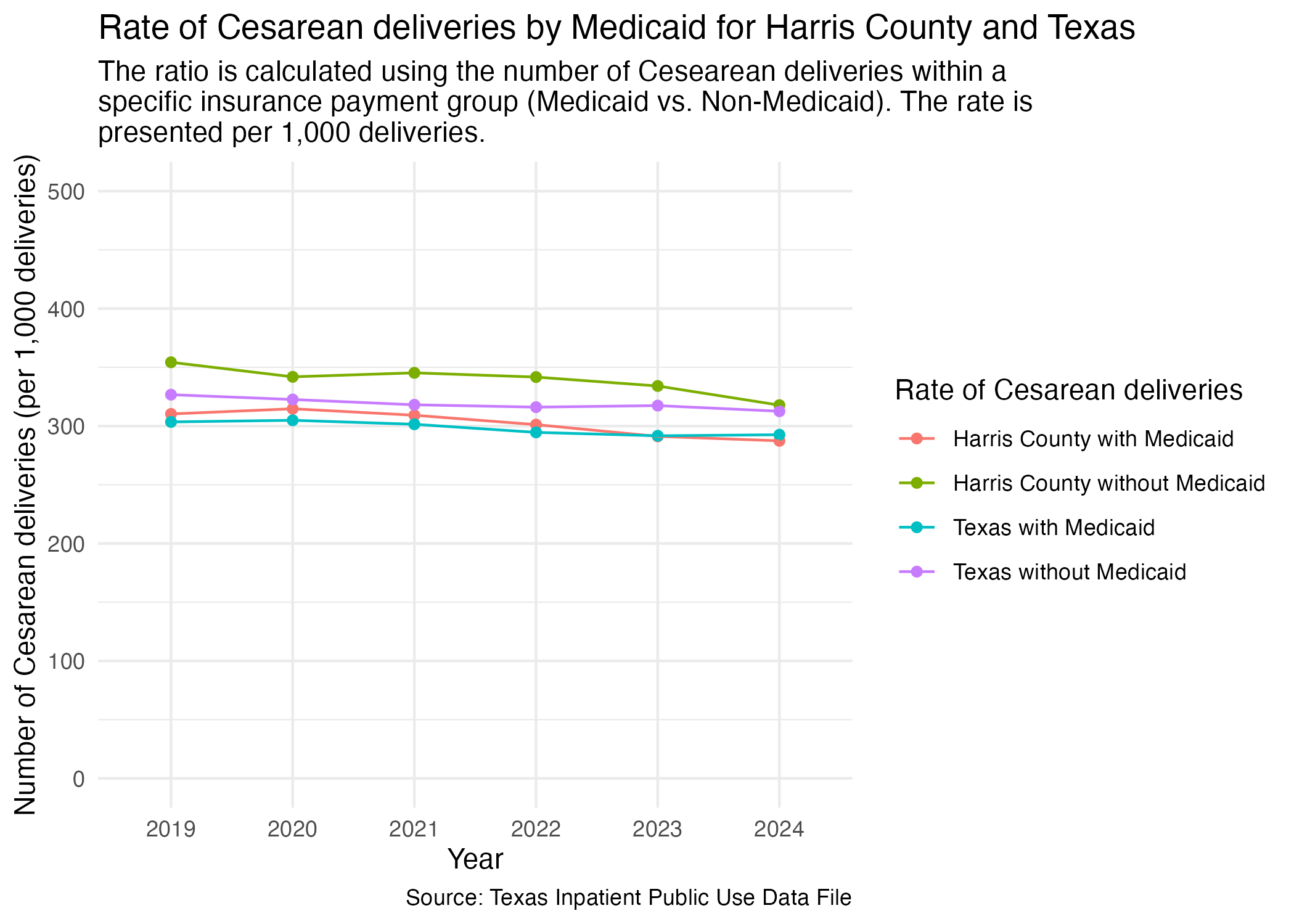
We want to look for Harris County and Texas in one graph as well. Let’s try this with separate bars instead of as a line graph this time around.First, we need to combine the data.
csec_mc_combined <- csec_mc_harris |>
  add_column(CATEGORY = "Harris") |>
  bind_rows(csec_mc_tx) |>
  # at this point, any unfilled category entry is a Texas entry
  mutate(
    CATEGORY = if_else(is.na(CATEGORY), "Texas", CATEGORY)
  ) |>
  mutate(
    DEL_PER_TYPE = paste(toupper(CATEGORY), DEL_PER_TYPE, sep = "_")
  ) |>
  select(!CATEGORY)

csec_mc_combined
Now, plot.
csec_mc_harris_tx <- csec_mc_combined |>
  ggplot(aes(x = YR, y = DEL_PER, group = DEL_PER_TYPE)) +
  geom_point(aes(color = DEL_PER_TYPE)) +
  geom_line(aes(color = DEL_PER_TYPE)) +
  scale_y_continuous(limits = c(0, 500)) +
  scale_color_discrete(labels = c("Harris County with Medicaid", "Harris County without Medicaid", "Texas with Medicaid", "Texas without Medicaid"), name = "Rate of Cesarean deliveries") +
  labs(
    title = "Rate of Cesarean deliveries by Medicaid for Harris County and Texas",
        subtitle = str_wrap("The ratio is calculated using the number of Cesearean deliveries within a specific insurance payment group (Medicaid vs. Non-Medicaid). The rate is presented per 1,000 deliveries."),
    caption = "Source: Texas Inpatient Public Use Data File",
    x = "Year", y = "Number of Cesarean deliveries (per 1,000 deliveries)",
  ) +
  theme_minimal()

ggsave("../data-published/figures/csec/csec-mc-harris-tx.png")
Saved Version:
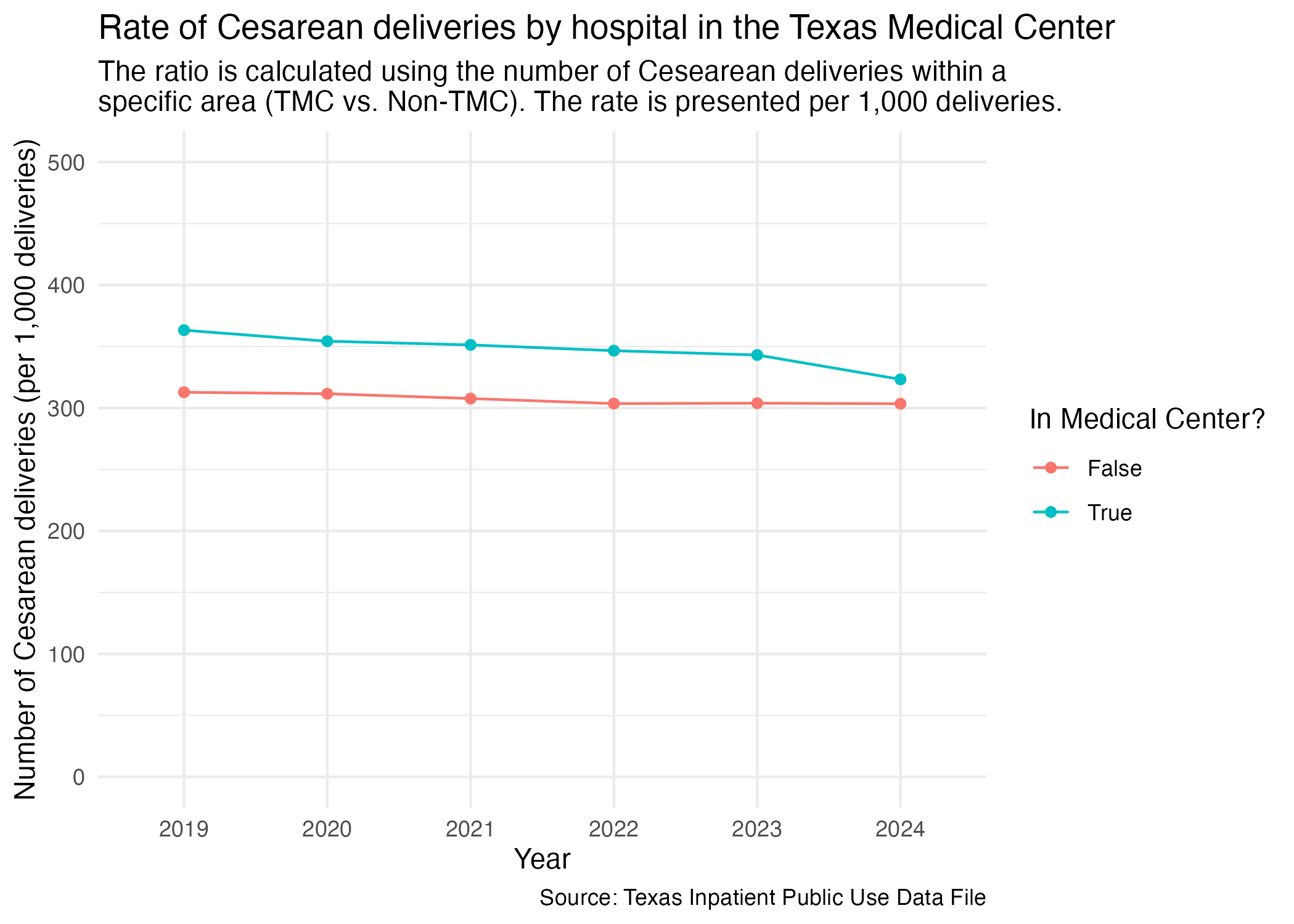
One other facet grouping we wanted to look at was Harris County hospitals in the Medical Center area versus outside of the Medical Center area. We imported this list at the top of this notebook.
Let’s create a new data frame that distinguishes whether a hospital is in the Medical Center or not.
ahrq_csec_rate_tmc <- tx_deliveries_csec |>
  mutate(
    TMC = if_else(FAC_NAME %in% tmc_list, T, F)
  ) |>
  group_by(YR, TMC, CSEC) |>
  add_csec_calc(1000)

ahrq_csec_rate_tmc
Now we can plot the comparison for Cesarean delivery rate between hospitals in the Medical Center area and not in the Medical Center area.
csec_tmc <- ahrq_csec_rate_tmc |>
  ggplot(aes(x = YR, y = CSEC_DEL_PER)) +
  geom_point(aes(color = TMC)) +
  geom_line(aes(color = TMC, group = TMC)) +
  scale_y_continuous(limits = c(0, 500)) +
  scale_color_discrete(name = "In Medical Center?", labels = c("False", "True")) +
  labs(
    title = "Rate of Cesarean deliveries by hospital in the Texas Medical Center",
        subtitle = str_wrap("The ratio is calculated using the number of Cesearean deliveries within a specific area (TMC vs. Non-TMC). The rate is presented per 1,000 deliveries."),
    caption = "Source: Texas Inpatient Public Use Data File",
    x = "Year", y = "Number of Cesarean deliveries (per 1,000 deliveries)",
  ) +
  theme_minimal()

ggsave("../data-published/figures/csec/csec-tmc.png")
Saved Version:
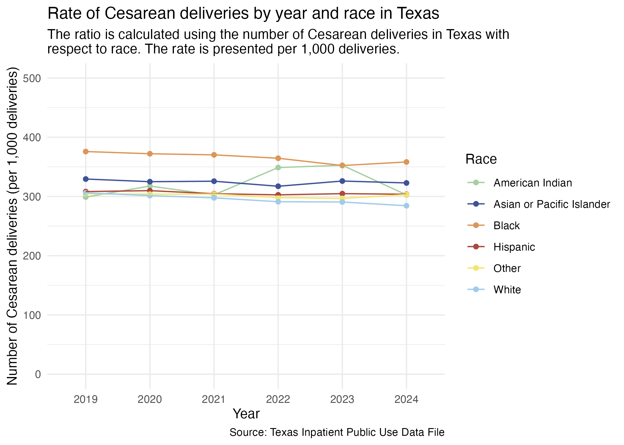
We previously redefined the MOD_RACE categories to also include the difference between Hispanic and non-Hispanic individuals. This was done in the Categorization notebook.
Prep for plotting.
ahrq_csec_rate_tx_race <- tx_deliveries_csec |>
  group_by(YR, MOD_RACE, CSEC) |>
  add_csec_calc(1000)

ahrq_csec_rate_tx_race
Now we try to plot this.
csec_race_yr_tx <- ahrq_csec_rate_tx_race |>
  ggplot(aes(x = YR, y = CSEC_DEL_PER)) +
  geom_point(aes(color = MOD_RACE)) +
  geom_line(aes(color = MOD_RACE, group = MOD_RACE)) +
  scale_color_manual(values = race_colors, name = "Race") +
  scale_y_continuous(limits = c(0, 500)) +
  labs(
    title = "Rate of Cesarean deliveries by year and race in Texas",
    subtitle = str_wrap("The ratio is calculated using the number of Cesarean deliveries in Texas with respect to race. The rate is presented per 1,000 deliveries."),
    x = "Year", y = "Number of Cesarean deliveries (per 1,000 deliveries)",
    caption = "Source: Texas Inpatient Public Use Data File"
  ) +
  theme_minimal()

ggsave("../data-published/figures/csec/csec-race-yr-tx.png")
Saved Version:
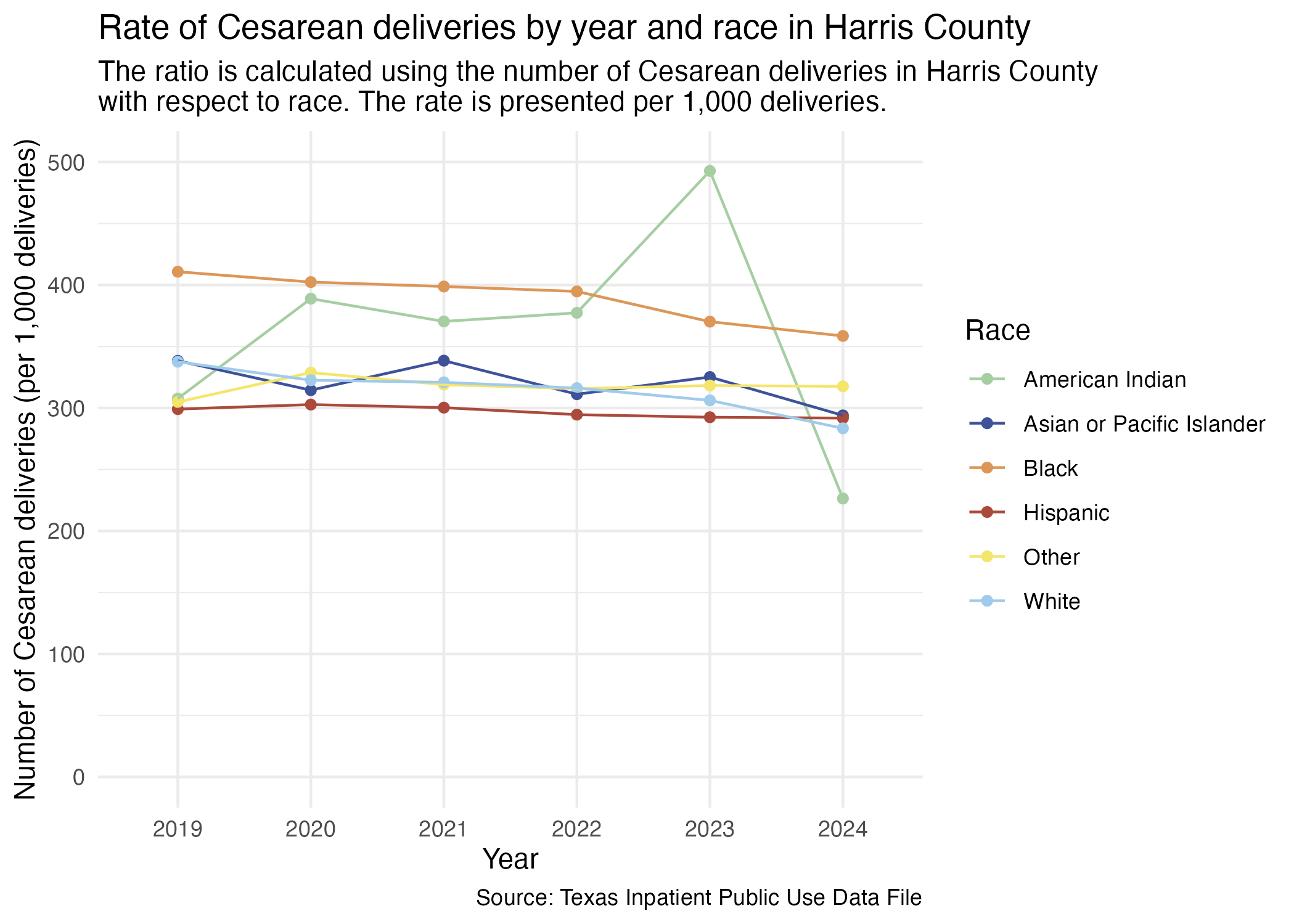
We can do a similar plot for just Harris County hospitals. First, prep the data.
ahrq_csec_rate_harris_race <- tx_deliveries_csec |>
  filter(FAC_CNTY == "Harris") |>
  group_by(YR, MOD_RACE, CSEC) |>
  add_csec_calc(1000)

ahrq_csec_rate_harris_race
Now, plot.
csec_race_yr_harris <- ahrq_csec_rate_harris_race |>
  ggplot(aes(x = YR, y = CSEC_DEL_PER)) +
  geom_point(aes(color = MOD_RACE)) +
  geom_line(aes(color = MOD_RACE, group = MOD_RACE)) +
  scale_y_continuous(limits = c(0, 500)) +
  scale_color_manual(values = race_colors, name = "Race") +
  labs(
    title = "Rate of Cesarean deliveries by year and race in Harris County",
    subtitle = str_wrap("The ratio is calculated using the number of Cesarean deliveries in Harris County with respect to race. The rate is presented per 1,000 deliveries."),
    x = "Year", y = "Number of Cesarean deliveries (per 1,000 deliveries)",
    caption = "Source: Texas Inpatient Public Use Data File"
  ) +
  theme_minimal()

ggsave("../data-published/figures/csec/csec-race-yr-harris.png")
American Indian has fewer cases than all other races. Its results is from a much smaller pool of data than other races.
Saved Version:
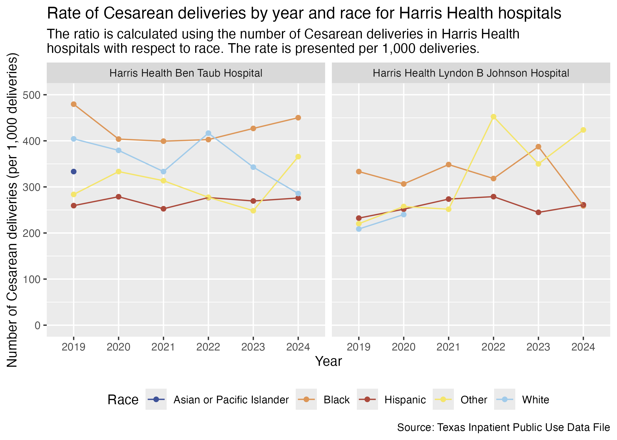
Look at individual hospitals now also with race. First, prep the data.
ahrq_csec_rate_hosp_race <- tx_deliveries_csec |>
  filter(FAC_CNTY == "Harris") |>
  group_by(YR, THCIC_ID, MOD_RACE, FAC_NAME, CSEC) |>
  add_csec_calc(1000)

ahrq_csec_rate_hosp_raceThis section will look at all of the Harris Health hospitals with race data included.
csec_hosp_race_harris_health <- ahrq_csec_rate_hosp_race |>
  filter(FAC_NAME %in% harris_health_list) |>
  create_race_graph() +
  labs(
    title = "Rate of Cesarean deliveries by year and race for Harris Health hospitals",
    subtitle = str_wrap("The ratio is calculated using the number of Cesarean deliveries in Harris Health hospitals with respect to race. The rate is presented per 1,000 deliveries."),
    x = "Year", y = "Number of Cesarean deliveries (per 1,000 deliveries)",
    caption = "Source: Texas Inpatient Public Use Data File"
  )

ggsave("../data-published/figures/csec/csec-hosp-race-harris-health.png")
Saved Version:
Now, HCA Houston Healthcare hospitals.
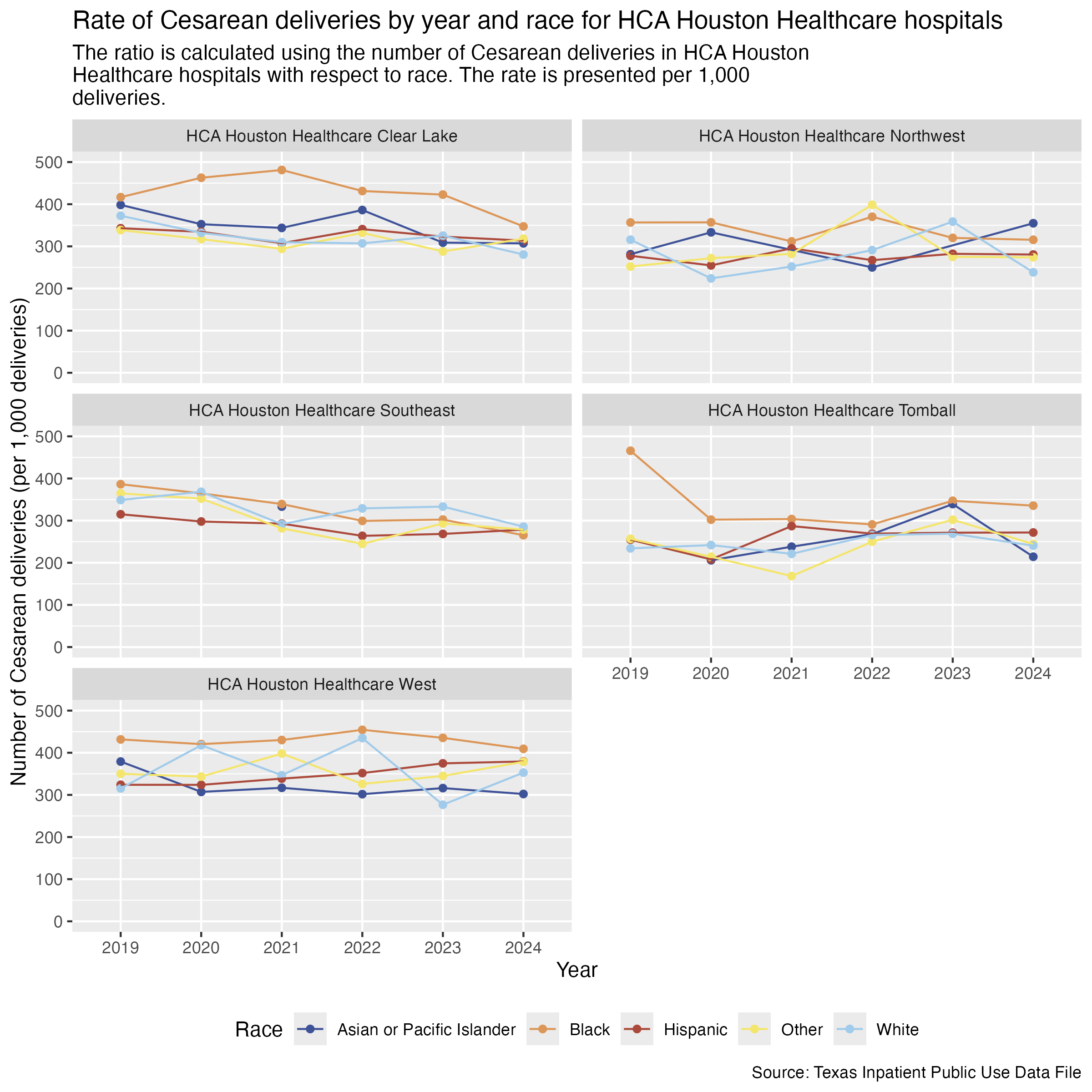
csec_hosp_race_hca <- ahrq_csec_rate_hosp_race |>
  filter(
    FAC_NAME %in% hca_list
  ) |>
  create_race_graph() +
  labs(
    title = "Rate of Cesarean deliveries by year and race for HCA Houston Healthcare hospitals",
    subtitle = str_wrap("The ratio is calculated using the number of Cesarean deliveries in HCA Houston Healthcare hospitals with respect to race. The rate is presented per 1,000 deliveries."),
    x = "Year", y = "Number of Cesarean deliveries (per 1,000 deliveries)",
    caption = "Source: Texas Inpatient Public Use Data File"
  )

ggsave("../data-published/figures/csec/csec-hosp-race-hca.png", width = 8, height = 8, units = "in")
Saved Version:
Houston Methodist hospitals.
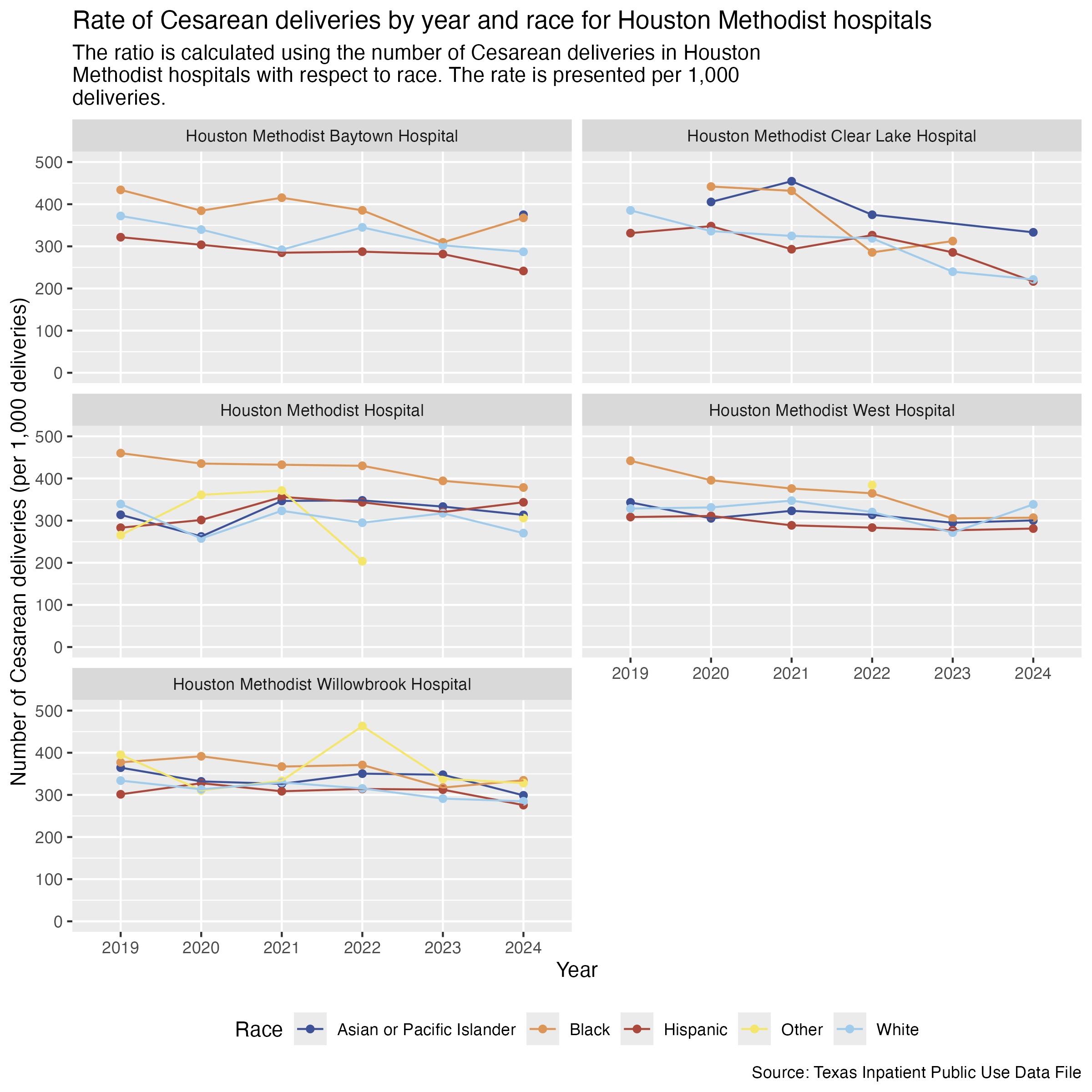
csec_hosp_race_houston_methodist <- ahrq_csec_rate_hosp_race |>
  filter(
    FAC_NAME %in% houston_methodist_list
  ) |>
  create_race_graph() +
  labs(
    title = "Rate of Cesarean deliveries by year and race for Houston Methodist hospitals",
    subtitle = str_wrap("The ratio is calculated using the number of Cesarean deliveries in Houston Methodist hospitals with respect to race. The rate is presented per 1,000 deliveries."),
    x = "Year", y = "Number of Cesarean deliveries (per 1,000 deliveries)",
    caption = "Source: Texas Inpatient Public Use Data File"
  )

ggsave("../data-published/figures/csec/csec-hosp-race-houston-methodist.png", height = 8, width = 8, units = "in")
Saved Version:
Finally, Memorial Hermann hospitals.
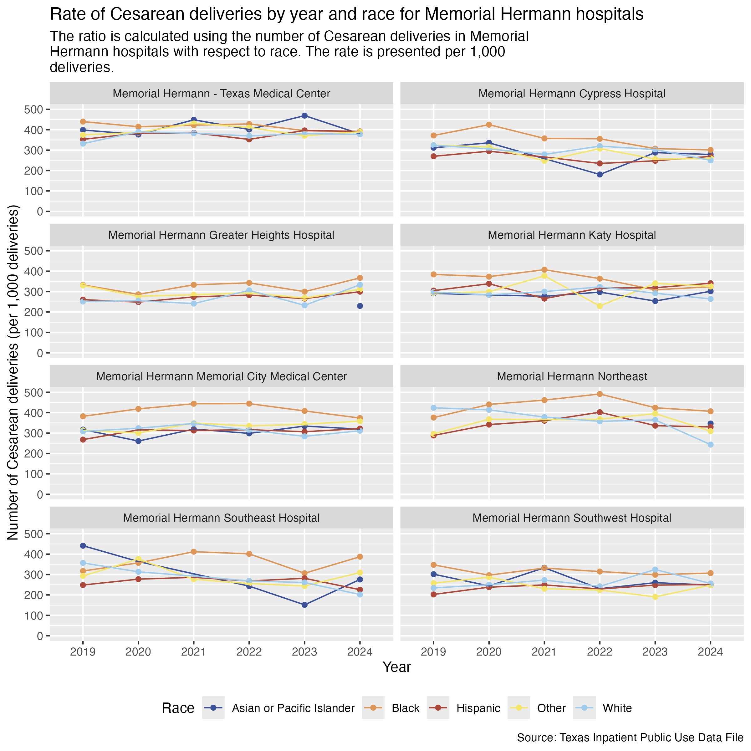
csec_hosp_race_memorial_hermann <- ahrq_csec_rate_hosp_race |>
  filter(
    FAC_NAME %in% memorial_hermann_list
  ) |>
  create_race_graph() +
  labs(
    title = "Rate of Cesarean deliveries by year and race for Memorial Hermann hospitals",
    subtitle = str_wrap("The ratio is calculated using the number of Cesarean deliveries in Memorial Hermann hospitals with respect to race. The rate is presented per 1,000 deliveries."),
    x = "Year", y = "Number of Cesarean deliveries (per 1,000 deliveries)",
    caption = "Source: Texas Inpatient Public Use Data File"
  )

ggsave("../data-published/figures/csec/csec-hosp-race-memorial-hermann.png", height = 8, width = 8, units = "in")
Saved Version:
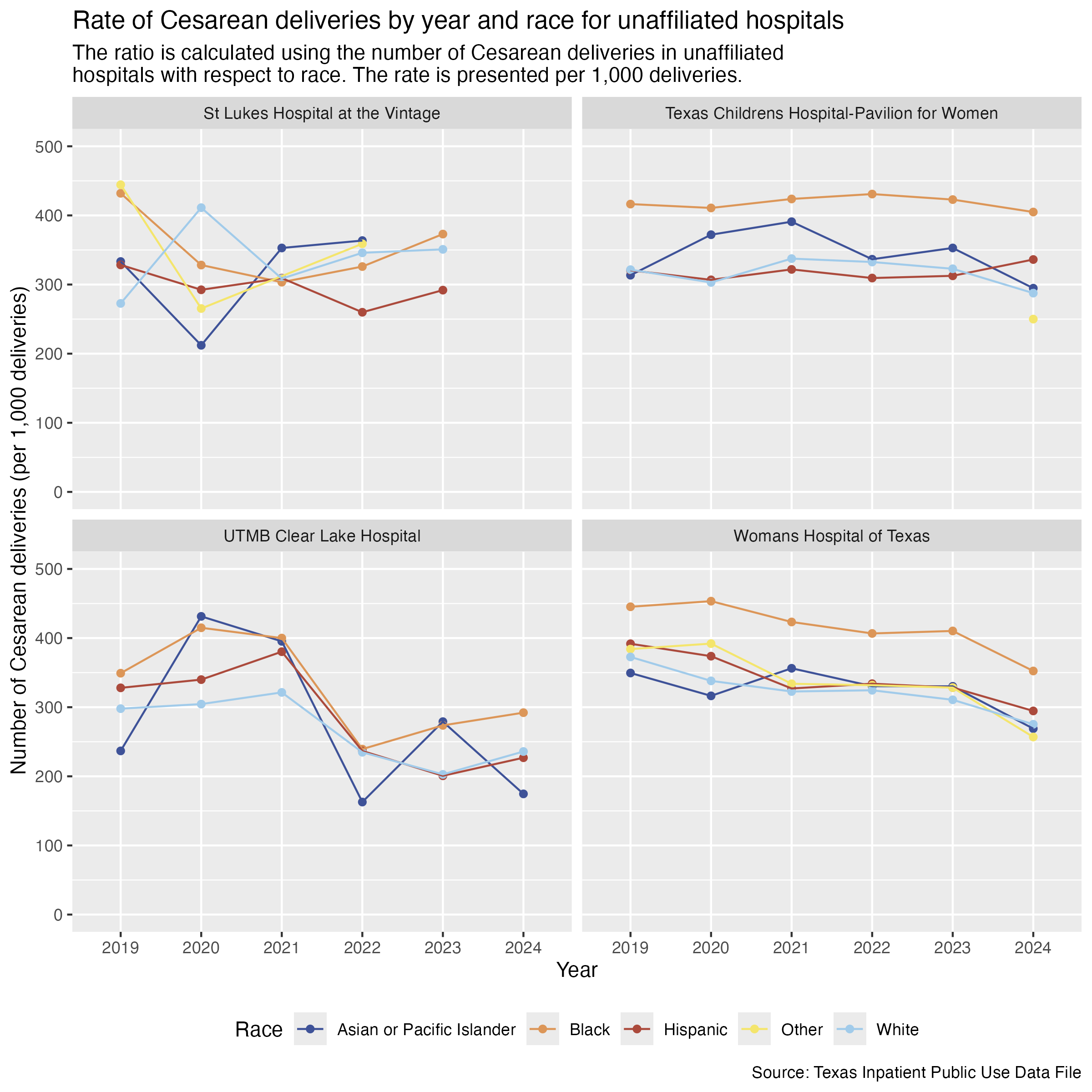
Here are the race breakdowns for all of the hospitals that don’t fall under a brand.
csec_hosp_race_unaffiliated <- ahrq_csec_rate_hosp_race |>
  filter(
    FAC_NAME %in% unaffiliated_list
  ) |>
  create_race_graph() +
  labs(
    title = "Rate of Cesarean deliveries by year and race for unaffiliated hospitals",
    subtitle = str_wrap("The ratio is calculated using the number of Cesarean deliveries in unaffiliated hospitals with respect to race. The rate is presented per 1,000 deliveries."),
    x = "Year", y = "Number of Cesarean deliveries (per 1,000 deliveries)",
    caption = "Source: Texas Inpatient Public Use Data File"
  )

ggsave("../data-published/figures/csec/csec-hosp-race-unaffiliated.png", height = 8, width = 8, units = "in")
Saved Version:
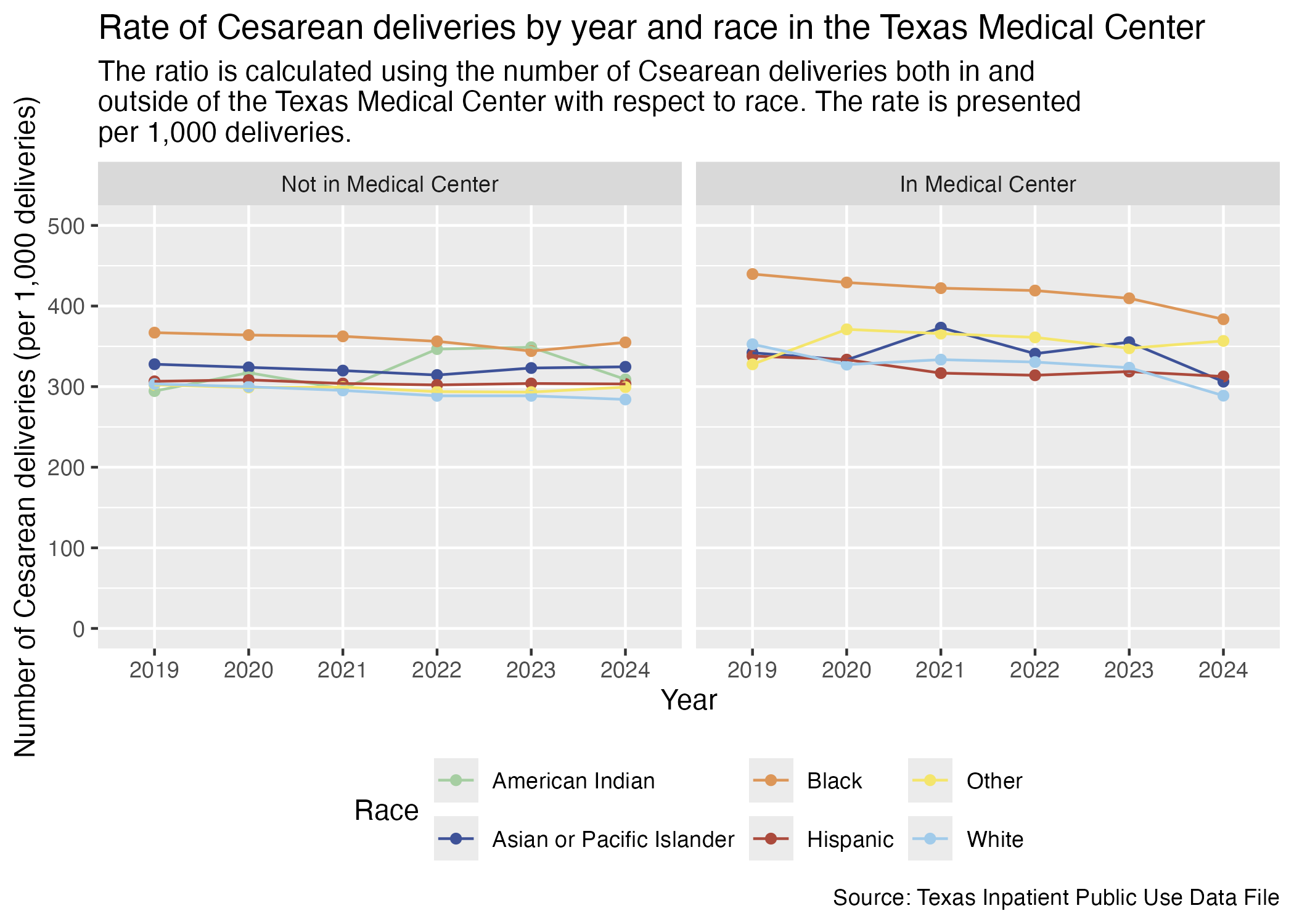
We will also compare by race for the hospitals in the Medical Center area and for those outside of the Medical Center area.
First, let’s create a data frame that determines whether the hospital is in the Medical Center and include considerations of race and ethnicity.
ahrq_csec_rate_tmc_race <- tx_deliveries_csec |>
  mutate(
    TMC = if_else(FAC_NAME %in% tmc_list, T, F)
  ) |>
  group_by(YR, TMC, MOD_RACE, CSEC) |>
  add_csec_calc(1000)

ahrq_csec_rate_tmc_race
Now we can create two graphs side by side so that we can compare the differences for race between whether a hospital is in the Medical Center or not.
tmc_labels <- c("FALSE" = "Not in Medical Center", "TRUE" = "In Medical Center")

csec_race_tmc <- ahrq_csec_rate_tmc_race |>
  ggplot(aes(x = YR, y = CSEC_DEL_PER)) +
  geom_point(aes(color = MOD_RACE)) +
  geom_line(aes(color = MOD_RACE, group = MOD_RACE)) +
  scale_color_manual(values = race_colors, name = "Race") +
  scale_y_continuous(limits = c(0, 500)) +
  facet_wrap(~ TMC, labeller = as_labeller(tmc_labels)) +
  labs(
    title = str_wrap("Rate of Cesarean deliveries by year and race in the Texas Medical Center"),
    subtitle = str_wrap("The ratio is calculated using the number of Csearean deliveries both in and outside of the Texas Medical Center with respect to race. The rate is presented per 1,000 deliveries."),
    x = "Year", y = "Number of Cesarean deliveries (per 1,000 deliveries)",
    caption = "Source: Texas Inpatient Public Use Data File"
  ) +
  theme(
    legend.position = "bottom"
  )

ggsave("../data-published/figures/csec/csec-race-tmc.png")
Saved Version: