Expand this to see code
library(tidyverse)
library(janitor)
library(DT)We want to analyze the Primary Cesarean delivery rate for “uncomplicated” births, as defined by IQI 33 Primary Cesarean Delivery Rate, Uncomplicated in 2025:
“First-time Cesarean deliveries without a hysterotomy procedure per 1,000 deliveries. Excludes deliveries with complications (abnormal presentation, preterm delivery, fetal death, multiple gestation or breech presentation)..”
We will be expressing the rates as per 1,000, following the IQI indicator.
Loading libraries.
library(tidyverse)
library(janitor)
library(DT)We previously categorized the data to show Primary Cesarean cases in the Categorization notebook. We will import that data now so that we can do the analysis.
tx_deliveries_pcsec <- read_rds("../data-processed/pcsec.rds")Additionally, since our breakdown involves breaking down these rates by hospital, we need some of the lists that we created in the Stored Lists notebook.
# list of Texas Medical Center hospitals
tmc_list <- read_rds("../data-published/technical-specs/tmc.rds") |> pull(name)

# brand and unaffiliated lists
harris_health_list <- read_rds("../data-published/technical-specs/harris_health.rds") |> pull(name)
hca_list <- read_rds("../data-published/technical-specs/hca.rds") |> pull(name)
houston_methodist_list <- read_rds("../data-published/technical-specs/houston_methodist.rds") |> pull(name)
memorial_hermann_list <- read_rds("../data-published/technical-specs/memorial_hermann.rds") |> pull(name)
unaffiliated_list <- read_rds("../data-published/technical-specs/unaffiliated.rds") |> pull(name)Here I’m going to define some functions that will help us to make some graphs with varying parts of the data.
First, I’ll make a function that adds the Primary Cesarean rate to data frame.
add_pcsec_calc <- function(.data, num_del) {
  .data |>
    summarize(CNT = n()) |>
    pivot_wider(names_from = PCSEC, values_from = CNT) |>
    rename(
      NON_PCSEC_CNT = "FALSE",
      PCSEC_CNT = "TRUE"
    ) |>
    mutate(
      TOTAL = NON_PCSEC_CNT + PCSEC_CNT
    ) |>
    filter(
      TOTAL > 30
    ) |>
    mutate(
      PCSEC_RATE = round_half_up((PCSEC_CNT / TOTAL) * 100, 1)
    ) |>
    mutate(
      PCSEC_DEL_PER = round_half_up((PCSEC_CNT / TOTAL) * num_del, 1)
    )
}We are also investigating the outcomes of births with Medicaid. We will also make a function that adds a rate of Primary Cesarean deliveries using Medicaid.
add_medicaid <- function(.data, num_del) {
  .data |>
    group_by(YR, PCSEC_MC_CATEGORY) |>
    summarize(CNT = n()) |>
    pivot_wider(names_from = PCSEC_MC_CATEGORY, values_from = CNT) |>
    mutate(
      TOTAL_MC = NONPCSEC_MC + PCSEC_MC,
      TOTAL_NONMC = NONPCSEC_NONMC + PCSEC_NONMC
    ) |>
    filter(TOTAL_MC > 30 | TOTAL_NONMC > 30) |>
    mutate(
      MC_DEL_PER = round_half_up((PCSEC_MC / TOTAL_MC) * num_del, 1),
      NONMC_DEL_PER = round_half_up((PCSEC_NONMC / TOTAL_NONMC) * num_del, 1)
    ) |>
    pivot_longer(
      cols = c(MC_DEL_PER, NONMC_DEL_PER),
      names_to = "DEL_PER_TYPE",
      values_to = "DEL_PER"
    )
}Let’s also make a function that provides a template for what the individual hospital graphs will look like.
create_hosp_graph <- function(.data) {
  .data |>
    ggplot(aes(x = YR, y = PCSEC_DEL_PER)) +
    geom_col() +
    scale_y_continuous(limits = c(0, 250)) +
    geom_text(aes(label = PCSEC_DEL_PER), vjust = 1.5, color = "white", size = 3) +
    facet_wrap(~ FAC_NAME, ncol = 2) +
    theme(
      legend.position = "bottom"
    )
}We can make our lives so much easier by making a function for each individual graph, similar to the one above, that also includes race.
First let’s define some colors that we’ll use for the race graphs. We want these colors to be consistent across all of the plots. We are using colors based on a Washington Post article on the subject.
race_colors <- c(
  "Hispanic" = "#ab4a3c",
  "American Indian" = "#a6cea2",
  "Asian or Pacific Islander" = "#3e5298",
  "Black" = "#dc9658",
  "White" = "#a1cbea",
  "Other" = "#f4e56c"
)
Now we can build a function to create race graphs using these specified colors.
 create_race_graph <- function(.data) {
   .data |>
     ggplot(aes(x = YR, y = PCSEC_DEL_PER)) +
     geom_point(aes(color = MOD_RACE)) +
     geom_line(aes(color = MOD_RACE, group = MOD_RACE)) +
     scale_y_continuous(limits = c(0, 350)) +
     scale_color_manual(values = race_colors, name = "Race") +
     facet_wrap(~ FAC_NAME, ncol = 2) +
     theme(
       legend.position = "bottom"
     )
}In order to graph the Primary Cesarean delivery rate by year for the state, we neecd to group up the cases by year and then add the Primary Cesarean rate using our add_pcsec function.
ahrq_pcsec_rate_tx <- tx_deliveries_pcsec |>
group_by(YR, PCSEC) |>
add_pcsec_calc(1000)
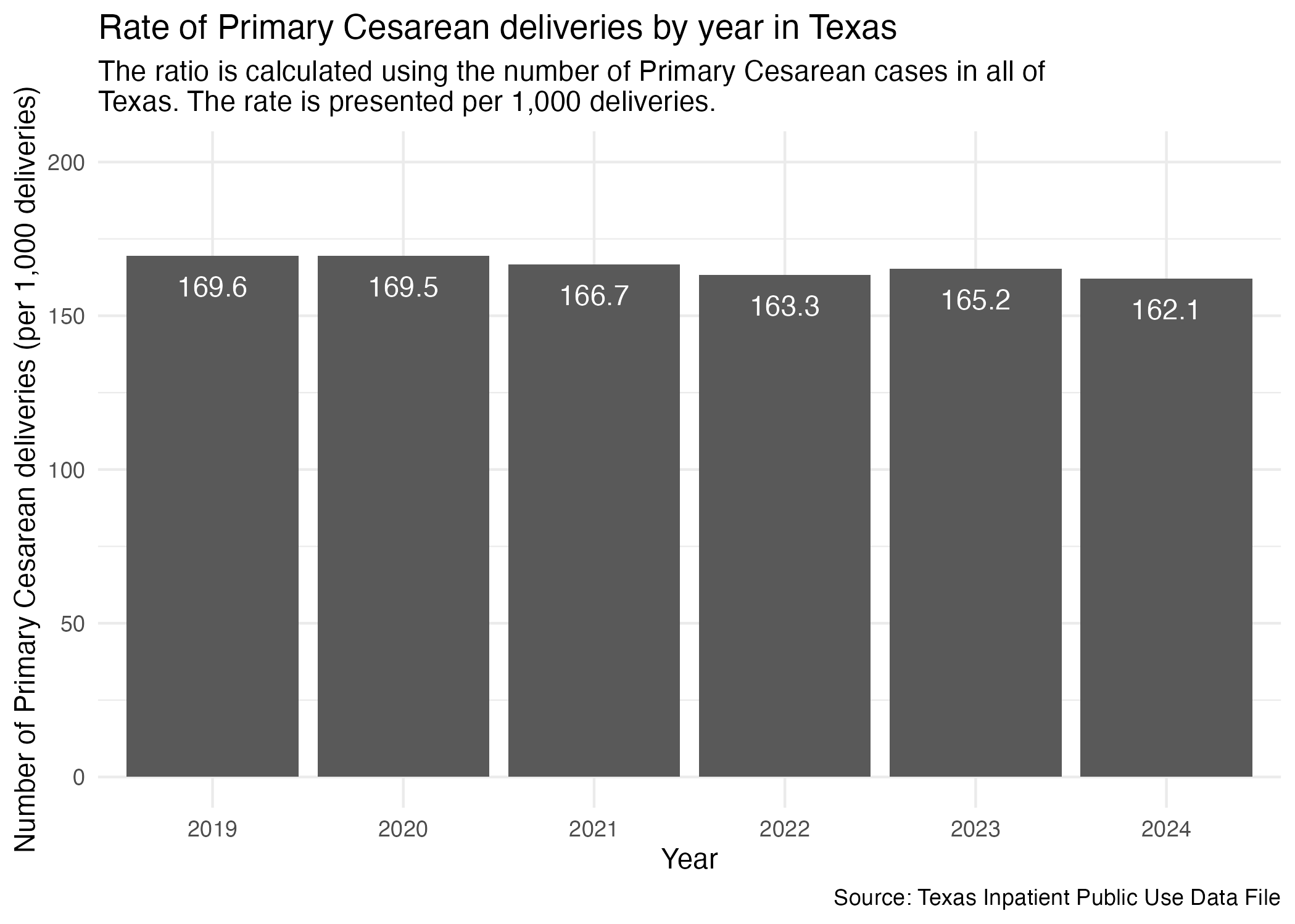
ahrq_pcsec_rate_txNow we can plot for the state of Texas.
psec_yr_tx <- ahrq_pcsec_rate_tx |>
  ggplot(aes(x = YR, y = PCSEC_DEL_PER)) +
  geom_col() +
  scale_y_continuous(limits = c(0, 200)) +
  geom_text(aes(label = PCSEC_DEL_PER), vjust = 2, color = "white") +
  labs(
    title = str_wrap("Rate of Primary Cesarean deliveries by year in Texas"),
    subtitle = str_wrap("The ratio is calculated using the number of Primary Cesarean cases in all of Texas. The rate is presented per 1,000 deliveries."),
    x = "Year", y = "Number of Primary Cesarean deliveries (per 1,000 deliveries)",
    caption = "Source: Texas Inpatient Public Use Data File"
  ) +
  theme_minimal()

ggsave("../data-published/figures/pcsec/pcsec-yr-tx.png")
Saved Version:
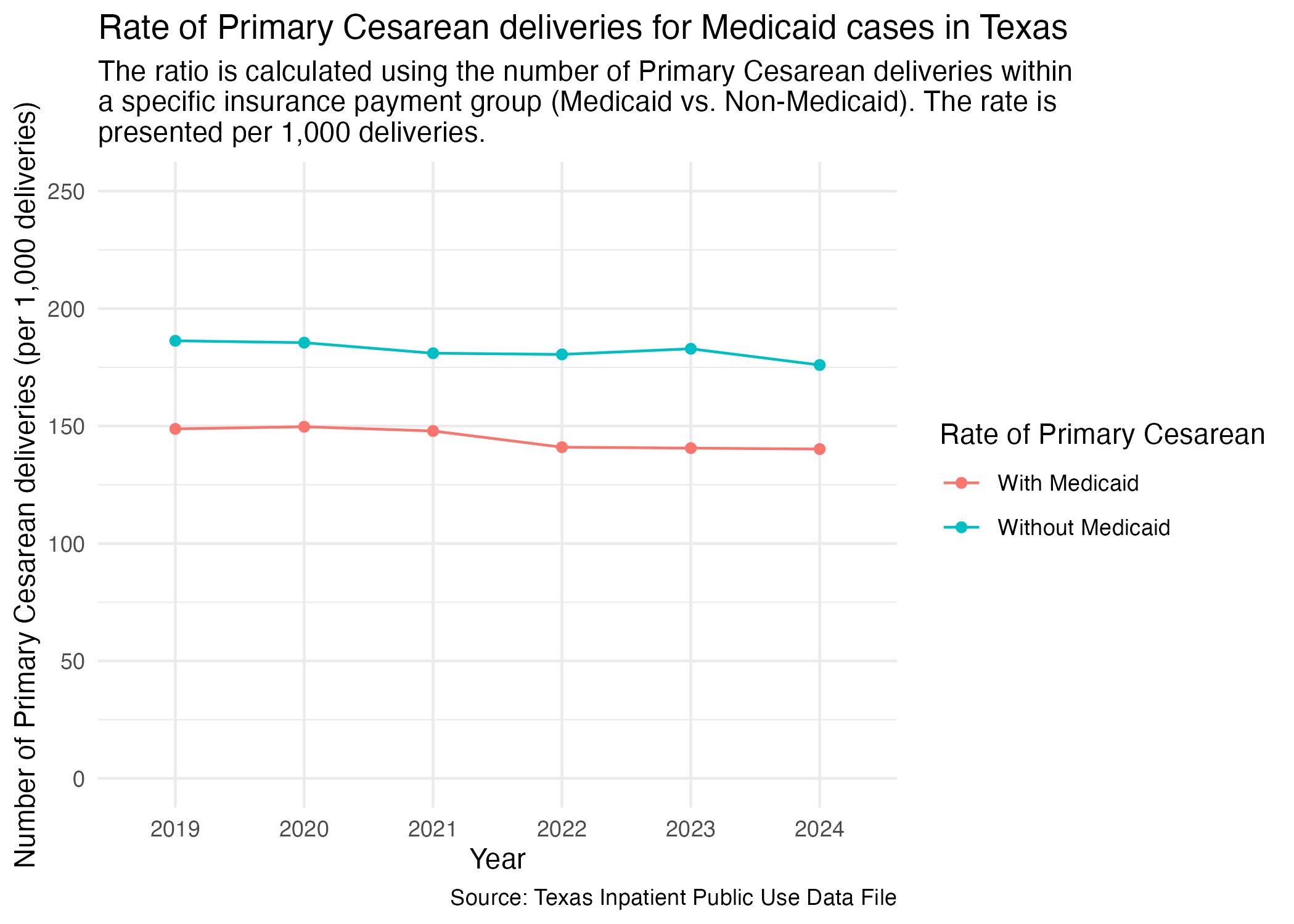
We want to know how many Primary Cesarean procedures were patients with Medicaid. First, we need to add percentage of how many cases per year for the state. First, we need to prep the data to be plotted.
pcsec_mc_tx <- tx_deliveries_pcsec |>
  add_medicaid(1000)

pcsec_mc_tx
Now, plot.
pcsec_mc_tx_plot <- pcsec_mc_tx |>
  ggplot(aes(x = YR, y = DEL_PER, group = DEL_PER_TYPE)) +
  geom_point(aes(color = DEL_PER_TYPE)) +
  geom_line(aes(color = DEL_PER_TYPE)) +
  scale_y_continuous(limits = c(0, 250)) +
  scale_color_discrete(labels = c("With Medicaid", "Without Medicaid"), name = "Rate of Primary Cesarean") +
  labs(
    title = str_wrap("Rate of Primary Cesarean deliveries for Medicaid cases in Texas"),
    subtitle = str_wrap("The ratio is calculated using the number of Primary Cesarean deliveries within a specific insurance payment group (Medicaid vs. Non-Medicaid). The rate is presented per 1,000 deliveries."),
    x = "Year", y = "Number of Primary Cesarean deliveries (per 1,000 deliveries)",
    caption = "Source: Texas Inpatient Public Use Data File"
  ) +
  theme_minimal()

ggsave("../data-published/figures/pcsec/pcsec-mc-tx.png")
Saved Version:
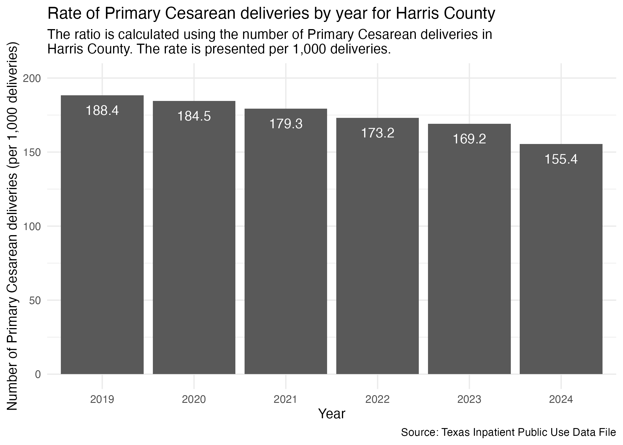
Need to limit the statewide data to just Harris County like we had done in the cleaning notebook.
ahrq_pcsec_rate_harris <- tx_deliveries_pcsec |>
  filter(FAC_CNTY == "Harris") |>
  group_by(YR, PCSEC) |>
  add_pcsec_calc(1000)

ahrq_pcsec_rate_harris
We can now plot it similar to how we did statewide.
pcsec_yr_harris <- ahrq_pcsec_rate_harris |>
  ggplot(aes(x = YR, y = PCSEC_DEL_PER)) +
  geom_col() +
  scale_y_continuous(limits = c(0, 200)) +
  geom_text(aes(label = PCSEC_DEL_PER), vjust = 2, color = "white") +
  labs(
    title = str_wrap("Rate of Primary Cesarean deliveries by year for Harris County"),
    subtitle = str_wrap("The ratio is calculated using the number of Primary Cesarean deliveries in Harris County. The rate is presented per 1,000 deliveries."),
    x = "Year", y = "Number of Primary Cesarean deliveries (per 1,000 deliveries)",
    caption = "Source: Texas Inpatient Public Use Data File"
  ) +
  theme_minimal()

ggsave("../data-published/figures/pcsec/pcsec-yr-harris.png")
Saved Version:
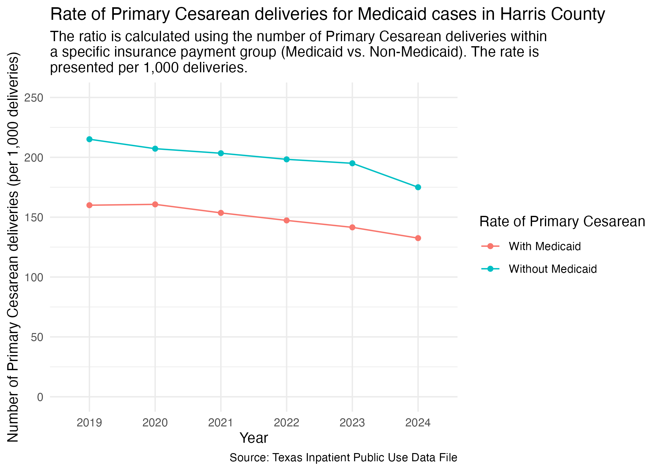
We want to focus in on Harris County now when looking at Medicaid paid Primary Cesarean procedures. Prep the data.
pcsec_mc_harris <- tx_deliveries_pcsec |>
  filter(FAC_CNTY == "Harris") |>
  add_medicaid(1000)
  # arrange(DEL_PER |> desc())

pcsec_mc_harris
Now, plot.
pcsec_mc_harris_plot <- pcsec_mc_harris |>
  ggplot(aes(x = YR, y = DEL_PER, group = DEL_PER_TYPE)) +
  geom_point(aes(color = DEL_PER_TYPE)) +
  geom_line(aes(color = DEL_PER_TYPE)) +
  scale_y_continuous(limits = c(0, 250)) +
  scale_color_discrete(labels = c("With Medicaid", "Without Medicaid"), name = "Rate of Primary Cesarean") +
  labs(
    title = str_wrap("Rate of Primary Cesarean deliveries for Medicaid cases in Harris County"),
    subtitle = str_wrap("The ratio is calculated using the number of Primary Cesarean deliveries within a specific insurance payment group (Medicaid vs. Non-Medicaid). The rate is presented per 1,000 deliveries."),
    x = "Year", y = "Number of Primary Cesarean deliveries (per 1,000 deliveries)",
    caption = "Source: Texas Inpatient Public Use Data File"
  ) +
  theme_minimal()

ggsave("../data-published/figures/pcsec/pcsec-mc-harris.png")
Saved Version:
Let’s compare the Primary Cesarean delivery rate across different hospitals in Harris County. We’ll prep the data so that it includes the facility’s name and ID.
ahrq_pcsec_rate_hosp <- tx_deliveries_pcsec |>
  filter(FAC_CNTY == "Harris") |>
  group_by(YR, THCIC_ID, FAC_NAME, PCSEC) |>
  add_pcsec_calc(1000)

ahrq_pcsec_rate_hosp |> datatable()
Now we can plot all of the individual hospitals into separate graphs. We’ll group up individual graphs by brand and by location.
Here are the brands of hospitals found in the Harris County data:
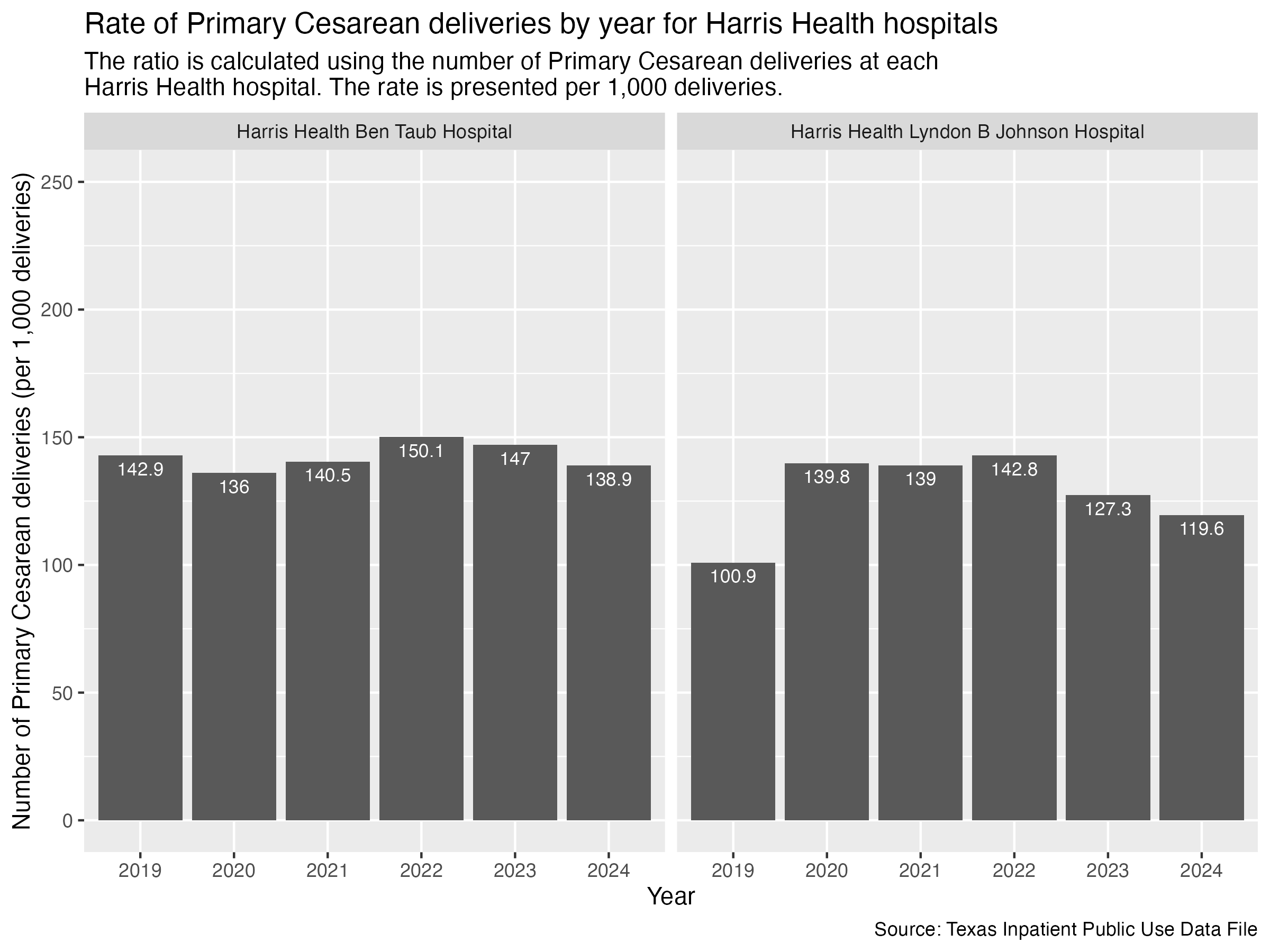
Let’s take a look at the Harris Health hospitals.
pcsec_hosp_harris_health <- ahrq_pcsec_rate_hosp |>
  filter(
    FAC_NAME %in% harris_health_list
    ) |>
  create_hosp_graph() +
  labs(
    title = str_wrap("Rate of Primary Cesarean deliveries by year for Harris Health hospitals"),
    subtitle = str_wrap("The ratio is calculated using the number of Primary Cesarean deliveries at each Harris Health hospital. The rate is presented per 1,000 deliveries."),
    x = "Year", y = "Number of Primary Cesarean deliveries (per 1,000 deliveries)",
    caption = "Source: Texas Inpatient Public Use Data File"
  )

ggsave("../data-published/figures/pcsec/pcsec-hosp-harris-health.png", width = 8, height = 6, units = "in")
Saved Version:
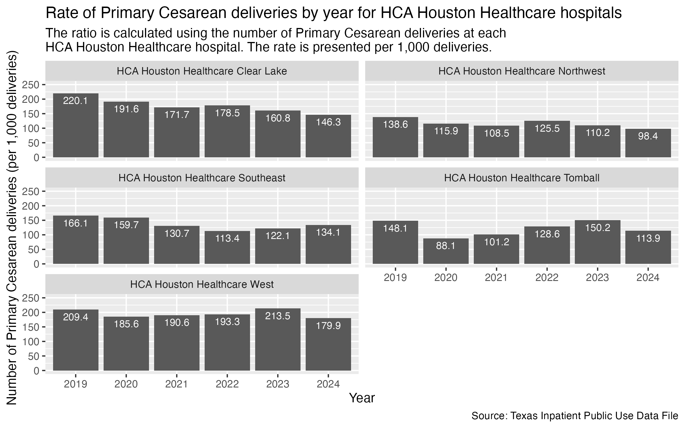
Same with HCA Houston Healthcare hospitals.
pcsec_hosp_hca <- ahrq_pcsec_rate_hosp |>
  filter(
    FAC_NAME %in% hca_list
    ) |>
  create_hosp_graph() +
  labs(
    title = str_wrap("Rate of Primary Cesarean deliveries by year for HCA Houston Healthcare hospitals"),
    subtitle = str_wrap("The ratio is calculated using the number of Primary Cesarean deliveries at each HCA Houston Healthcare hospital. The rate is presented per 1,000 deliveries."),
    x = "Year", y = "Number of Primary Cesarean deliveries (per 1,000 deliveries)",
    caption = "Source: Texas Inpatient Public Use Data File"
  )

ggsave("../data-published/figures/pcsec/pcsec-hosp-hca.png", width = 8, units = "in")
Saved Version:
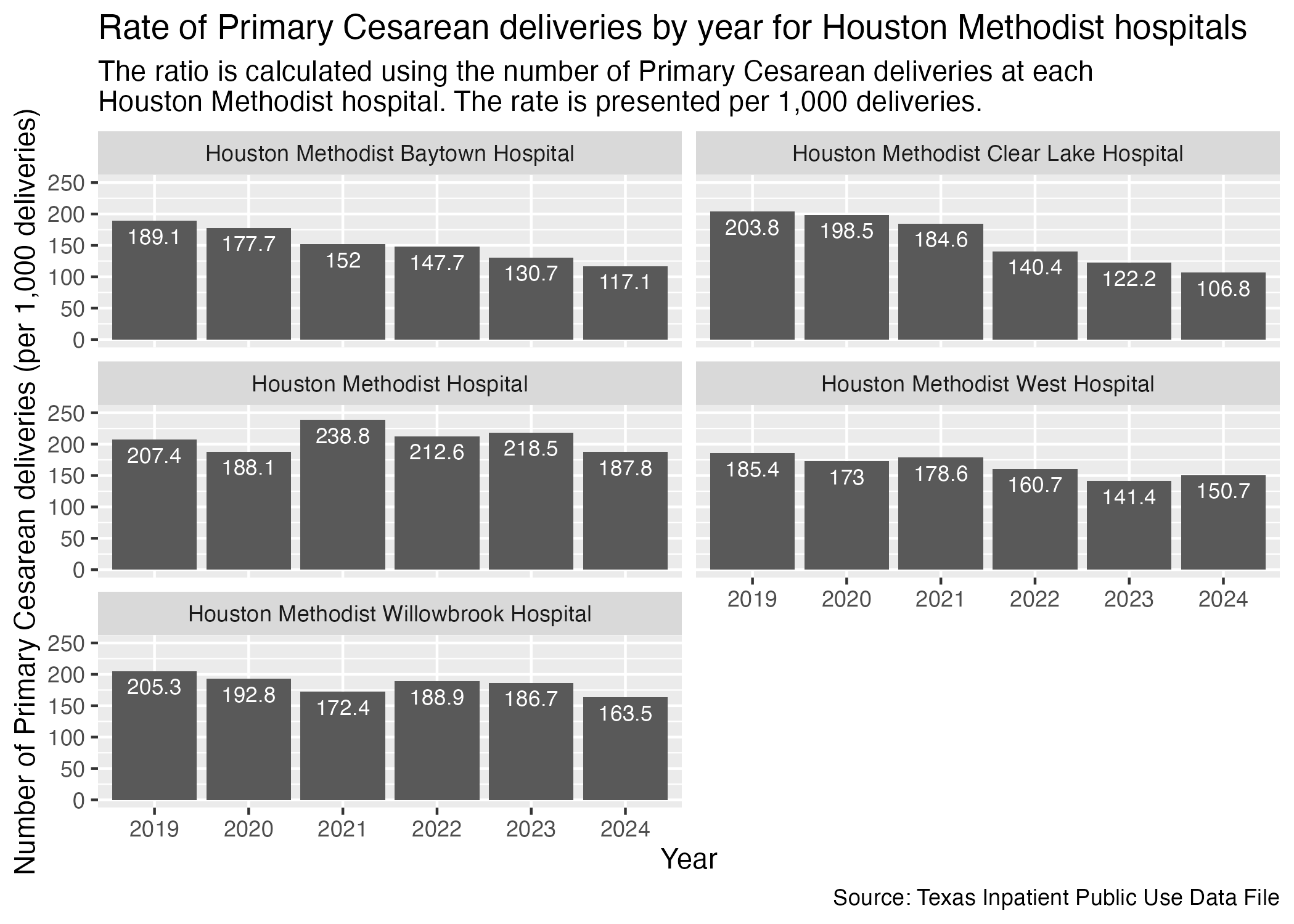
Houston Methodist hospitals next.
psec_hosp_houston_methodist <- ahrq_pcsec_rate_hosp |>
  filter(
    FAC_NAME %in% houston_methodist_list
    ) |>
  create_hosp_graph() +
  labs(
    title = str_wrap("Rate of Primary Cesarean deliveries by year for Houston Methodist hospitals"),
    subtitle = str_wrap("The ratio is calculated using the number of Primary Cesarean deliveries at each Houston Methodist hospital. The rate is presented per 1,000 deliveries."),
    x = "Year", y = "Number of Primary Cesarean deliveries (per 1,000 deliveries)",
    caption = "Source: Texas Inpatient Public Use Data File"
  )

ggsave("../data-published/figures/pcsec/pcsec-hosp-houston-methodist.png")
Saved Version:
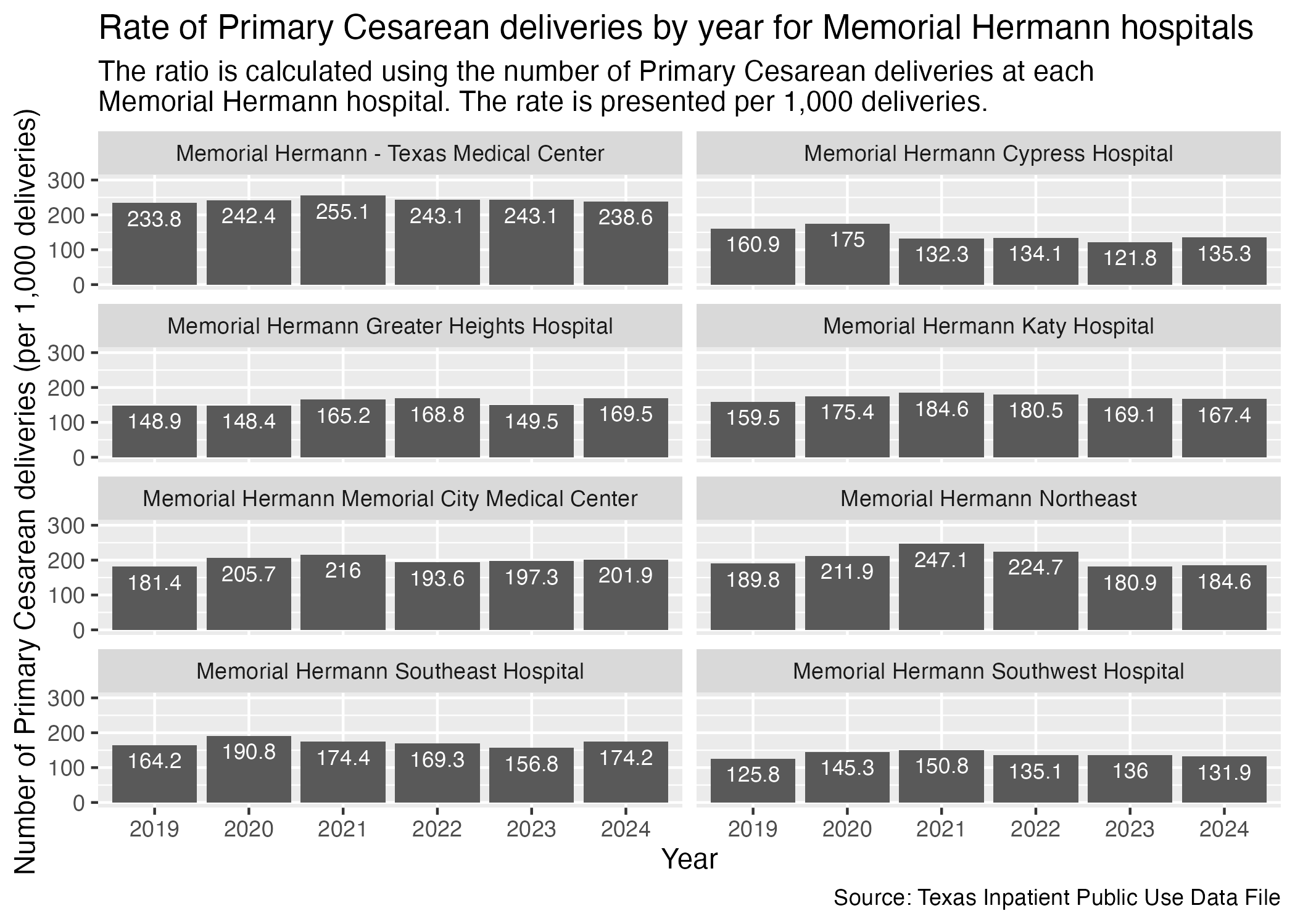
Finally, Memorial Hermann hospitals.
NOTE: The scale of this particular hospital graph is from 0 to 300 while others range from 0 to 250. This accounts for the Memorial Hermann facet plot.
pcsec_hosp_memorial_hermann <- ahrq_pcsec_rate_hosp |>
  filter(
    FAC_NAME %in% memorial_hermann_list
    ) |>
  create_hosp_graph() +
  scale_y_continuous(limits = c(0, 300)) +
  labs(
    title = str_wrap("Rate of Primary Cesarean deliveries by year for Memorial Hermann hospitals"),
    subtitle = str_wrap("The ratio is calculated using the number of Primary Cesarean deliveries at each Memorial Hermann hospital. The rate is presented per 1,000 deliveries."),
    x = "Year", y = "Number of Primary Cesarean deliveries (per 1,000 deliveries)",
    caption = "Source: Texas Inpatient Public Use Data File"
  )

ggsave("../data-published/figures/pcsec/pcsec-hosp-memorial-hermann.png")
Saved Version:
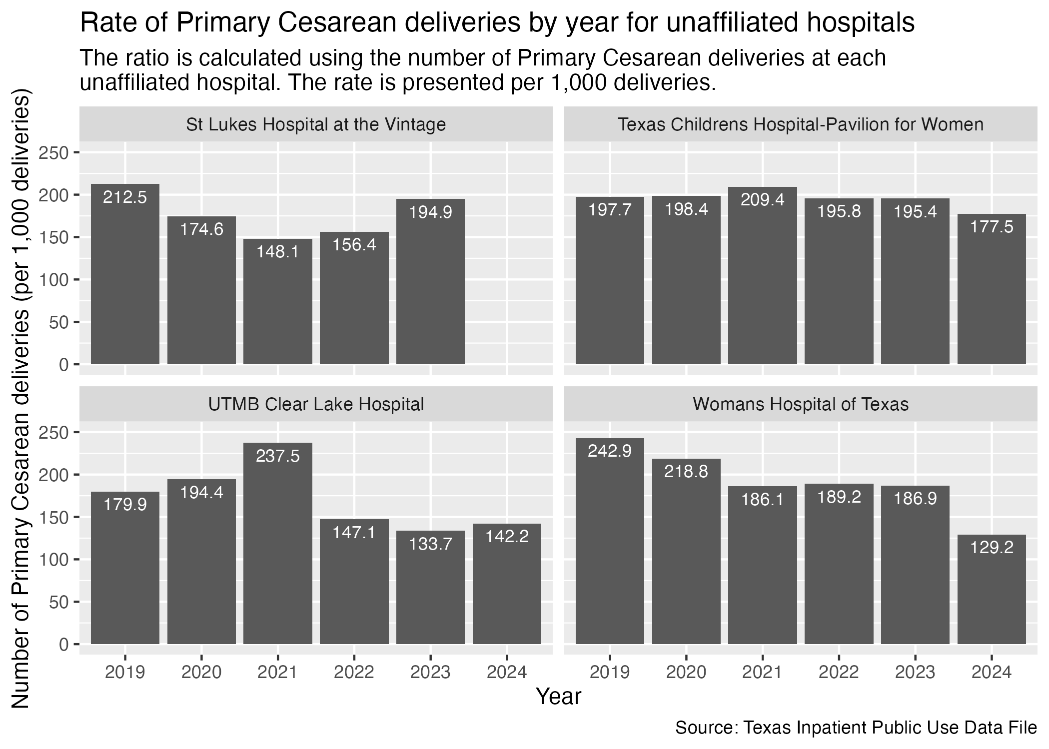
There are some hospitals in Harris County that don’t have other affiliated hospitals across the county. We will put them all into another set of graphs.
psec_hosp_unaffiliated <- ahrq_pcsec_rate_hosp |>
  filter(
    FAC_NAME %in% unaffiliated_list
  ) |>
  create_hosp_graph() +
  labs(
    title = str_wrap("Rate of Primary Cesarean deliveries by year for unaffiliated hospitals"),
    subtitle = str_wrap("The ratio is calculated using the number of Primary Cesarean deliveries at each unaffiliated hospital. The rate is presented per 1,000 deliveries."),
    x = "Year", y = "Number of Primary Cesarean deliveries (per 1,000 deliveries)",
    caption = "Source: Texas Inpatient Public Use Data File"
  )

ggsave("../data-published/figures/pcsec/pcsec-hosp-unaffiliated.png")
Saved Version:
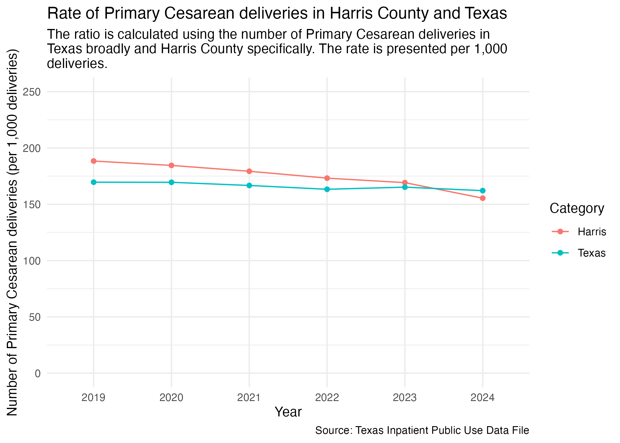
If we want to look at the data for Harris and Texas in one graph, we can plot Harris and Texas as two separate lines.
First, we need to put the Texas and Harris data into one data frame.
ahrq_pcsec_rate_combined <- ahrq_pcsec_rate_harris |>
  add_column(CATEGORY = "Harris") |>
  bind_rows(ahrq_pcsec_rate_tx) |>
  # at this point, any unfilled category entry is a Texas entry
  mutate(
    CATEGORY = if_else(is.na(CATEGORY), "Texas", CATEGORY)
  )

ahrq_pcsec_rate_combined
Now we can plot with the grouping being determined by the CATEGORY value.
psec_harris_tx <- ahrq_pcsec_rate_combined |>
  ggplot(aes(x = YR, y = PCSEC_DEL_PER)) +
  geom_point(aes(color = CATEGORY)) +
  geom_line(aes(color = CATEGORY, group = CATEGORY)) +
  scale_y_continuous(limits = c(0, 250)) +
  scale_color_discrete(name = "Category") +
  labs(
    title = str_wrap("Rate of Primary Cesarean deliveries in Harris County and Texas"),
    subtitle = str_wrap("The ratio is calculated using the number of Primary Cesarean deliveries in Texas broadly and Harris County specifically. The rate is presented per 1,000 deliveries."),
    x = "Year", y = "Number of Primary Cesarean deliveries (per 1,000 deliveries)",
    caption = "Source: Texas Inpatient Public Use Data File"
  ) +
  theme_minimal()

ggsave("../data-published/figures/pcsec/pcsec-harris-tx.png")
Saved Version:
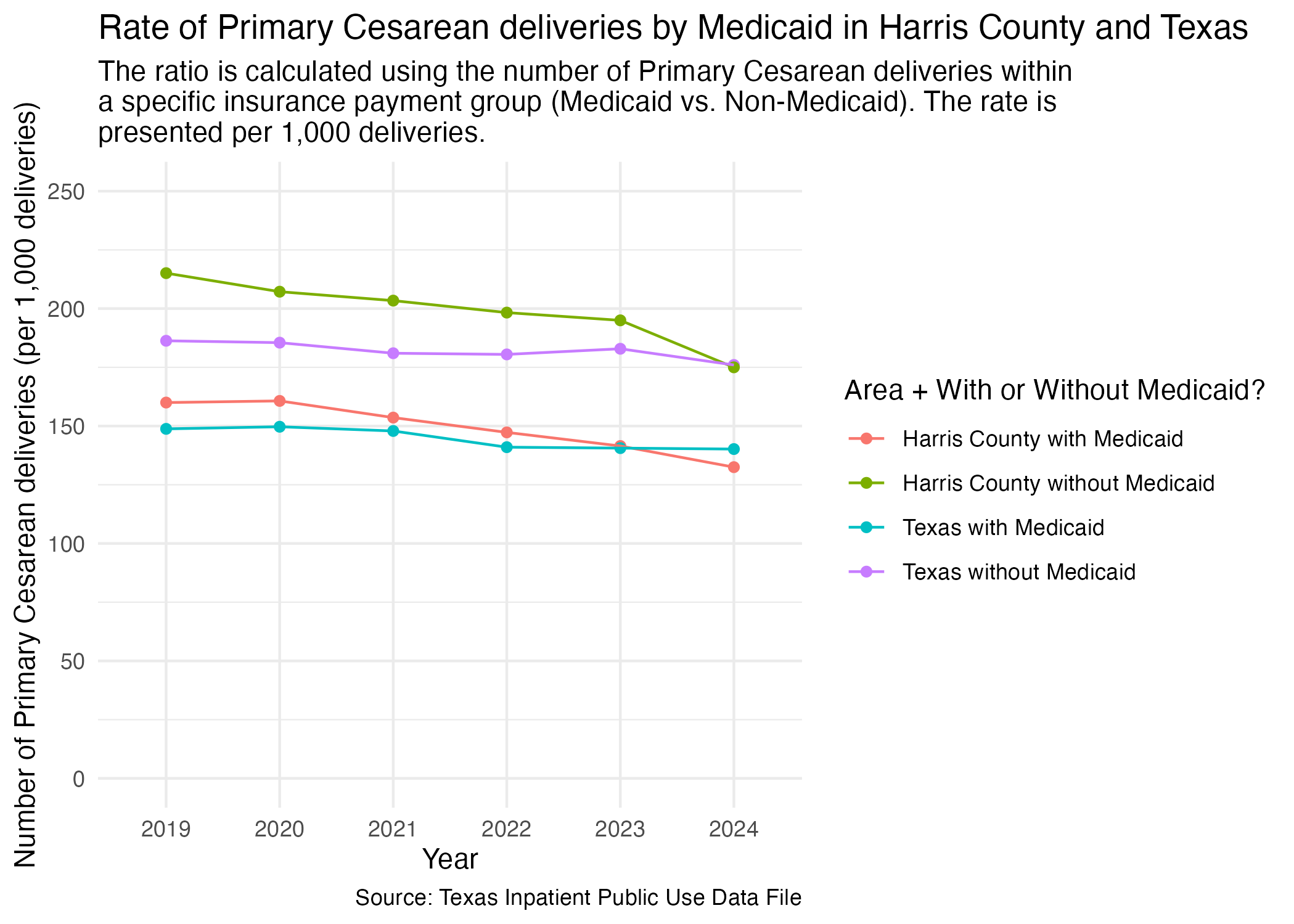
We want to compare the percentage of Primary Cesareans that are paid for by Medicaid on the state level and in Harris County specifically. We will create the data frame that combines our two previous data frames and then plot it.
First, combine the data.
pcsec_mc_combined <- pcsec_mc_harris |>
  add_column(CATEGORY = "Harris") |>
  bind_rows(pcsec_mc_tx) |>
  # at this point, any unfilled category entry is a Texas entry
  mutate(
    CATEGORY = if_else(is.na(CATEGORY), "Texas", CATEGORY)
  ) |>
  mutate(
    DEL_PER_TYPE = paste(toupper(CATEGORY), DEL_PER_TYPE, sep = "_")
  ) |>
  select(!CATEGORY) |>
  arrange(DEL_PER |> desc())

pcsec_mc_combined
Now, plot.
pcsec_mc_harris_tx <- pcsec_mc_combined |>
  ggplot(aes(x = YR, y = DEL_PER, group = DEL_PER_TYPE)) +
  geom_point(aes(color = DEL_PER_TYPE)) +
  geom_line(aes(color = DEL_PER_TYPE)) +
  scale_y_continuous(limits = c(0, 250)) +
  scale_color_discrete(labels = c("Harris County with Medicaid", "Harris County without Medicaid", "Texas with Medicaid", "Texas without Medicaid"), name = "Area + With or Without Medicaid?") +
  labs(
    title = str_wrap("Rate of Primary Cesarean deliveries by Medicaid in Harris County and Texas"),
    subtitle = str_wrap("The ratio is calculated using the number of Primary Cesarean deliveries within a specific insurance payment group (Medicaid vs. Non-Medicaid). The rate is presented per 1,000 deliveries."),
    x = "Year", y = "Number of Primary Cesarean deliveries (per 1,000 deliveries)",
    caption = "Source: Texas Inpatient Public Use Data File",
  ) +
  theme_minimal()

ggsave("../data-published/figures/pcsec/pcsec-mc-harris-tx.png")
Saved Version:
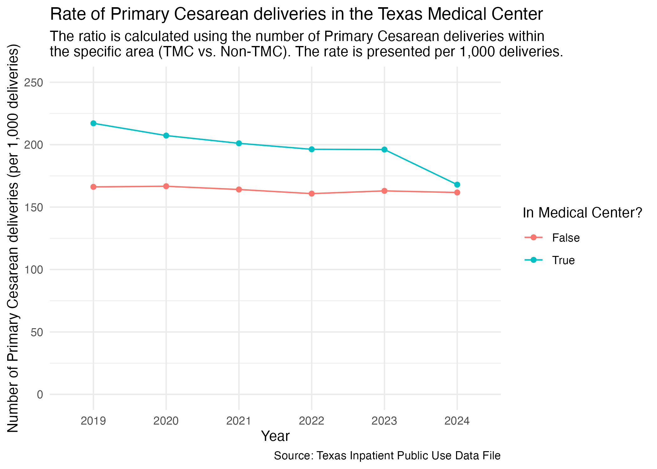
One other facet grouping we wanted to look at was Harris County hospitals in the Medical Center area versus outside of the Medical Center area. We imported this list at the top of this notebook.
Let’s create a new data frame that distinguishes whether a hospital is in the Medical Center or not.
ahrq_pcsec_rate_tmc <- tx_deliveries_pcsec |>
  mutate(
    TMC = if_else(FAC_NAME %in% tmc_list, T, F)
  ) |>
  group_by(YR, TMC, PCSEC) |>
  add_pcsec_calc(1000)

ahrq_pcsec_rate_tmc
Now we can plot the comparison for Primary Cesarean delivery rate between hospitals in the Medical Center area and not in the Medical Center area.
ahrq_pcsec_rate_tmc |>
  ggplot(aes(x = YR, y = PCSEC_DEL_PER)) +
  geom_point(aes(color = TMC)) +
  geom_line(aes(color = TMC, group = TMC)) +
  scale_y_continuous(limits = c(0, 250)) +
  scale_color_discrete(name = "In Medical Center?", labels = c("False", "True")) +
  labs(
    title = str_wrap("Rate of Primary Cesarean deliveries in the Texas Medical Center"),
    subtitle = str_wrap("The ratio is calculated using the number of Primary Cesarean deliveries within the specific area (TMC vs. Non-TMC). The rate is presented per 1,000 deliveries."),
    x = "Year", y = "Number of Primary Cesarean deliveries (per 1,000 deliveries)",
    caption = "Source: Texas Inpatient Public Use Data File"
  ) +
  theme_minimal()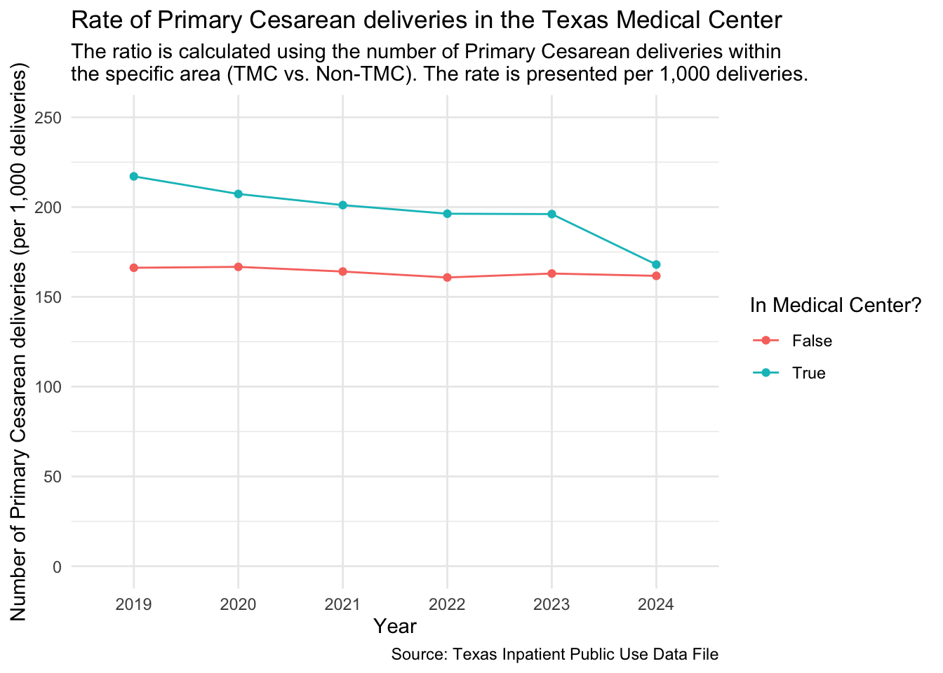
ggsave("../data-published/figures/pcsec/pcsec-tmc.png")Saved Version:
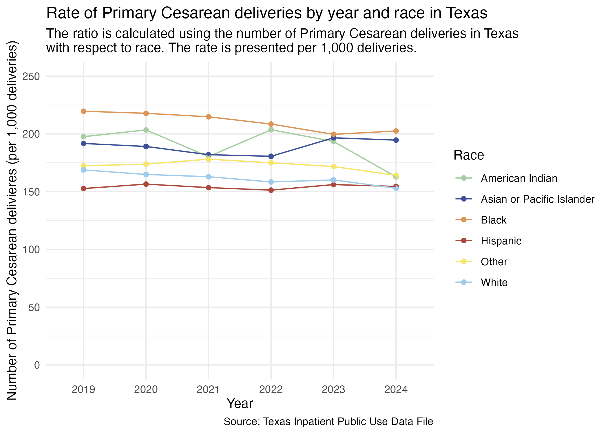
We previously redefined the MOD_RACE categories to also include the difference between Hispanic and non-Hispanic individuals. This was done in the Categorization notebook.
Prep for plotting.
ahrq_pcsec_rate_tx_race <- tx_deliveries_pcsec |>
  group_by(YR, MOD_RACE, PCSEC) |>
  add_pcsec_calc(1000)

ahrq_pcsec_rate_tx_race
Now we try to plot this.
pcsec_race_yr_tx <- ahrq_pcsec_rate_tx_race |>
  ggplot(aes(x = YR, y = PCSEC_DEL_PER)) +
  geom_point(aes(color = MOD_RACE)) +
  geom_line(aes(color = MOD_RACE, group = MOD_RACE)) +
  scale_color_manual(values = race_colors, name = "Race") +
  scale_y_continuous(limits = c(0, 250)) +
  labs(
    title = "Rate of Primary Cesarean deliveries by year and race in Texas",
    subtitle = str_wrap("The ratio is calculated using the number of Primary Cesarean deliveries in Texas with respect to race. The rate is presented per 1,000 deliveries."),
    x = "Year", y = "Number of Primary Cesarean delivieres (per 1,000 deliveries)",
    caption = "Source: Texas Inpatient Public Use Data File"
  ) +
  theme_minimal()

ggsave("../data-published/figures/pcsec/pcsec-race-yr-tx.png")
Saved Version:
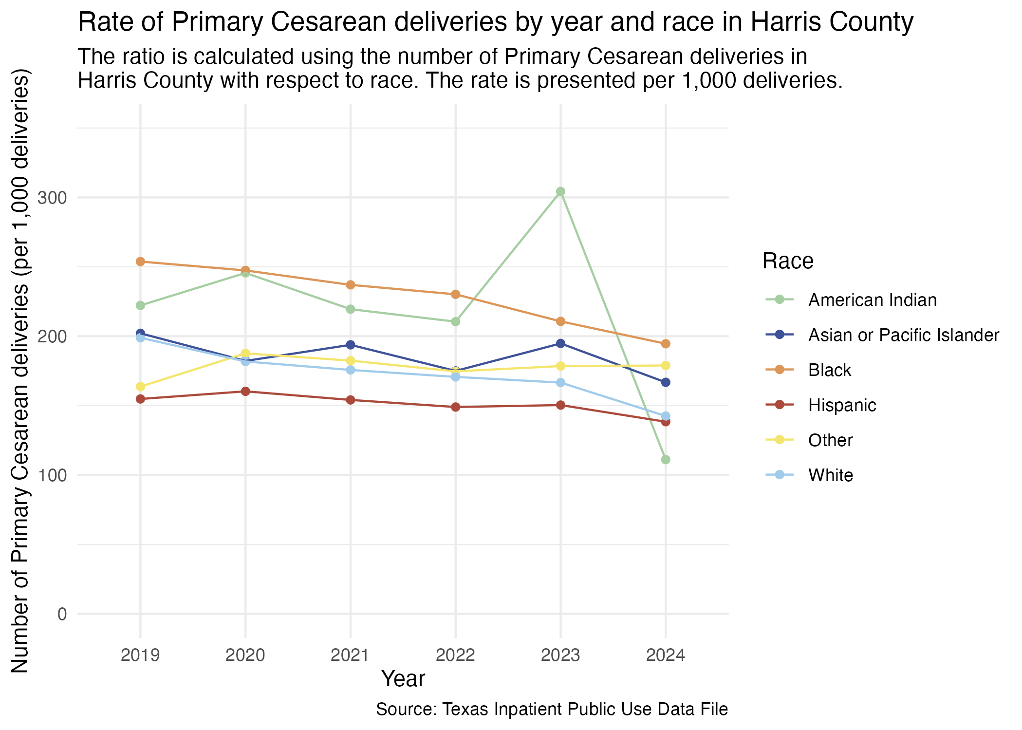
We can do a similar plot for just Harris County hospitals. First, prep the data.
ahrq_pcsec_rate_harris_race <- tx_deliveries_pcsec |>
  filter(FAC_CNTY == "Harris") |>
  group_by(YR, MOD_RACE, PCSEC) |>
  add_pcsec_calc(1000)

ahrq_pcsec_rate_harris_race
Now, plot.
pcsec_race_yr_harris <- ahrq_pcsec_rate_harris_race |>
  ggplot(aes(x = YR, y = PCSEC_DEL_PER)) +
  geom_point(aes(color = MOD_RACE)) +
  geom_line(aes(color = MOD_RACE, group = MOD_RACE)) +
  scale_y_continuous(limits = c(0, 350)) +
  scale_color_manual(values = race_colors, name = "Race") +
  labs(
    title = "Rate of Primary Cesarean deliveries by year and race in Harris County",
    subtitle = str_wrap("The ratio is calculated using the number of Primary Cesarean deliveries in Harris County with respect to race. The rate is presented per 1,000 deliveries."),
    x = "Year", y = "Number of Primary Cesarean deliveries (per 1,000 deliveries)",
    caption = "Source: Texas Inpatient Public Use Data File"
  ) +
  theme_minimal()

ggsave("../data-published/figures/pcsec/pcsec-race-yr-harris.png")
American Indian has fewer cases than all other races. Its results is from a much smaller pool of data than other races.
Saved Version:
Look at individual hospitals now also with race. First, prep the data.
ahrq_pcsec_rate_hosp_race <- tx_deliveries_pcsec |>
  filter(FAC_CNTY == "Harris") |>
  group_by(YR, THCIC_ID, MOD_RACE, FAC_NAME, PCSEC) |>
  add_pcsec_calc(1000)

ahrq_pcsec_rate_hosp_raceThis section will look at all of the Harris Health hospitals with race data included.
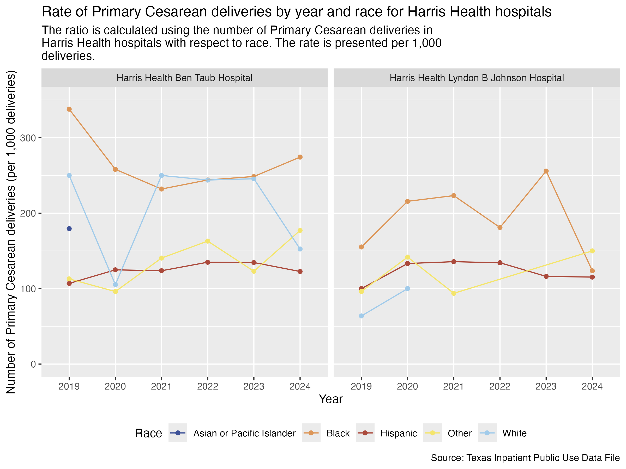
pcsec_hosp_race_harris_health <- ahrq_pcsec_rate_hosp_race |>
  filter(FAC_NAME %in% harris_health_list) |>
  create_race_graph() +
  labs(
    title = str_wrap("Rate of Primary Cesarean deliveries by year and race for Harris Health hospitals"),
    subtitle = str_wrap("The ratio is calculated using the number of Primary Cesarean deliveries in Harris Health hospitals with respect to race. The rate is presented per 1,000 deliveries."),
    x = "Year", y = "Number of Primary Cesarean deliveries (per 1,000 deliveries)",
    caption = "Source: Texas Inpatient Public Use Data File"
  )

ggsave("../data-published/figures/pcsec/pcsec-hosp-race-harris-health.png", width = 8, height = 6, units = "in")
Saved Version:
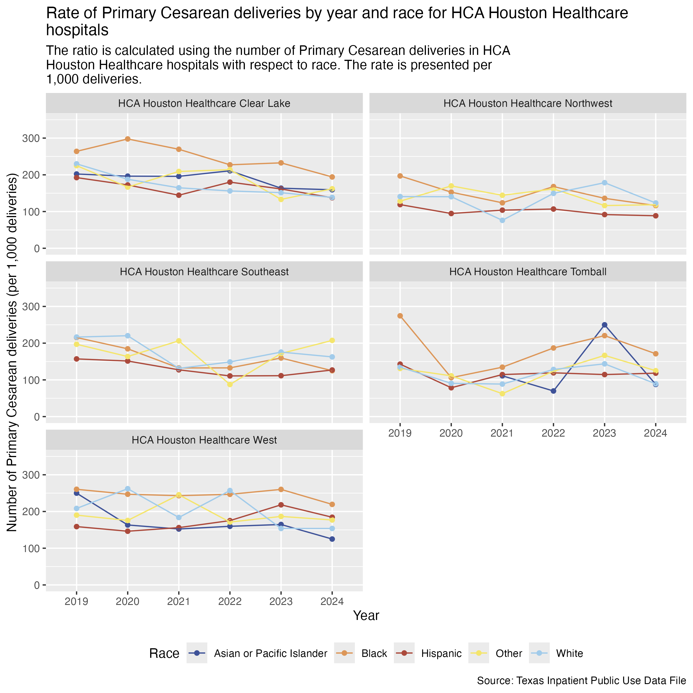
Now, HCA Houston Healthcare hospitals.
pcsec_hosp_race_hca <- ahrq_pcsec_rate_hosp_race |>
  filter(
    FAC_NAME %in% hca_list
  ) |>
  create_race_graph() +
  labs(
    title = str_wrap("Rate of Primary Cesarean deliveries by year and race for HCA Houston Healthcare hospitals"),
    subtitle = str_wrap("The ratio is calculated using the number of Primary Cesarean deliveries in HCA Houston Healthcare hospitals with respect to race. The rate is presented per 1,000 deliveries."),
    x = "Year", y = "Number of Primary Cesarean deliveries (per 1,000 deliveries)",
    caption = "Source: Texas Inpatient Public Use Data File"
  )

ggsave("../data-published/figures/pcsec/pcsec-hosp-race-hca.png", height = 8, width = 8, units = "in")
Saved Version:
Houston Methodist hospitals.
pcsec_hosp_race_houston_methodist <- ahrq_pcsec_rate_hosp_race |>
  filter(
    FAC_NAME %in% houston_methodist_list
  ) |>
  create_race_graph() +
  labs(
    title = str_wrap("Rate of Primary Cesarean deliveries by year and race for Houston Methodist hospitals"),
    subtitle = str_wrap("The ratio is calculated using the number of Primary Cesarean deliveries in Houston Methodist hospitals with respect to race. The rate is presented per 1,000 deliveries."),
    x = "Year", y = "Number of Primary Cesarean deliveries (per 1,000 deliveries)",
    caption = "Source: Texas Inpatient Public Use Data File"
  )

ggsave("../data-published/figures/pcsec/pcsec-hosp-race-houston-methodist.png", height = 8, width = 8, units = "in")
Saved Version:
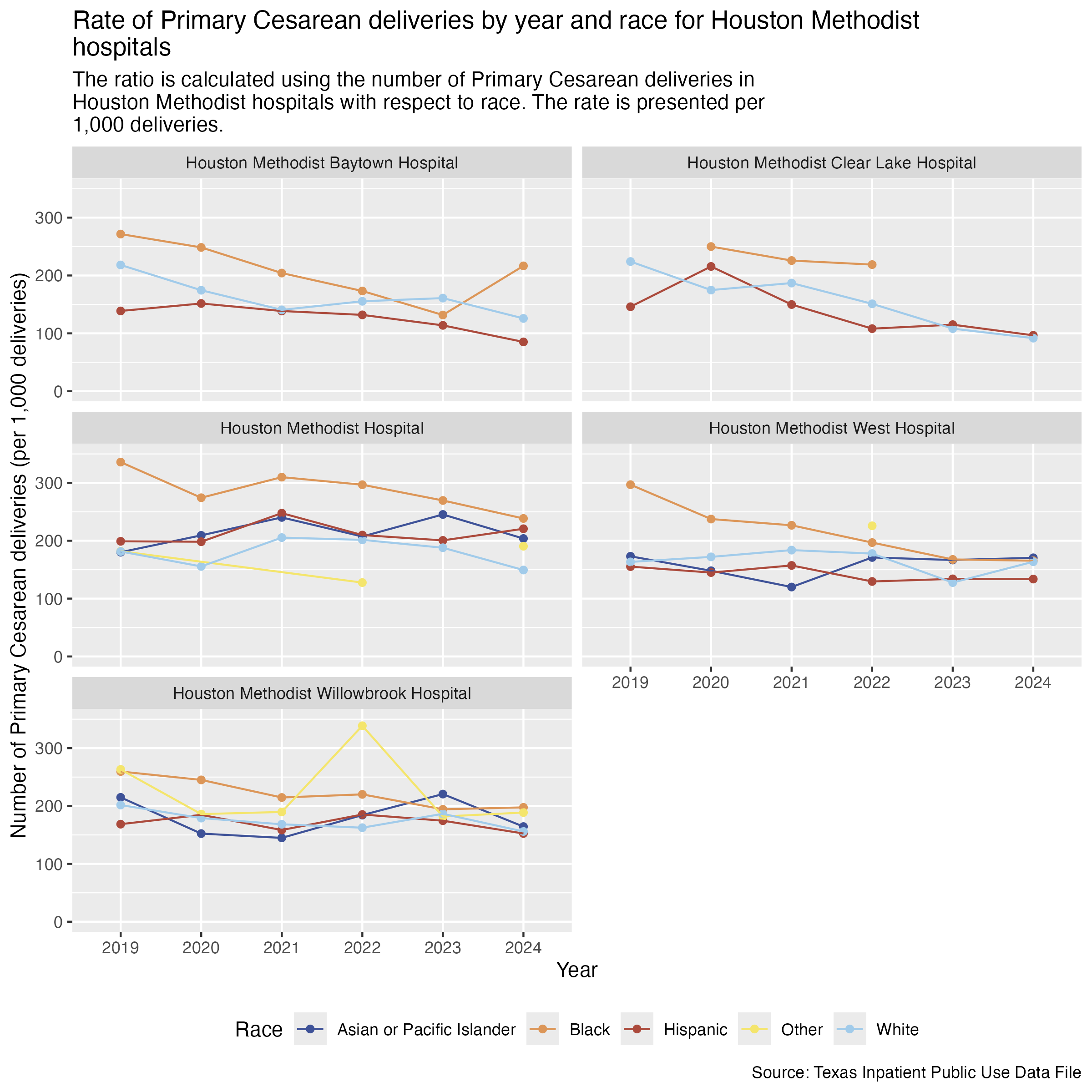
tx_deliveries_pcsec |>
  filter(FAC_NAME == "Houston Methodist Clear Lake Hospital") |>
  group_by(YR, MOD_RACE) |>
  summarize(CNT = n()) |>
filter(MOD_RACE == "Black")Finally, Memorial Hermann hospitals.
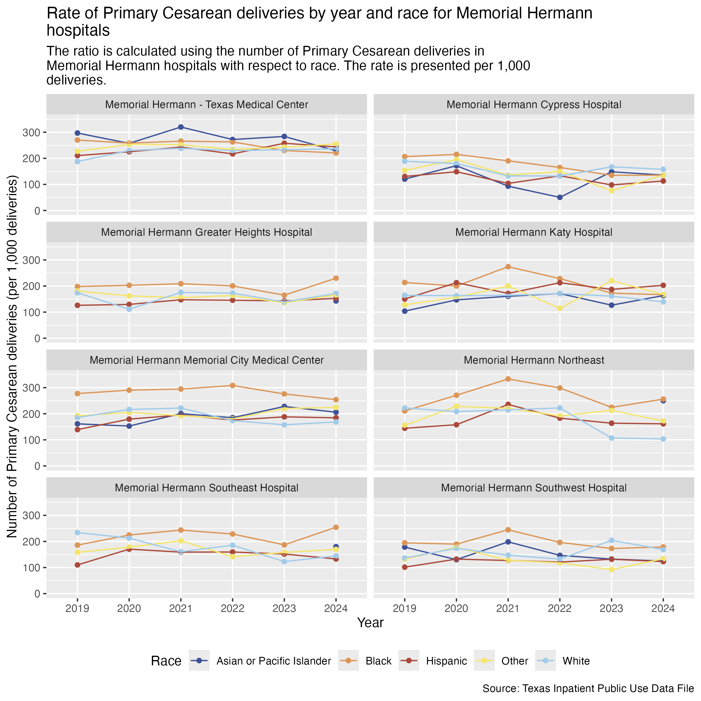
pcsec_hosp_race_memorial_hermann <- ahrq_pcsec_rate_hosp_race |>
  filter(
    FAC_NAME %in% memorial_hermann_list
  ) |>
  create_race_graph() +
  labs(
    title = str_wrap("Rate of Primary Cesarean deliveries by year and race for Memorial Hermann hospitals"),
    subtitle = str_wrap("The ratio is calculated using the number of Primary Cesarean deliveries in Memorial Hermann hospitals with respect to race. The rate is presented per 1,000 deliveries."),
    x = "Year", y = "Number of Primary Cesarean deliveries (per 1,000 deliveries)",
    caption = "Source: Texas Inpatient Public Use Data File"
  )

ggsave("../data-published/figures/pcsec/pcsec-hosp-race-memorial-hermann.png", height = 8, width = 8, units = "in")
Saved Version:
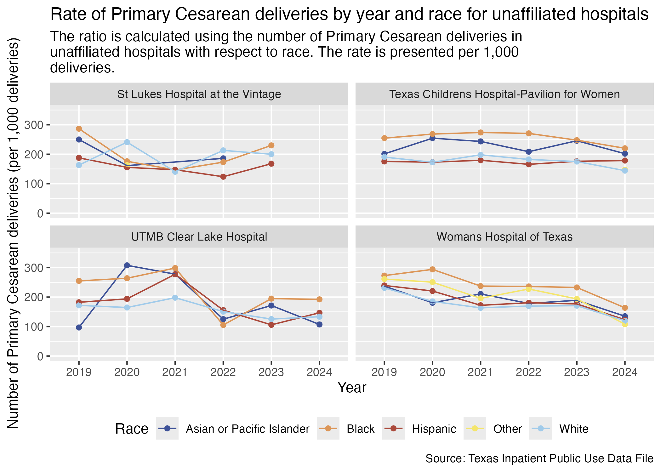
Here are the race breakdowns for all of the hospitals that don’t fall under a brand.
pcsec_hosp_race_unaffiliated <- ahrq_pcsec_rate_hosp_race |>
  filter(
    FAC_NAME %in% unaffiliated_list
  ) |>
  create_race_graph() +
  labs(
    title = str_wrap("Rate of Primary Cesarean deliveries by year and race for unaffiliated hospitals"),
    subtitle = str_wrap("The ratio is calculated using the number of Primary Cesarean deliveries in unaffiliated hospitals with respect to race. The rate is presented per 1,000 deliveries."),
    x = "Year", y = "Number of Primary Cesarean deliveries (per 1,000 deliveries)",
    caption = "Source: Texas Inpatient Public Use Data File"
  )

ggsave("../data-published/figures/pcsec/pcsec-hosp-race-unaffiliated.png")
Saved Version:
We will also compare by race for the hospitals in the Medical Center area and for those outside of the Medical Center area.
First, let’s create a data frame that determines whether the hospital is in the Medical Center and include considerations of race and ethnicity.
ahrq_pcsec_rate_tmc_race <- tx_deliveries_pcsec |>
  mutate(
    TMC = if_else(FAC_NAME %in% tmc_list, T, F)
  ) |>
  group_by(YR, TMC, MOD_RACE, PCSEC) |>
  add_pcsec_calc(1000)

ahrq_pcsec_rate_tmc_race
Now we can create two graphs side by side so that we can compare the differences for race between whether a hospital is in the Medical Center or not.
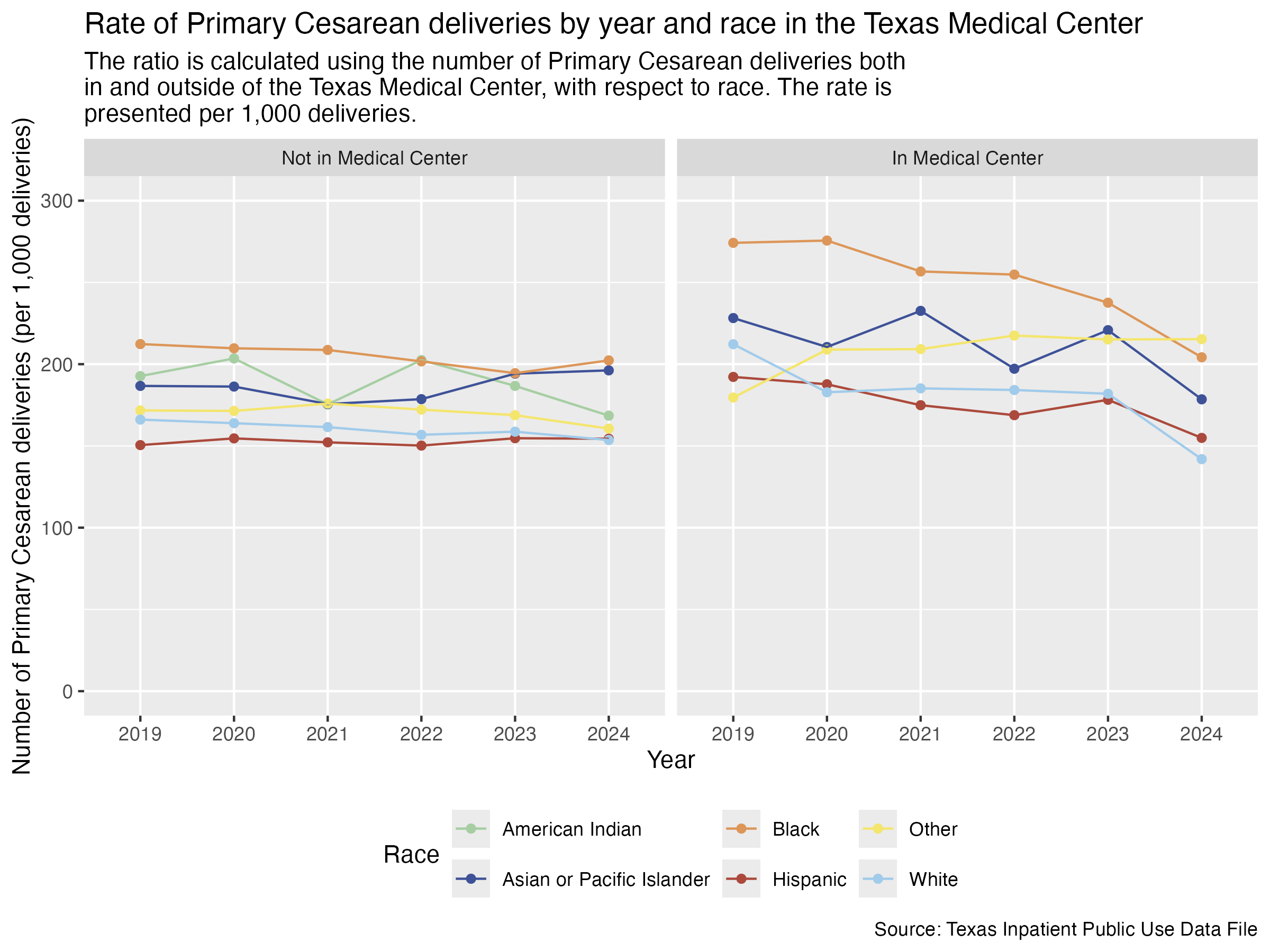
tmc_labels <- c("FALSE" = "Not in Medical Center", "TRUE" = "In Medical Center")

pcsec_race_tmc <- ahrq_pcsec_rate_tmc_race |>
  ggplot(aes(x = YR, y = PCSEC_DEL_PER)) +
  geom_point(aes(color = MOD_RACE)) +
  geom_line(aes(color = MOD_RACE, group = MOD_RACE)) +
  scale_color_manual(values = race_colors, name = "Race") +
  scale_y_continuous(limits = c(0, 300)) +
  facet_wrap(~ TMC, labeller = as_labeller(tmc_labels)) +
  labs(
    title = str_wrap("Rate of Primary Cesarean deliveries by year and race in the Texas Medical Center"),
    subtitle = str_wrap("The ratio is calculated using the number of Primary Cesarean deliveries both in and outside of the Texas Medical Center, with respect to race. The rate is presented per 1,000 deliveries."),
    x = "Year", y = "Number of Primary Cesarean deliveries (per 1,000 deliveries)",
    caption = "Source: Texas Inpatient Public Use Data File"
  ) +
  theme(
    legend.position = "bottom"
  )

ggsave("../data-published/figures/pcsec/pcsec-race-tmc.png", width = 8, height = 6, units = "in")
Saved Version: