Expand this to see code
library(tidyverse)
library(janitor)
library(DT)We want to analyze the rate of Severe Maternal Morbidity (SMM) using the list of codes that indicate SMM. The list of codes originally came from the HCUP Clinical Coding Definitions and include many different complications that can come up during a delivery.
These rates are analyzed to be “per 10,000 deliveries” as is the standard in reporting Severe Maternal Morbidity rates.
library(tidyverse)
library(janitor)
library(DT)We previously created a data set that flagged SMM deliveries in the Categorization notebook. We will pull that data to use here for analysis (Texas, Harris County, Individual Hospitals and by Race).
deliveries_smm <- read_rds("../data-processed/smm.rds")Additionally, since our breakdown involves breaking down these rates by hospital, we need some of the lists that we created in the Stored Lists notebook.These lists group by brand for the hospital as well as distinguish whether a hospital is in the Texas Medical Center.
# list of Texas Medical Center hospitals
tmc_list <- read_rds("../data-published/technical-specs/tmc.rds") |> pull(name)

# brand and unaffiliated lists
harris_health_list <- read_rds("../data-published/technical-specs/harris_health.rds") |> pull(name)
hca_list <- read_rds("../data-published/technical-specs/hca.rds") |> pull(name)
houston_methodist_list <- read_rds("../data-published/technical-specs/houston_methodist.rds") |> pull(name)
memorial_hermann_list <- read_rds("../data-published/technical-specs/memorial_hermann.rds") |> pull(name)
unaffiliated_list <- read_rds("../data-published/technical-specs/unaffiliated.rds") |> pull(name)There are some actions that will happen repeatedly throughout the analysis, such as adding an SMM rate or plotting individual hospitals (including by race). We will define some functions to do these.
Since we have already created a data set that flags which cases include Severe Maternal Morbidity, we can go ahead and use it to calculate the SMM rate.
add_smm_calc <- function(.data, num_del) {
  .data |>
    summarize(CNT = n()) |>
    pivot_wider(names_from = SMM, values_from = CNT) |>
    rename(
      NON_SMM_CNT = "FALSE",
      SMM_CNT = "TRUE"
    ) |>
    mutate(
      TOTAL = NON_SMM_CNT + SMM_CNT
    ) |>
    filter(
      TOTAL > 25
    ) |>
    mutate(
      # this gives us the percentage of total deliveries that are SMM
      SMM_RATE = round_half_up((SMM_CNT / TOTAL) * 100, 1)
    ) |>
    mutate(
      # we want to create a column that will use the rate we previously
      # calculated to give us a number out of how many deliveries would appear
      # as SMM -- use an adjustable value so I don't have to change this
      # if we decide on a different number
      SMM_DEL_PER = round_half_up((SMM_CNT / TOTAL) * num_del, 1)
    )
}We want to look at the SMM cases in context of payment source. We will make a function that adds the Medicaid rate by year.
add_medicaid <- function(.data, num_del) {
  .data |>
    group_by(YR, SMM_MC_CATEGORY) |>
    summarize(CNT = n()) |>
    pivot_wider(names_from = SMM_MC_CATEGORY, values_from = CNT) |>
    mutate(
      TOTAL_MC = NONSMM_MC + SMM_MC,
      TOTAL_NONMC = NONSMM_NONMC + SMM_NONMC
    ) |>
    filter(TOTAL_MC > 25 | TOTAL_NONMC > 25) |>
    mutate(
      MC_DEL_PER = round_half_up((SMM_MC / TOTAL_MC) * num_del, 1),
      NONMC_DEL_PER = round_half_up((SMM_NONMC / TOTAL_NONMC) * num_del, 1)
    ) |>
    pivot_longer(
      cols = c(MC_DEL_PER, NONMC_DEL_PER),
      names_to = "DEL_PER_TYPE",
      values_to = "DEL_PER"
    )
}deliveries_smm |>
group_by(YR, SMM_MC_CATEGORY) |>
summarize(CNT = n()) |>
pivot_wider(names_from = SMM_MC_CATEGORY, values_from = CNT) |>
mutate(
TOTAL_MC = NONSMM_MC + SMM_MC,
TOTAL_NONMC = NONSMM_NONMC + SMM_NONMC
) |>
filter(TOTAL_MC > 25 | TOTAL_NONMC > 25) |>
mutate(
MC_DEL_PER = round_half_up((SMM_MC / TOTAL_MC) * 10000, 1),
NONMC_DEL_PER = round_half_up((SMM_NONMC / TOTAL_NONMC) * 10000, 1)
) |>
pivot_longer(
cols = c(MC_DEL_PER, NONMC_DEL_PER),
names_to = "DEL_PER_TYPE",
values_to = "DEL_PER"
)Let’s also make a function that provides a template for what the individual hospital graphs will look like. We want to show this on the scale of number of cases that are SMM per 10,000 deliveries.
create_hosp_graph <- function(.data) {
  .data |>
    ggplot(aes(x = YR, y = SMM_DEL_PER)) +
    geom_col() +
    geom_text(aes(label = SMM_DEL_PER), vjust = 1.5, color = "white", size = 3) +
    facet_wrap(~ FAC_NAME, ncol = 2) +
    theme(
      legend.position = "bottom"
    )
}We can make our lives so much easier by making a function for each individual graph, similar to the one above, that also includes race.
First let’s define some colors that we’ll use for the race graphs. We want these colors to be consistent across all of the plots. We are using colors based on a Washington Post article on the subject.
race_colors <- c(
  "Hispanic" = "#ecda5c",
  "American Indian" = "#a4c589",
  "Asian or Pacific Islander" = "#c69cc1",
  "Black" = "#d89d88",
  "White" = "#8eb3be",
  "Other" = "#c8ad68"
)
Now we can define a function that will create the race graphs using these colors.
 create_race_graph <- function(.data) {
   .data |>
     ggplot(aes(x = YR, y = SMM_DEL_PER)) +
     geom_point(aes(color = MOD_RACE)) +
     geom_line(aes(color = MOD_RACE, group = MOD_RACE)) +
     scale_color_manual(values = race_colors, name = "Race)") +
     facet_wrap(~ FAC_NAME, ncol = 2) +
     theme(
       legend.position = "bottom"
     )
}In order to showcase the data visually, there are some things we have to do to the data set in order to prepare it to be plotted/shown in a plot. This includes making a column for our various SMM calculations, even though we will ultimately use the per 10,000 deliveries calculation. We will do this by hospital, but this might not be relevant to certain tables.
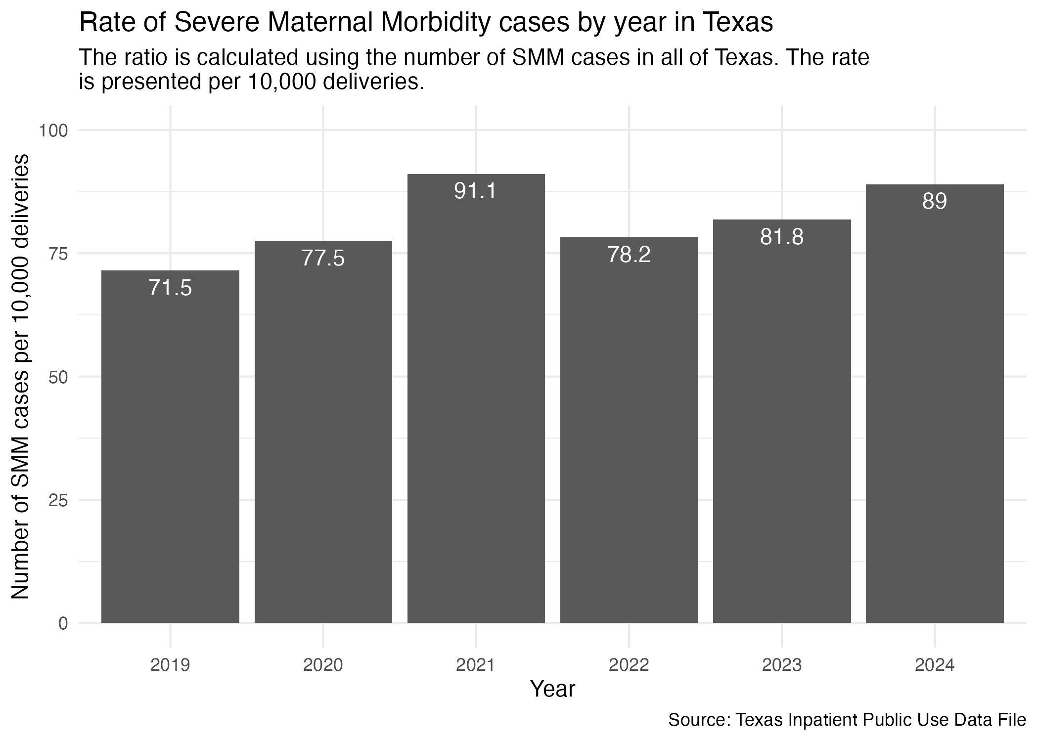
hcup_smm_rate_tx <- deliveries_smm |>
  group_by(YR, SMM) |>
  add_smm_calc(10000) |>
  arrange(SMM_DEL_PER |> desc())

hcup_smm_rate_tx
Now, plot.
smm_yr_tx_plot <- hcup_smm_rate_tx |>
  ggplot(aes(x = YR, y = SMM_DEL_PER)) +
  geom_col() +
  scale_y_continuous(limits = c(0, 100)) +
  geom_text(aes(label = SMM_DEL_PER), vjust = 1.5, color = "white") +
  labs(
    title = str_wrap("Rate of Severe Maternal Morbidity cases by year in Texas"),
    subtitle = str_wrap("The ratio is calculated using the number of SMM cases in all of Texas. The rate is presented per 10,000 deliveries."),
    x = "Year", y = "Number of SMM cases per 10,000 deliveries",
    caption = "Source: Texas Inpatient Public Use Data File"
  ) +
  theme_minimal()

ggsave("../data-published/figures/smm/smm-yr-tx.png")
Saved Version:
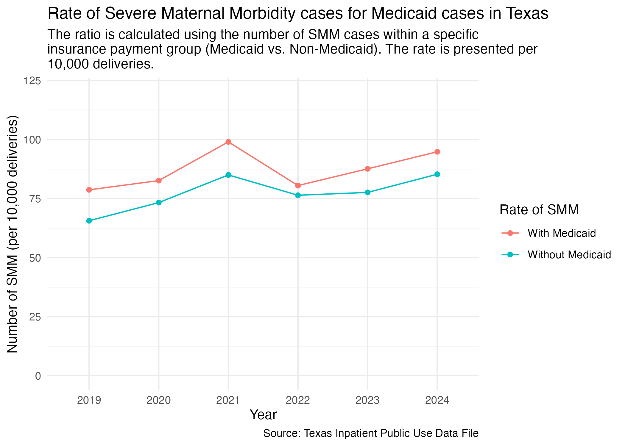
We want to know how many mothers that paid with Medicaid also resulted in a case with Severe Maternal Morbidity and compare it to mothers that did not pay with Medicaid. First, we need to add the percentage of patients that paid with Medicaid for their procedures before we can plot by year. We will express this rate as per 10,000 deliveries within the resulting plot.
smm_mc_tx <- deliveries_smm |>
  add_medicaid(10000) |>
  # go ahead and arrange it in descending order to help showcase points in
  # the graph
  arrange(DEL_PER |> desc())

smm_mc_tx
Now, plot.
smm_mc_tx_plot <- smm_mc_tx |>
  ggplot(aes(x = YR, y = DEL_PER, group = DEL_PER_TYPE)) +
  geom_point(aes(color = DEL_PER_TYPE)) +
  geom_line(aes(color = DEL_PER_TYPE)) +
  scale_y_continuous(limits = c(0, 120)) +
  scale_color_discrete(labels = c("With Medicaid", "Without Medicaid"), name = "Rate of SMM") +
  labs(
    title = str_wrap("Rate of Severe Maternal Morbidity cases for Medicaid cases in Texas"),
    subtitle = str_wrap("The ratio is calculated using the number of SMM cases within a specific insurance payment group (Medicaid vs. Non-Medicaid). The rate is presented per 10,000 deliveries."),
    x = "Year", y = "Number of SMM (per 10,000 deliveries)",
    caption = "Source: Texas Inpatient Public Use Data File"
  ) +
  theme_minimal()

ggsave("../data-published/figures/smm/smm-mc-tx.png")
Saved Version:
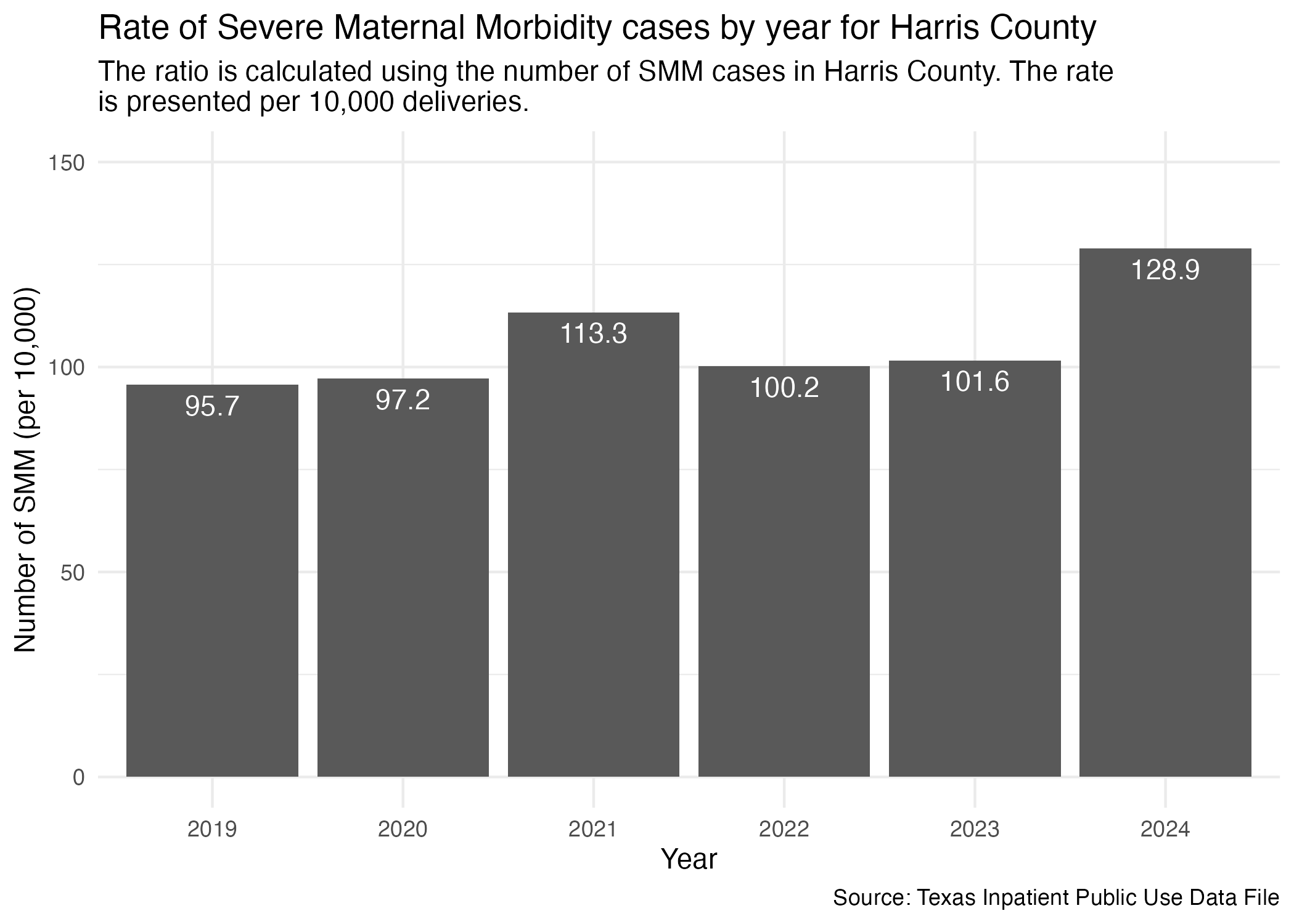
Need to limit the statewide data to just Harris County like we had done in the cleaning notebook.
hcup_smm_rate_harris <- deliveries_smm |>
  filter(FAC_CNTY == "Harris") |>
  group_by(YR, SMM) |>
  add_smm_calc(10000) |>
  arrange(SMM_DEL_PER |> desc())

hcup_smm_rate_harris
Now, plot.
smm_yr_harris_plot <- hcup_smm_rate_harris |>
  ggplot(aes(x = YR, y = SMM_DEL_PER)) +
  geom_col() +
  scale_y_continuous(limits = c(0, 150)) +
  geom_text(aes(label = SMM_DEL_PER), vjust = 1.5, color = "white") +
  labs(
    title = str_wrap("Rate of Severe Maternal Morbidity cases by year for Harris County"),
    subtitle = str_wrap("The ratio is calculated using the number of SMM cases in Harris County. The rate is presented per 10,000 deliveries."),
    x = "Year", y = "Number of SMM (per 10,000)",
    caption = "Source: Texas Inpatient Public Use Data File"
  ) +
  theme_minimal()

ggsave("../data-published/figures/smm/smm-yr-harris.png")
Saved Version:
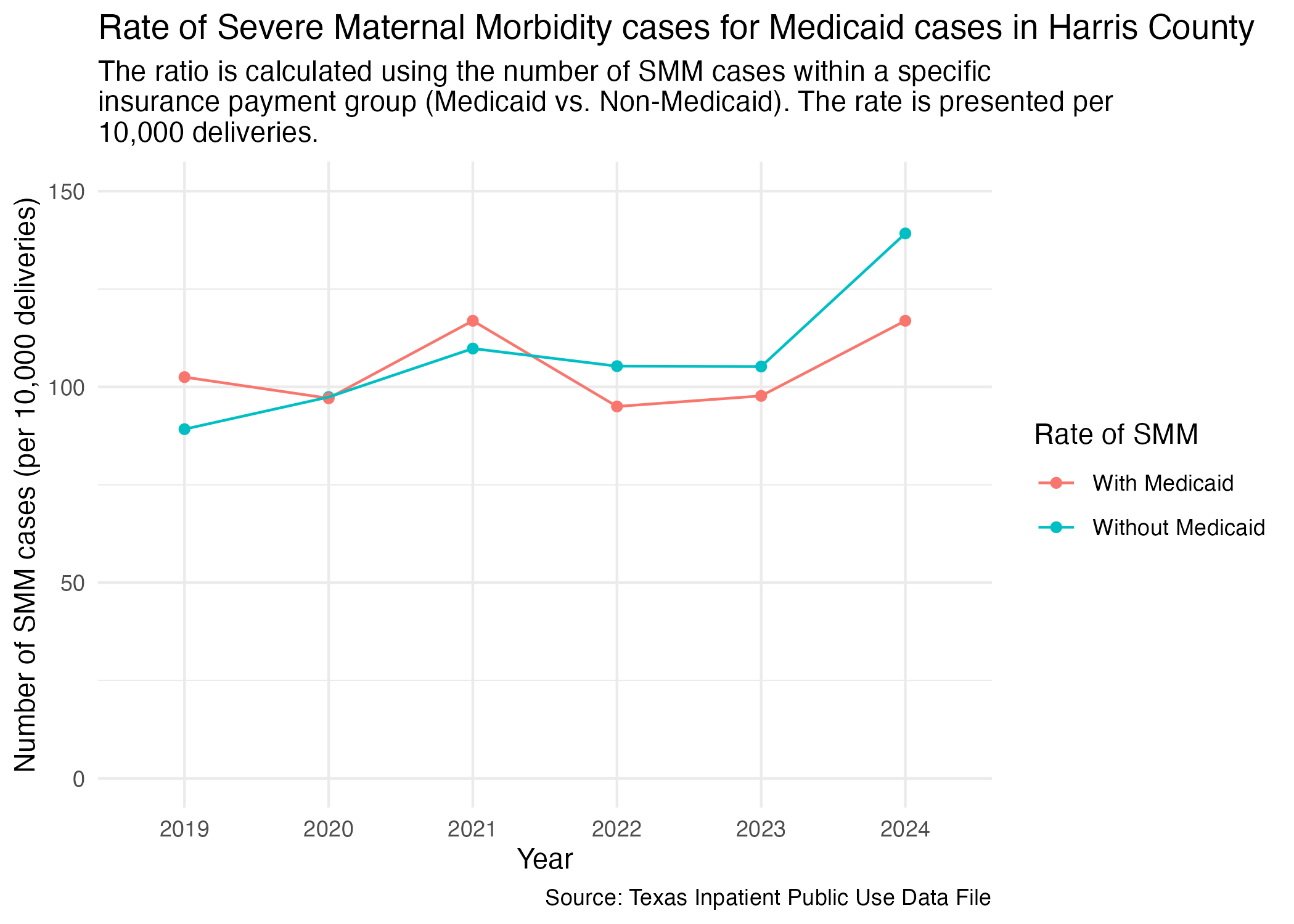
We want to do the same analysis we did for all of Texas and focus in on Harris County. This will look at the rate Medicaid is used in cases where Severe Maternal Morbidity occurs and express as it as the number of cases per 10,000 deliveries. First, we must prep the data.
smm_mc_harris <- deliveries_smm |>
  filter(FAC_CNTY == "Harris") |>
  add_medicaid(10000) |>
  arrange(DEL_PER |> desc())

smm_mc_harris
Now, plot.
smm_mc_harris_plot <- smm_mc_harris |>
  ggplot(aes(x = YR, y = DEL_PER, group = DEL_PER_TYPE)) +
  geom_point(aes(color = DEL_PER_TYPE)) +
  geom_line(aes(color = DEL_PER_TYPE)) +
  scale_y_continuous(limits = c(0, 150)) +
  scale_color_discrete(labels = c("With Medicaid", "Without Medicaid"), name = "Rate of SMM") +
  labs(
    title = str_wrap("Rate of Severe Maternal Morbidity cases for Medicaid cases in Harris County"),
    subtitle = str_wrap("The ratio is calculated using the number of SMM cases within a specific insurance payment group (Medicaid vs. Non-Medicaid). The rate is presented per 10,000 deliveries."),
    x = "Year", y = "Number of SMM cases (per 10,000 deliveries)",
    caption = "Source: Texas Inpatient Public Use Data File"
  ) +
  theme_minimal()

ggsave("../data-published/figures/smm/smm-mc-harris.png")
Saved Version:
Let’s compare the Cesarean delivery rate across different hospitals in Harris County. We’ll prep the data so that it includes the facility’s name and ID.
hcup_smm_rate_hosp <- deliveries_smm |>
  filter(FAC_CNTY == "Harris") |>
  group_by(YR, THCIC_ID, FAC_NAME, SMM) |>
  add_smm_calc(10000) |>
  arrange(SMM_DEL_PER |> desc())

hcup_smm_rate_hosp |> datatable()
Now we can plot all of the individual hospitals into separate graphs. We’ll group up individual graphs by brand and by location.
Here are the brands of hospitals found in the Harris County data:
Let’s take a look at the Harris Health hospitals.
smm_hosp_harris_health_plot <- hcup_smm_rate_hosp |>
  filter(
    FAC_NAME %in% harris_health_list
    ) |>
  create_hosp_graph() +
  labs(
    title = str_wrap("Rate of Severe Maternal Morbidity cases by year for Harris Health hospitals"),
    subtitle = str_wrap("The ratio is calculated using the number of SMM cases at each Harris Health hospital. The rate is presented per 10,000 deliveries."),
    x = "Year", y = "Number of SMM (per 10,000 deliveries)",
    caption = "Source: Texas Inpatient Public Use Data File"
  )

ggsave("../data-published/figures/smm/smm-hosp-harris-health.png", width = 8, height = 6, units = "in")
Saved Version:
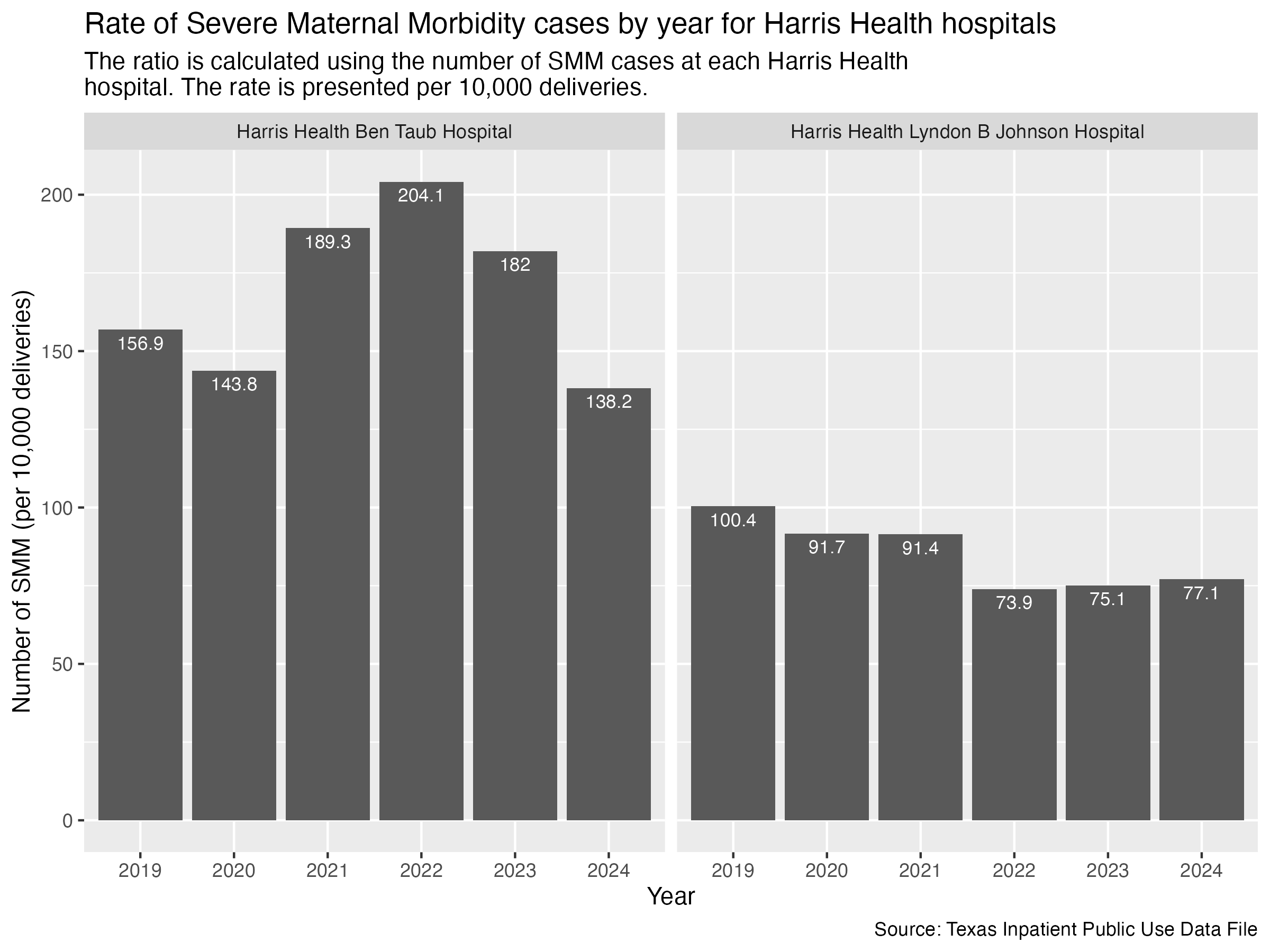
We would like to pull out the data specific to Harris Health Ben Taub for further visualization in Datawrapper.
harris_health_ben_taub_df <- hcup_smm_rate_hosp |>
  filter(
    FAC_NAME == "Harris Health Ben Taub Hospital"
  ) |>
  select(YR, SMM_DEL_PER)
Export.
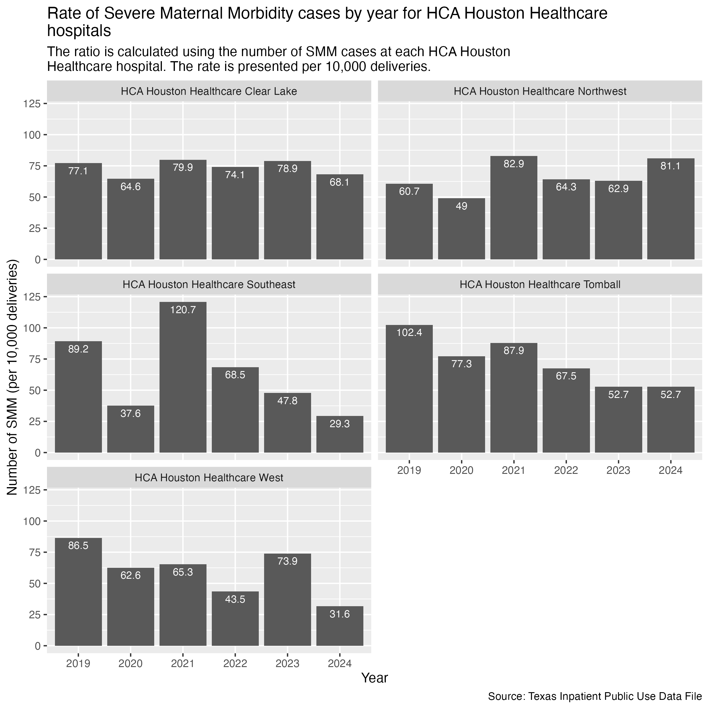
harris_health_ben_taub_df |> write_csv("../data-published/datawrapper/harris-health-ben-taub.csv")Same with HCA Houston Healthcare hospitals.
smm_hosp_hca_plot <- hcup_smm_rate_hosp |>
  filter(
    FAC_NAME %in% hca_list
    ) |>
  create_hosp_graph() +
  labs(
    title = str_wrap("Rate of Severe Maternal Morbidity cases by year for HCA Houston Healthcare hospitals"),
    subtitle = str_wrap("The ratio is calculated using the number of SMM cases at each HCA Houston Healthcare hospital. The rate is presented per 10,000 deliveries."),
    x = "Year", y = "Number of SMM (per 10,000 deliveries)",
    caption = "Source: Texas Inpatient Public Use Data File"
  )

ggsave("../data-published/figures/smm/smm_hosp_hca.png", width = 8, height = 8, units = "in")
Saved Version:
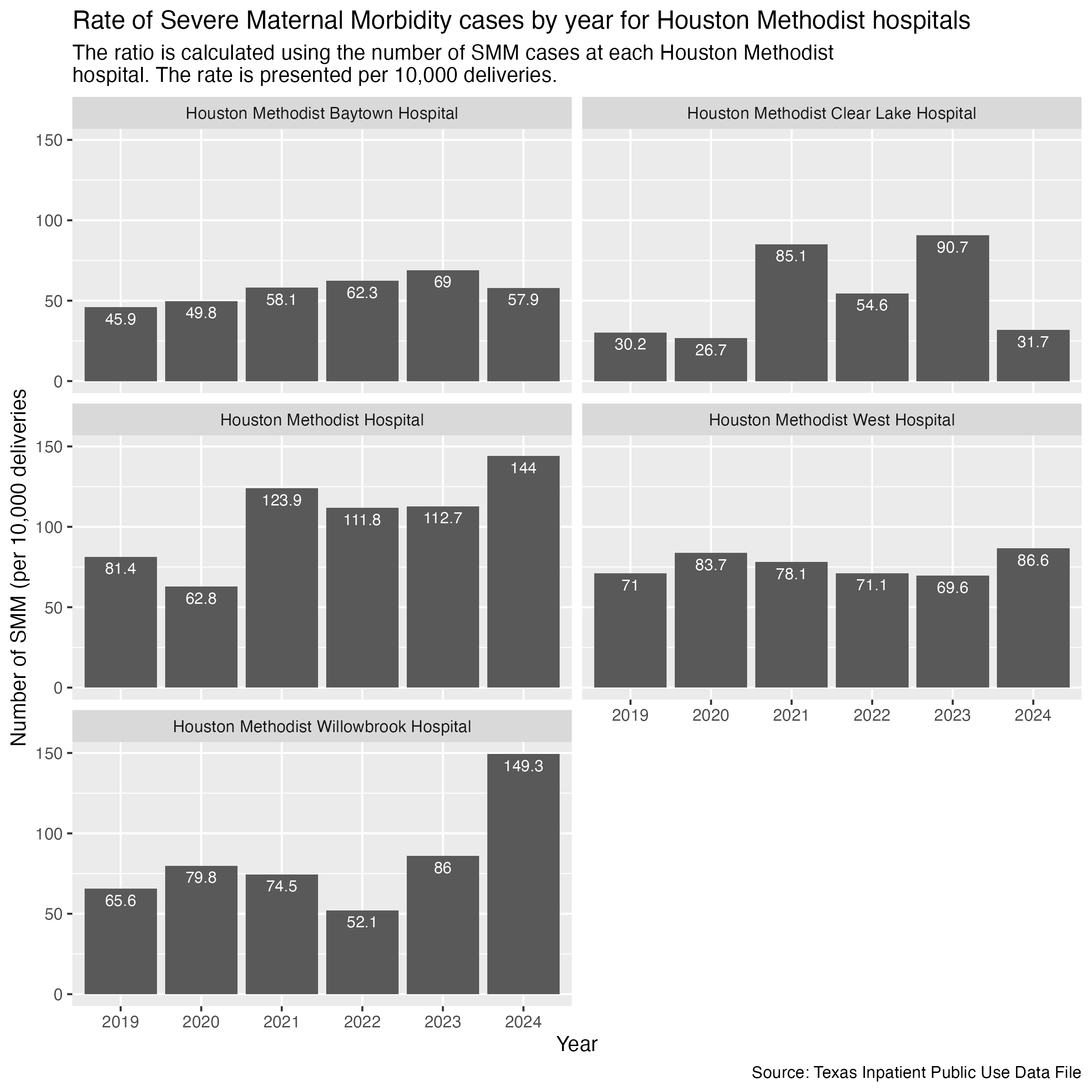
Houston Methodist hospitals next.
smm_hosp_houston_methodist_plot <- hcup_smm_rate_hosp |>
  filter(
    FAC_NAME %in% houston_methodist_list
    ) |>
  create_hosp_graph() +
  labs(
    title = str_wrap("Rate of Severe Maternal Morbidity cases by year for Houston Methodist hospitals"),
    subtitle = str_wrap("The ratio is calculated using the number of SMM cases at each Houston Methodist hospital. The rate is presented per 10,000 deliveries."),
    x = "Year", y = "Number of SMM (per 10,000 deliveries",
    caption = "Source: Texas Inpatient Public Use Data File"
  )

ggsave("../data-published/figures/smm/smm-hosp-houston-methodist.png", width = 8, height = 8, units = "in")
Saved Version:
Finally, Memorial Hermann hospitals.
smm_hosp_memorial_hermann <- hcup_smm_rate_hosp |>
  filter(
    FAC_NAME %in% memorial_hermann_list
    ) |>
  create_hosp_graph() +
  labs(
    title = str_wrap("Rate of Severe Maternal Morbidity cases by year for Memorial Hermann hospitals"),
    subtitle = str_wrap("The ratio is calculated using the number of SMM cases at each Memorial Hermann hospital. The rate is presented per 10,000 deliveries."),
    x = "Year", y = "Number of SMM (per 10,000 deliveries)",
    caption = "Source: Texas Inpatient Public Use Data File"
  )

ggsave("../data-published/figures/smm/smm-hosp-memorial-hermann.png", width = 8, height = 8, units = "in")
Saved Version:
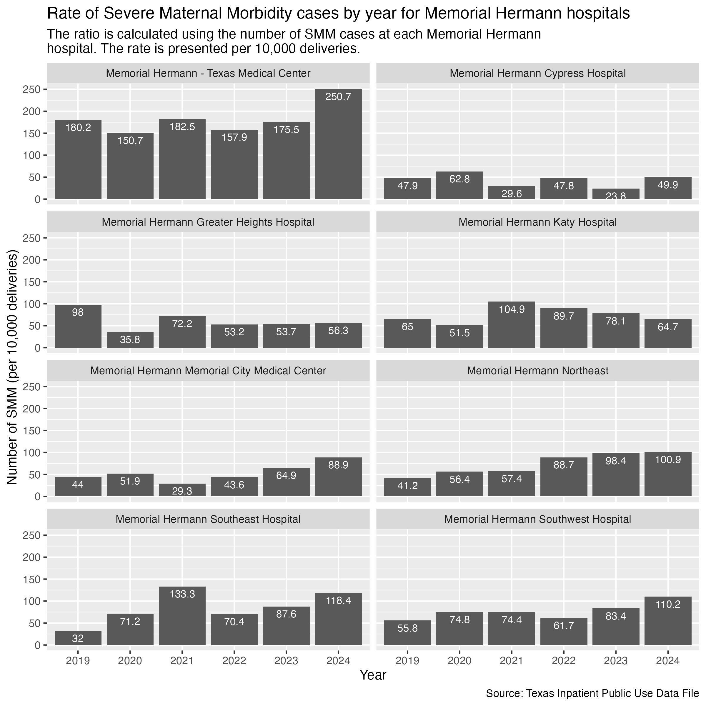
We will pull out the data for Memorial Hermann - Texas Medical Center for a polished visualization in Datawrapper.
memorial_hermann_tmc_df <- hcup_smm_rate_hosp |>
  filter(
    FAC_NAME == "Memorial Hermann - Texas Medical Center"
  ) |>
  arrange(YR) |>
  select(YR, SMM_DEL_PER)

memorial_hermann_tmc_df
Export data.
memorial_hermann_tmc_df |> write_csv("../data-published/datawrapper/memorial-hermann-tmc.csv")There are some hospitals in Harris County that don’t have other affiliated hospitals across the county. We will put them all into another set of graphs.
smm_hosp_unaffiliated_plot <- hcup_smm_rate_hosp |>
  filter(
    FAC_NAME %in% unaffiliated_list
  ) |>
  create_hosp_graph() +
  labs(
    title = str_wrap("Rate of Severe Maternal Morbidity cases by year for unaffiliated hospitals"),
    subtitle = str_wrap("The ratio is calculated using the number of SMM cases at each unaffiliated hospital. The rate is presented per 10,000 deliveries."),
    x = "Year", y = "Number of SMM (per 10,000 deliveries)",
    caption = "Source: Texas Inpatient Public Use Data File"
  )

ggsave("../data-published/figures/smm/smm-hosp-unaffiliated.png", width = 8, height = 8, units = "in")
Saved Version:
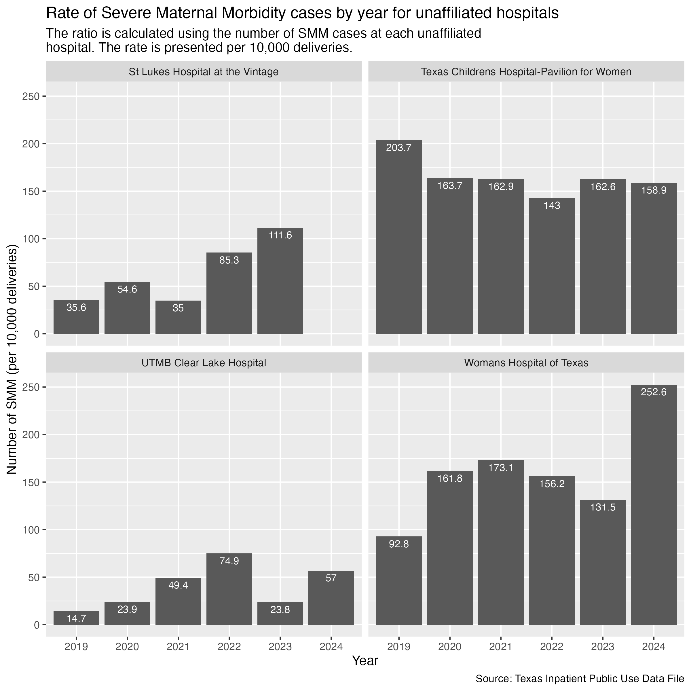
We want to pull out Texas Children’s Hospital-Pavilion for Women and Woman’s Hospital of Texas for Datawrapper visualizations. We need to get the data and export it.
tx_childrens_df <- hcup_smm_rate_hosp |>
  filter(
    FAC_NAME == "Texas Childrens Hospital-Pavilion for Women"
  ) |>
  select(YR, SMM_DEL_PER) |>
  arrange(YR)

tx_childrens_dfwomans_hosp_df <- hcup_smm_rate_hosp |>
filter(
FAC_NAME == "Womans Hospital of Texas"
) |>
select(YR, SMM_DEL_PER) |>
arrange(YR)
womans_hosp_dfExport.
tx_childrens_df |> write_csv("../data-published/datawrapper/tx-childrens.csv")
womans_hosp_df |> write_csv("../data-published/datawrapper/womans-hospital.csv")If we want to look at the data for Harris and Texas in one graph, we can plot Harris and Texas as two separate lines.
First, we need to put the Texas and Harris data into one data frame.
hcup_smm_rate_combined <- hcup_smm_rate_harris |>
  add_column(CATEGORY = "Harris") |>
  bind_rows(hcup_smm_rate_tx) |>
  # at this point, any unfilled category entry is a Texas entry
  mutate(
    CATEGORY = if_else(is.na(CATEGORY), "Texas", CATEGORY)
  )

hcup_smm_rate_combined
Now we can plot with the grouping being determined by the CATEGORY value.
smm_harris_tx_plot <- hcup_smm_rate_combined |>
  ggplot(aes(x = YR, y = SMM_DEL_PER)) +
  geom_point(aes(color = CATEGORY)) +
  geom_line(aes(color = CATEGORY, group = CATEGORY)) +
  scale_y_continuous(limits = c(0, 150)) +
  scale_color_discrete(name = "Category") +
  labs(
    title = str_wrap("Rate of Severe Maternal Morbidity cases in Harris County and Texas"),
    subtitle = str_wrap("The ratio is calculated using the number of SMM cases in Texas broadly and Harris County specifically. The rate is presented per 10,000 deliveries."),
    x = "Year", y = "Number of SMM (per 10,000 deliveries)",
    caption = "Source: Texas Inpatient Public Use Data File"
  ) +
  theme_minimal()

ggsave("../data-published/figures/smm/smm-harris-tx.png")
Saved Version:
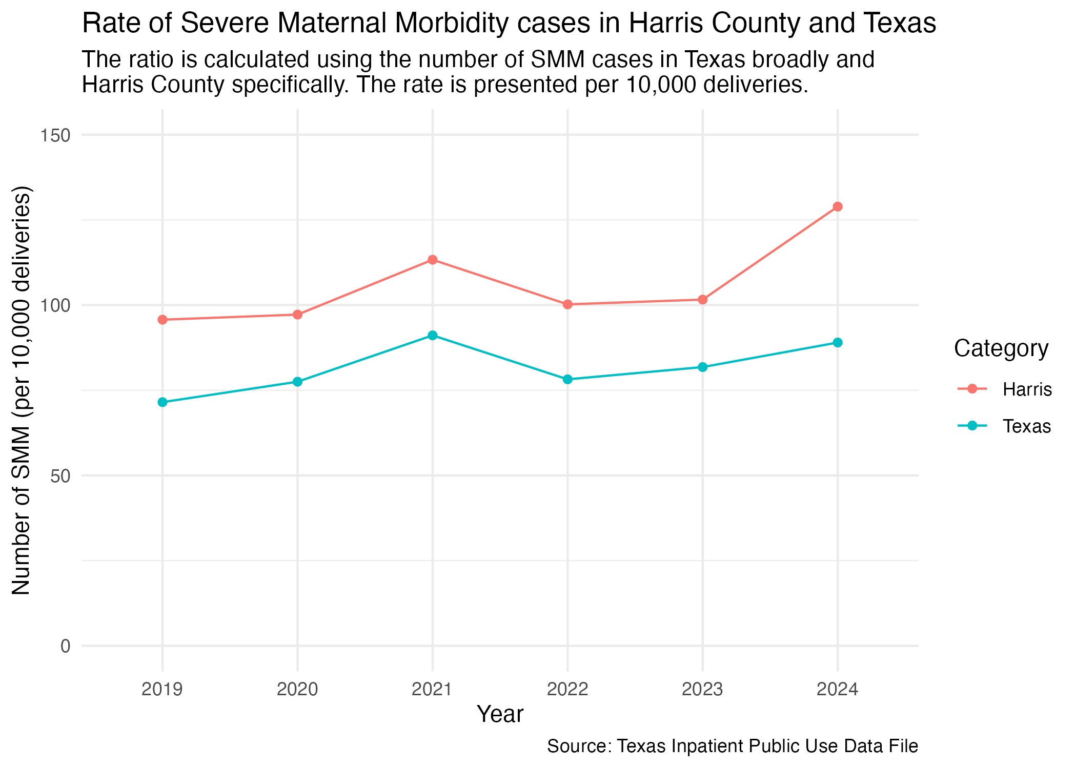
We also want to create a data visualization for this comparison in Datawrapper. We need to prep the data for datawrapper and export.
harris_tx_cmp <- hcup_smm_rate_combined |>
  select(YR, SMM_DEL_PER, CATEGORY) |>
  pivot_wider(
    names_from = CATEGORY,
    values_from = SMM_DEL_PER
  )

harris_tx_cmp |> write_csv("../data-published/datawrapper/harris-tx.csv")As a part of the reporting process, I will provide some takeaways that can be included in reporting on the difference between Harris County and Texas in Severe Maternal Morbidity cases. To do so, let’s calculate the simple difference between Harris and Texas for each year.
hcup_smm_rate_harris_mod <- hcup_smm_rate_harris |>
  select(YR, HARRIS_DEL_PER = SMM_DEL_PER) |>
  arrange(YR)

hcup_smm_rate_tx_mod <- hcup_smm_rate_tx |>
  select(YR, TEXAS_DEL_PER = SMM_DEL_PER) |>
  arrange(YR)

# use inner_join to combine the two data frames and then calculate the simple
# difference
harris_tx_simple_diff <- hcup_smm_rate_harris_mod |>
  inner_join(
    hcup_smm_rate_tx_mod,
    by = join_by(YR)
  ) |>
  mutate(
    # This difference describes number of cases per 10,000 deliveries.
    DIFF = HARRIS_DEL_PER - TEXAS_DEL_PER
  )

harris_tx_simple_diff
Data Takeaway: The difference in severe maternal morbidity cases per 10,000 deliveries between Harris County and Texas floats around 20 deliveries from 2019 to 2023. The difference shoots up in 2024 to nearly 40 deliveries.
Percent change will be calculated as the percentage change year-by-year for Harris County vs. the percentage change year-by-year for Texas. This will illustrate the growth year-by-year for Harris and Texas individually, which can then be compared to each other. For now, this is manually done using the values from the previous tibble.
smm_pct_change_harris <- hcup_smm_rate_harris_mod |>
  arrange(YR) |>
  # I need to ungroup because lag will look for random groupings in between?
  # for some reason...
  ungroup() |>
  # The formula for percent change is as follows: ((New - Old) / Old) * 100
  # lag: basically shifts back to the previous observation
  mutate(
    HARRIS_PCT_CHANGE = round_half_up(((HARRIS_DEL_PER - lag(HARRIS_DEL_PER)) / lag(HARRIS_DEL_PER)) * 100, 1)
  )

smm_pct_change_tx <- hcup_smm_rate_tx_mod |>
  arrange(YR) |>
  ungroup() |>
  mutate(
    TX_PCT_CHANGE = round_half_up(((TEXAS_DEL_PER - lag(TEXAS_DEL_PER)) / lag(TEXAS_DEL_PER)) * 100, 1)
  )

# combine the two df through join
smm_pct_change <- smm_pct_change_harris |>
  inner_join(
    smm_pct_change_tx,
    by = join_by(YR)
  )

smm_pct_change
2019 will always have NA in the PCT_CHANGE columns because it is the first year of observations.
We also want to compare the percent change just between 2019 and 2024 for both Harris and Texas.
overall_pct_change_harris <- hcup_smm_rate_harris_mod |>
  filter(
    YR == "2019" | YR == "2024"
  ) |>
  arrange(YR) |>
  ungroup() |>
  mutate(
    HARRIS_PCT_CHANGE = round_half_up(((HARRIS_DEL_PER - lag(HARRIS_DEL_PER)) / lag(HARRIS_DEL_PER)) * 100, 1)
  )

overall_pct_change_tx <- hcup_smm_rate_tx_mod |>
  filter(
    YR == "2019" | YR == "2024"
  ) |>
  arrange(YR) |>
  ungroup() |>
  mutate(
    TX_PCT_CHANGE = round_half_up(((TEXAS_DEL_PER - lag(TEXAS_DEL_PER)) / lag(TEXAS_DEL_PER)) * 100, 1)
  )

overall_pct_change <- overall_pct_change_harris |>
  inner_join(
    smm_pct_change_tx,
    by = join_by(YR)
  )

overall_pct_change
Data Takeaway: Comparing 2019 and 2024, Harris County saw a 26.3% increase in the rate of severe maternal morbidity cases while Texas only saw a 0.5% increase.
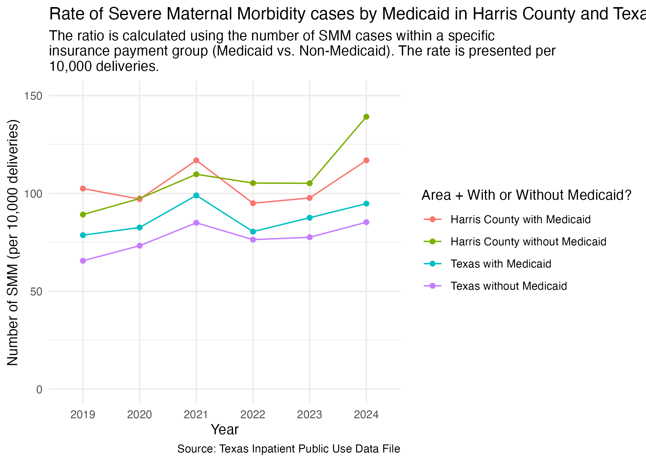
We also need to combine the data frames that we created specific for Texas and Harris County in terms of Medicaid rates.
smm_mc_combined <- smm_mc_harris |>
  add_column(CATEGORY = "Harris") |>
  bind_rows(smm_mc_tx) |>
  # at this point, any unfilled category entry is a Texas entry
  mutate(
    CATEGORY = if_else(is.na(CATEGORY), "Texas", CATEGORY)
  ) |>
  mutate(
    DEL_PER_TYPE = paste(toupper(CATEGORY), DEL_PER_TYPE, sep = "_")
  ) |>
  select(!CATEGORY)

smm_mc_combined
Now, plot.
smm_mc_harris_tx_plot <- smm_mc_combined |>
  ggplot(aes(x = YR, y = DEL_PER, group = DEL_PER_TYPE)) +
  geom_point(aes(color = DEL_PER_TYPE)) +
  geom_line(aes(color = DEL_PER_TYPE)) +
  scale_y_continuous(limits = c(0, 150)) +
  scale_color_discrete(labels = c("Harris County with Medicaid", "Harris County without Medicaid", "Texas with Medicaid", "Texas without Medicaid"), name = "Area + With or Without Medicaid?") +
  labs(
    title = str_wrap("Rate of Severe Maternal Morbidity cases by Medicaid in Harris County and Texas"),
    subtitle = str_wrap("The ratio is calculated using the number of SMM cases within a specific insurance payment group (Medicaid vs. Non-Medicaid). The rate is presented per 10,000 deliveries."),
    x = "Year", y = "Number of SMM (per 10,000 deliveries)",
    caption = "Source: Texas Inpatient Public Use Data File",
  ) +
  theme_minimal()

ggsave("../data-published/figures/smm/smm-mc-harris-tx.png")
Saved Version:
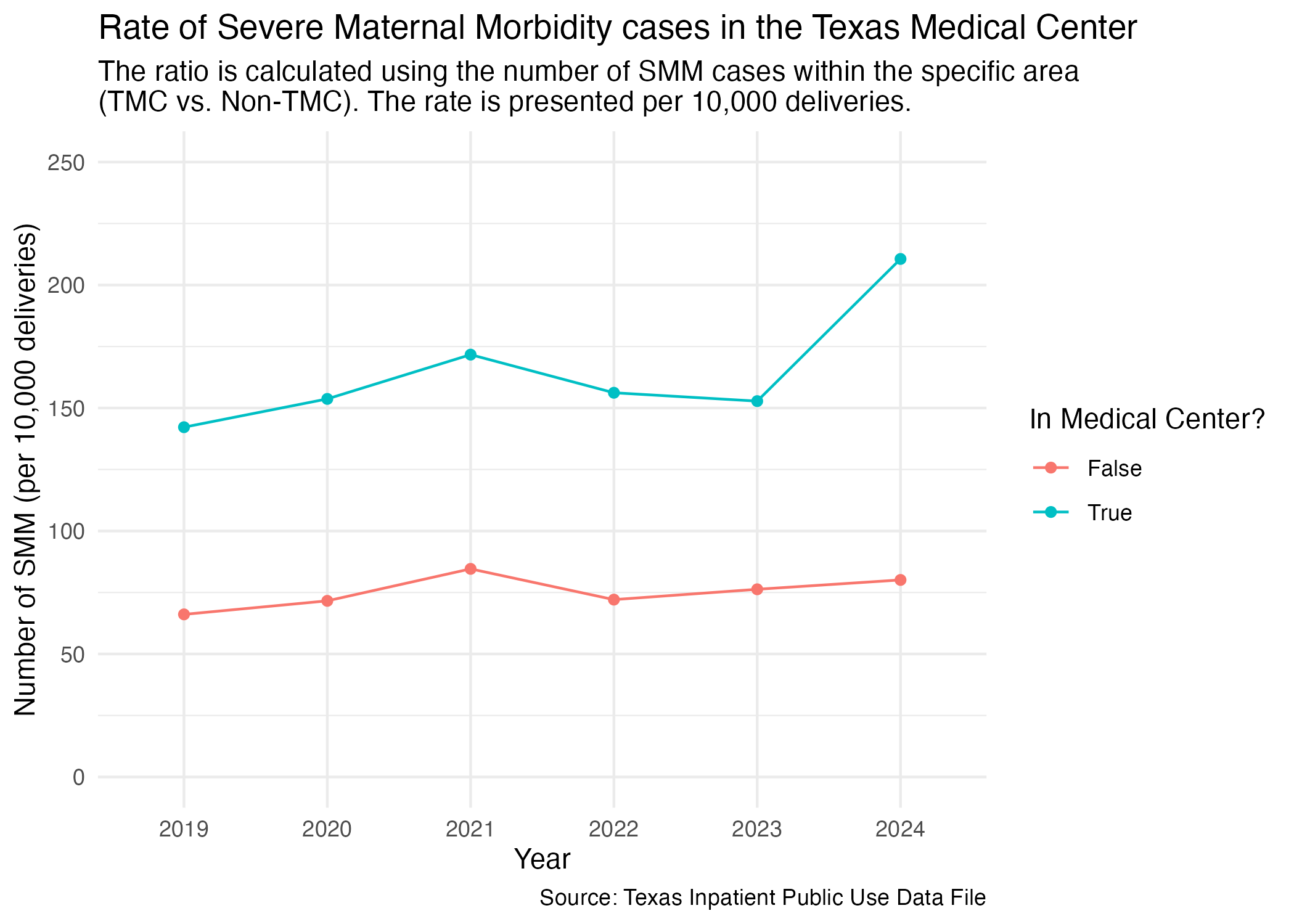
One other facet grouping we wanted to look at was Harris County hospitals in the Medical Center area versus outside of the Medical Center area. We imported this list at the top of this notebook.
Let’s create a new data frame that distinguishes whether a hospital is in the Medical Center or not.
hcup_smm_rate_tmc <- deliveries_smm |>
  mutate(
    TMC = if_else(FAC_NAME %in% tmc_list, T, F)
  ) |>
  group_by(YR, TMC, SMM) |>
  add_smm_calc(10000) |>
  arrange(SMM_DEL_PER |> desc())

hcup_smm_rate_tmc
Now we can plot the comparison for the rate of SMM cases between hospitals in the Medical Center area and not in the Medical Center area.
smm_tmc_plot <- hcup_smm_rate_tmc |>
  ggplot(aes(x = YR, y = SMM_DEL_PER)) +
  geom_point(aes(color = TMC)) +
  geom_line(aes(color = TMC, group = TMC)) +
  scale_y_continuous(limits = c(0, 250)) +
  scale_color_discrete(name = "In Medical Center?", labels = c("False", "True")) +
  labs(
    title = str_wrap("Rate of Severe Maternal Morbidity cases in the Texas Medical Center"),
    subtitle = str_wrap("The ratio is calculated using the number of SMM cases within the specific area (TMC vs. Non-TMC). The rate is presented per 10,000 deliveries."),
    x = "Year", y = "Number of SMM (per 10,000 deliveries)",
    caption = "Source: Texas Inpatient Public Use Data File"
  ) +
  theme_minimal()

ggsave("../data-published/figures/smm/smm-tmc.png")
Saved Version:
We want to create one line graph to look at all of the hospitals we previously pulled out. Export the data for all of those hospitals so that it can be visualized using Datawrapper.
dw_hosp_list <- c("Memorial Hermann - Texas Medical Center",
                  "Harris Health Ben Taub Hospital",
                  "Texas Childrens Hospital-Pavilion for Women",
                  "Womans Hospital of Texas")

all_hosp_df <- hcup_smm_rate_hosp |>
  filter(
    FAC_NAME %in% dw_hosp_list
  ) |>
  ungroup() |>
  select(YR, FAC_NAME, SMM_DEL_PER) |>
  pivot_wider(
    names_from = FAC_NAME,
    values_from = SMM_DEL_PER
  ) |>
  arrange(YR)

all_hosp_df |> write_csv("../data-published/datawrapper/all-hosp.csv")We previously redefined the MOD_RACE categories to also include the difference between Hispanic and non-Hispanic individuals. This was done in the Categorization notebook.
Prep for plotting.
hcup_smm_rate_tx_race <- deliveries_smm |>
  group_by(YR, MOD_RACE, SMM) |>
  add_smm_calc(10000) |>
  arrange(SMM_DEL_PER |> desc())

hcup_smm_rate_tx_race
Now we try to plot this.
smm_race_yr_tx_plot <- hcup_smm_rate_tx_race |>
  ggplot(aes(x = YR, y = SMM_DEL_PER)) +
  geom_point(aes(color = MOD_RACE)) +
  geom_line(aes(color = MOD_RACE, group = MOD_RACE)) +
  scale_color_manual(values = race_colors, name = "Race") +
  scale_y_continuous(limits = c(0, 350)) +
  labs(
    title = "Rate of Severe Maternal Morbidity cases by year and race in Texas",
    subtitle = str_wrap("The ratio is calculated using the number of SMM cases in Texas with respect to race. The rate is presented per 10,000 deliveries."),
    x = "Year", y = "Number of SMM (per 10,000 deliveries)",
    caption = "Source: Texas Inpatient Public Use Data File"
  ) +
  theme_minimal()

ggsave("../data-published/figures/smm/smm-race-yr-tx.png")
Saved Version:
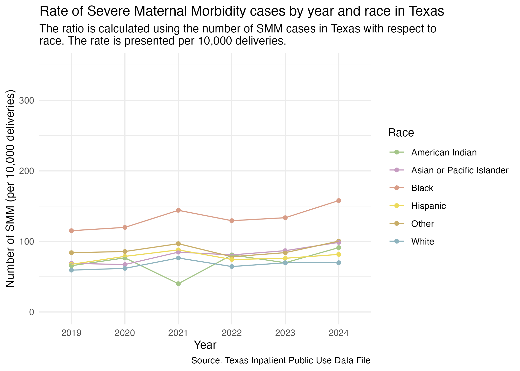
We also want to make this plot into a refined visualization in Datawrapper. We will export the data now to be used in Datawrapper. We will exclude cases defined as “Other.” According to the data dictionary provided with the inpatient data, race was changed to “Other” and ethnicity is suppressed if a hospital has fewer than ten discharges of a race.
tx_race_df <- hcup_smm_rate_tx_race |>
  filter(
    MOD_RACE != "Other"
  ) |>
  select(YR, MOD_RACE, SMM_DEL_PER) |>
  pivot_wider(
    names_from = MOD_RACE,
    values_from = SMM_DEL_PER
  ) |>
  arrange(YR)

tx_race_df |> write_csv("../data-published/datawrapper/tx-race.csv")We can do a similar plot for just Harris County hospitals. First, prep the data.
hcup_smm_rate_harris_race <- deliveries_smm |>
  filter(FAC_CNTY == "Harris") |>
  group_by(YR, MOD_RACE, SMM) |>
  add_smm_calc(10000) |>
  arrange(SMM_DEL_PER |> desc())

hcup_smm_rate_harris_race
There are much fewer American Indian cases than other races.
Now, plot.
smm_race_yr_harris_plot <- hcup_smm_rate_harris_race |>
  ggplot(aes(x = YR, y = SMM_DEL_PER)) +
  geom_point(aes(color = MOD_RACE)) +
  geom_line(aes(color = MOD_RACE, group = MOD_RACE)) +
  scale_y_continuous(n.breaks = 10, limits = c(0, 350)) +
  scale_color_manual(values = race_colors, name = "Race") +
  labs(
    title = "Rate of Severe Maternal Morbidity cases by year and race in Harris County",
    subtitle = str_wrap("The ratio is calculated using the number of SMM cases in Harris County with respect to race. The rate is presented per 10,000 deliveries."),
    x = "Year", y = "Number of SMM (per 10,000 deliveries)",
    caption = "Source: Texas Inpatient Public Use Data File"
  ) +
  theme_minimal()

ggsave("../data-published/figures/smm/smm-race-yr-harris.png")
Saved Version:
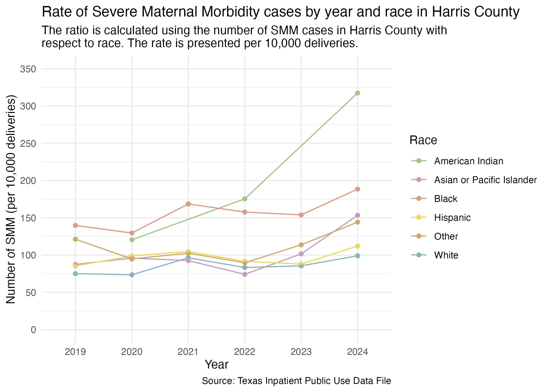
We will also export this data to be plotted using Datawrapper. We will also exclude the “Other” category for the reasons previously described.
harris_race_df <- hcup_smm_rate_harris_race |>
  filter(
    MOD_RACE != "Other"
  ) |>
  select(YR, MOD_RACE, SMM_DEL_PER) |>
  pivot_wider(
    names_from = MOD_RACE,
    values_from = SMM_DEL_PER
  ) |>
  arrange(YR)

harris_race_df |> write_csv("../data-published/datawrapper/harris-race.csv")NOTE: The following graphs are exploratory and do not exclude races/ethnicities that have very few cases. This may skew the data. More official graphs were made available in the Introduction that takes care of this.
Look at individual hospitals now also with race. First, prep the data.
hcup_smm_rate_hosp_race <- deliveries_smm |>
  filter(FAC_CNTY == "Harris") |>
  group_by(YR, THCIC_ID, MOD_RACE, FAC_NAME, SMM) |>
  add_smm_calc(10000) |>
  arrange(SMM_DEL_PER |> desc())

hcup_smm_rate_hosp_race
NOTE: There are some hospitals that are working off of VERY FEW cases compared to other hospitals for each race. For example, HCA Houston Healthcare Southeast has 3 out of 28 Asian patients that report SMM, making the SMM rate 9.7% of all cases.
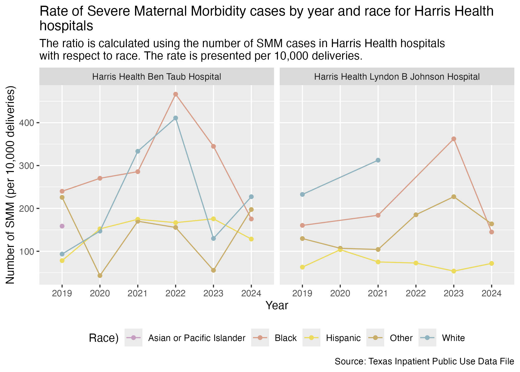
This section will look at all of the Harris Health hospitals with race data included.
smm_hosp_race_harris_health_plot <- hcup_smm_rate_hosp_race |>
  filter(FAC_NAME %in% harris_health_list) |>
  create_race_graph() +
  labs(
    title = str_wrap("Rate of Severe Maternal Morbidity cases by year and race for Harris Health hospitals"),
    subtitle = str_wrap("The ratio is calculated using the number of SMM cases in Harris Health hospitals with respect to race. The rate is presented per 10,000 deliveries."),
    x = "Year", y = "Number of SMM (per 10,000 deliveries)",
    caption = "Source: Texas Inpatient Public Use Data File"
  )

ggsave("../data-published/figures/smm/smm-hosp-race-harris-health.png")
Saved Version:
Now, HCA Houston Healthcare hospitals.
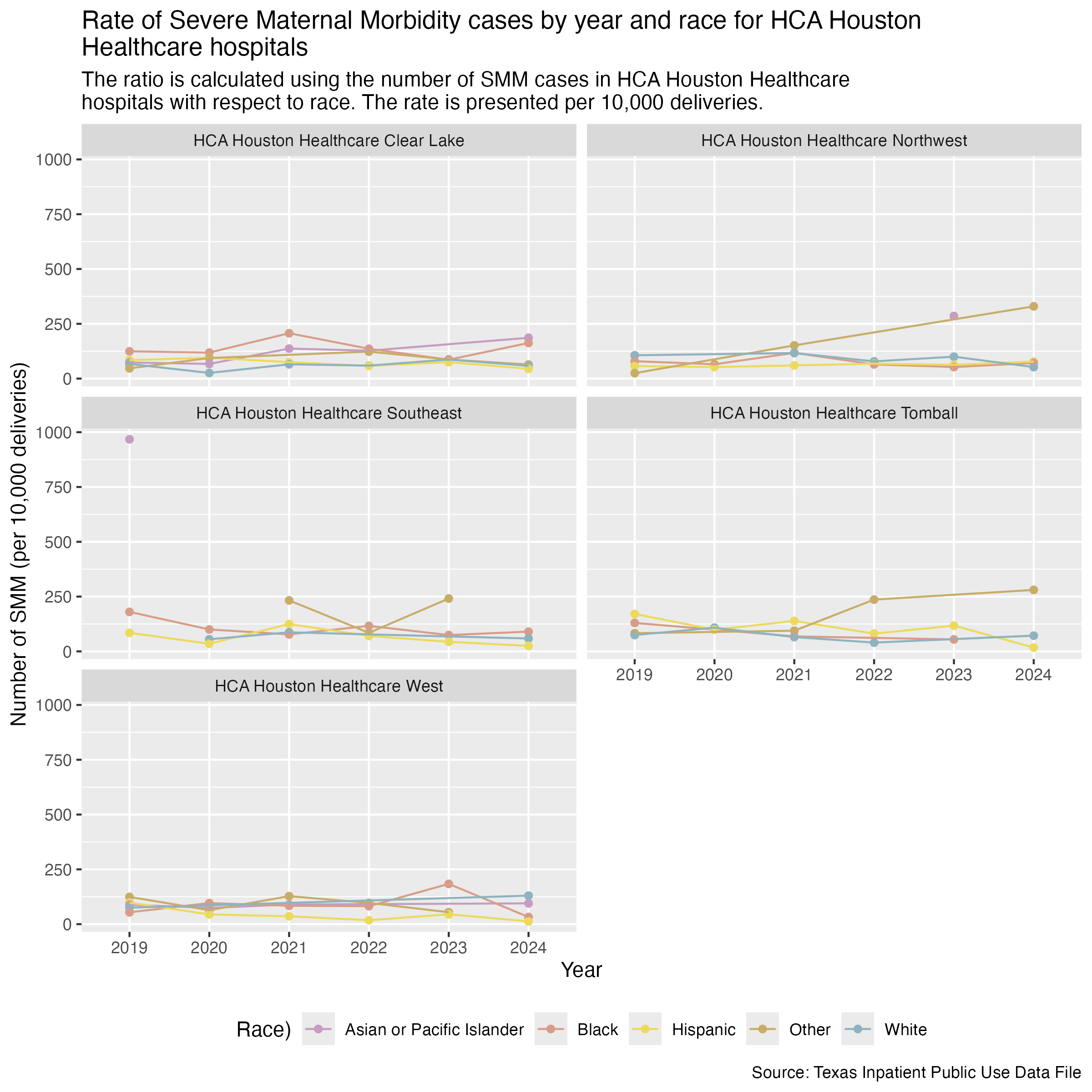
smm_hosp_race_hca_plot <- hcup_smm_rate_hosp_race |>
  filter(
    FAC_NAME %in% hca_list
  ) |>
  create_race_graph() +
  labs(
    title = str_wrap("Rate of Severe Maternal Morbidity cases by year and race for HCA Houston Healthcare hospitals"),
    subtitle = str_wrap("The ratio is calculated using the number of SMM cases in HCA Houston Healthcare hospitals with respect to race. The rate is presented per 10,000 deliveries."),
    x = "Year", y = "Number of SMM (per 10,000 deliveries)",
    caption = "Source: Texas Inpatient Public Use Data File"
  )

ggsave("../data-published/figures/smm/smm-hosp-race-hca.png", width = 8, height = 8, units = "in")
Saved Version:
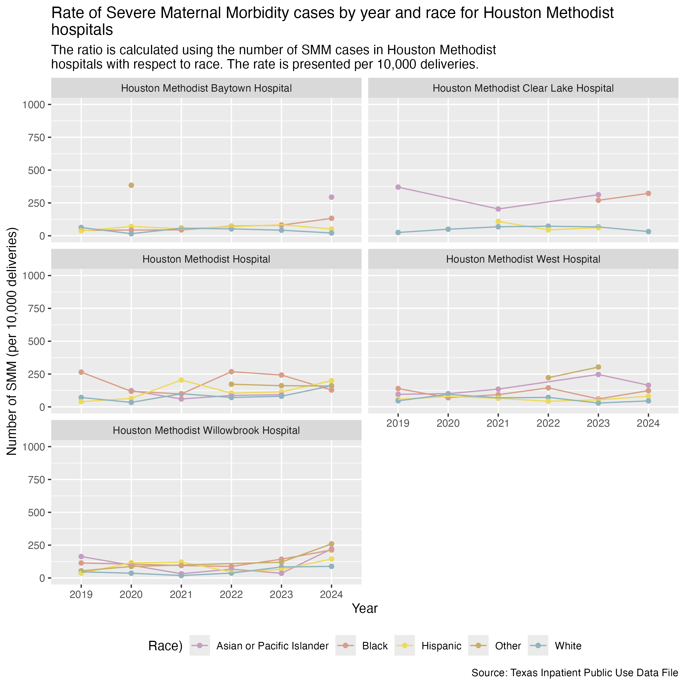
Houston Methodist hospitals.
Need to look at some exploratory data to make sure that we’re plotting all of the years that surpass 30 cases for a race. Monique noticed that there seemed to be missing data for Black people between 2019-2022.
deliveries_smm |>
  filter(
    FAC_NAME == "Houston Methodist Clear Lake Hospital"
  ) |>
  group_by(YR, MOD_RACE, SMM) |>
  summarize(CNT = n()) |>
  filter(
    MOD_RACE == "Black"
  )
There are actually no cases of SMM for Black people in 2019-2022. Only one case in 2023 and one case in 2024.
smm_hosp_race_houston_methodist_plot <- hcup_smm_rate_hosp_race |>
  filter(
    FAC_NAME %in% houston_methodist_list
  ) |>
  create_race_graph() +
  scale_y_continuous(limits = c(0, 1000)) +
  labs(
    title = str_wrap("Rate of Severe Maternal Morbidity cases by year and race for Houston Methodist hospitals"),
    subtitle = str_wrap("The ratio is calculated using the number of SMM cases in Houston Methodist hospitals with respect to race. The rate is presented per 10,000 deliveries."),
    x = "Year", y = "Number of SMM (per 10,000 deliveries)",
    caption = "Source: Texas Inpatient Public Use Data File"
  )

ggsave("../data-published/figures/smm/smm-hosp-race-houston-methodist.png", width = 8, height = 8, units = "in")
Saved Version:
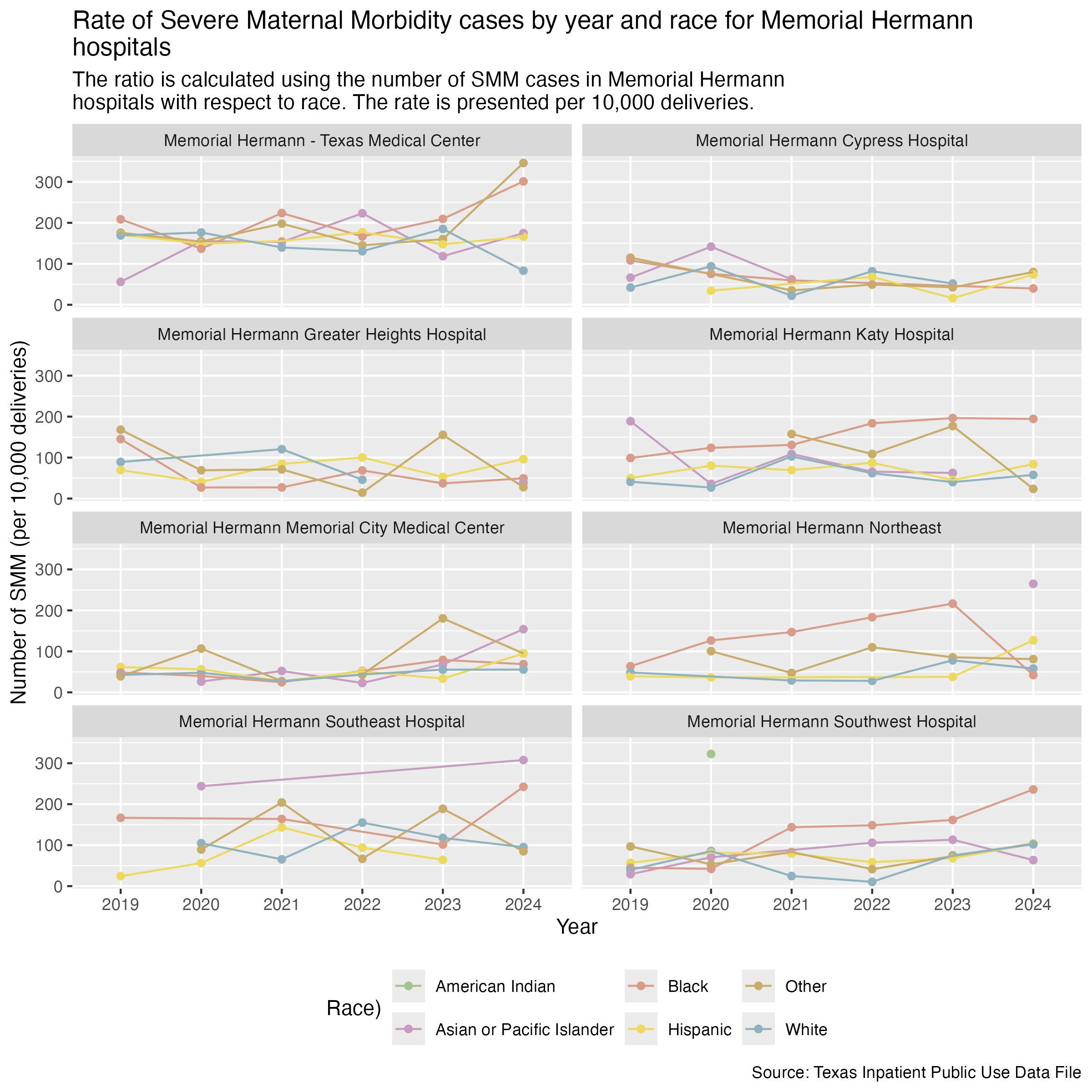
Finally, Memorial Hermann hospitals.
smm_hosp_race_memorial_hermann_plot <- hcup_smm_rate_hosp_race |>
  filter(
    FAC_NAME %in% memorial_hermann_list
  ) |>
  create_race_graph() +
  labs(
    title = str_wrap("Rate of Severe Maternal Morbidity cases by year and race for Memorial Hermann hospitals"),
    subtitle = str_wrap("The ratio is calculated using the number of SMM cases in Memorial Hermann hospitals with respect to race. The rate is presented per 10,000 deliveries."),
    x = "Year", y = "Number of SMM (per 10,000 deliveries)",
    caption = "Source: Texas Inpatient Public Use Data File"
  )

ggsave("../data-published/figures/smm/smm-hosp-race-memorial-hermann.png", width = 8, height = 8, units = "in")
Saved Version:
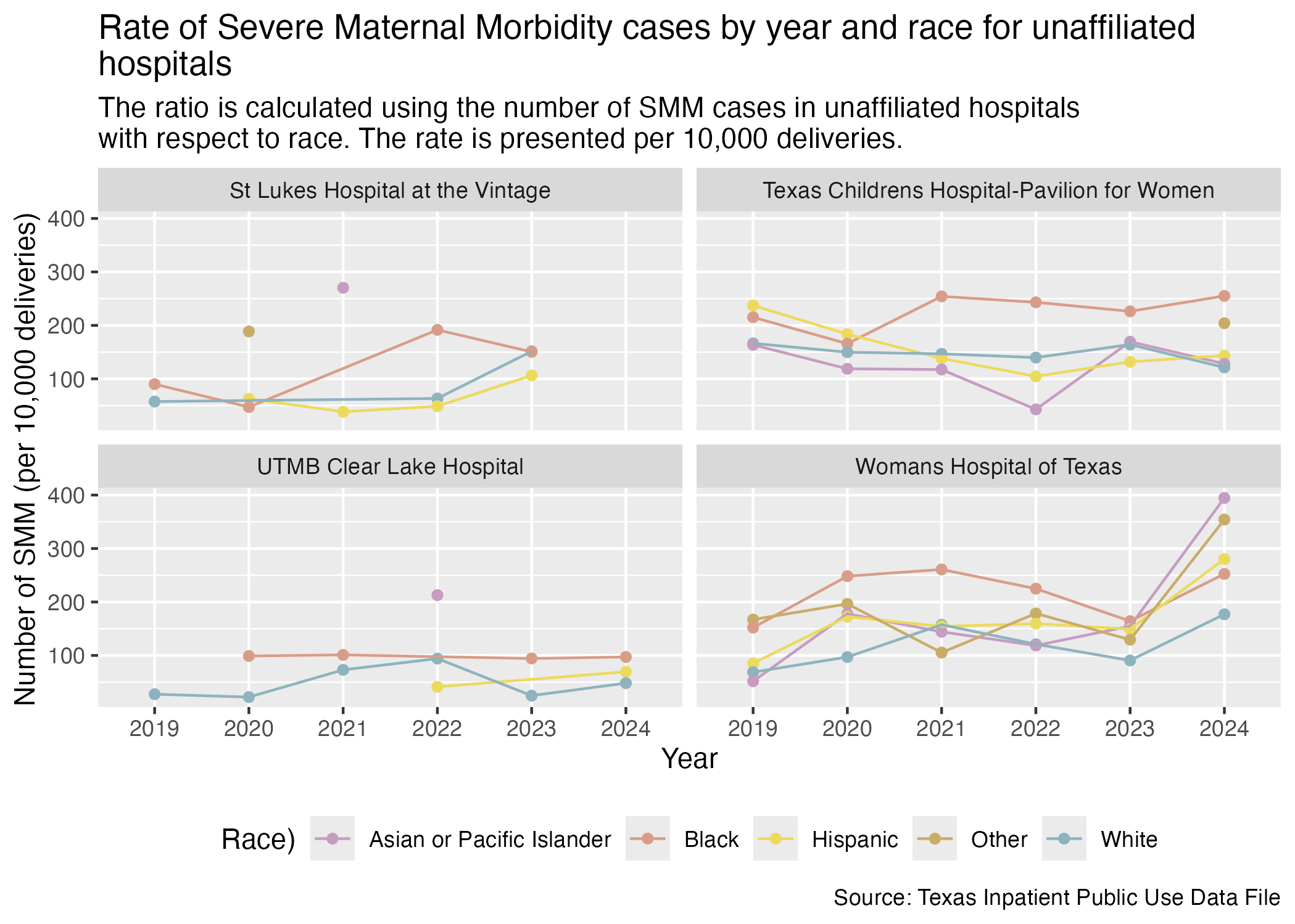
Here are the race breakdowns for all of the hospitals that don’t fall under a brand.
smm_hosp_race_unaffiliated_plot <- hcup_smm_rate_hosp_race |>
  filter(
    FAC_NAME %in% unaffiliated_list
  ) |>
  create_race_graph() +
  labs(
    title = str_wrap("Rate of Severe Maternal Morbidity cases by year and race for unaffiliated hospitals"),
    subtitle = str_wrap("The ratio is calculated using the number of SMM cases in unaffiliated hospitals with respect to race. The rate is presented per 10,000 deliveries."),
    x = "Year", y = "Number of SMM (per 10,000 deliveries)",
    caption = "Source: Texas Inpatient Public Use Data File"
  )

ggsave("../data-published/figures/smm/smm-hosp-race-unaffiliated.png")
Saved Version:
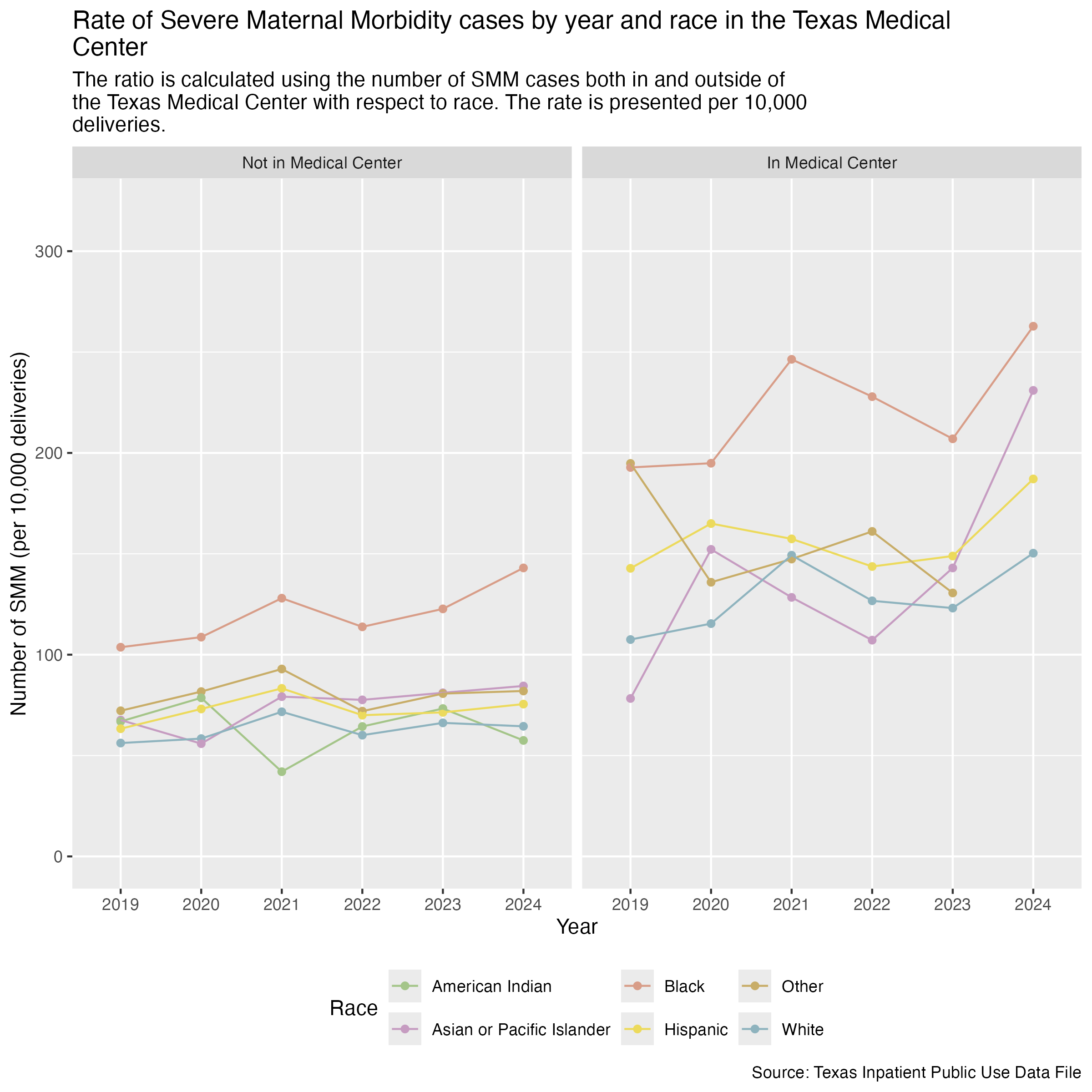
We will also compare by race for the hospitals in the Medical Center area and for those outside of the Medical Center area.
First, let’s create a data frame that determines whether the hospital is in the Medical Center and include considerations of race and ethnicity.
hcup_smm_rate_tmc_race <- deliveries_smm |>
  mutate(
    TMC = if_else(FAC_NAME %in% tmc_list, T, F)
  ) |>
  group_by(YR, TMC, MOD_RACE, SMM) |>
  add_smm_calc(10000) |>
  arrange(SMM_DEL_PER |> desc())

hcup_smm_rate_tmc_race
Now we can create two graphs side by side so that we can compare the differences for race between whether a hospital is in the Medical Center or not.
tmc_labels <- c("FALSE" = "Not in Medical Center", "TRUE" = "In Medical Center")

smm_race_tmc_plot <- hcup_smm_rate_tmc_race |>
  ggplot(aes(x = YR, y = SMM_DEL_PER)) +
  geom_point(aes(color = MOD_RACE)) +
  geom_line(aes(color = MOD_RACE, group = MOD_RACE)) +
  scale_color_manual(values = race_colors, name = "Race") +
  scale_y_continuous(limits = c(0, 320)) +
  facet_wrap(~ TMC, labeller = as_labeller(tmc_labels)) +
  labs(
    title = str_wrap("Rate of Severe Maternal Morbidity cases by year and race in the Texas Medical Center"),
    subtitle = str_wrap("The ratio is calculated using the number of SMM cases both in and outside of the Texas Medical Center with respect to race. The rate is presented per 10,000 deliveries."),
    x = "Year", y = "Number of SMM (per 10,000 deliveries)",
    caption = "Source: Texas Inpatient Public Use Data File"
  ) +
  theme(
    legend.position = "bottom"
  )

ggsave("../data-published/figures/smm/smm-race-tmc.png", width = 8, height = 8, units = "in")
Saved Version: