Expand this to see code
library(tidyverse)
library(janitor)
library(DT)We want to analyze the Vaginal Birth After Cesarean delivery rate for “uncomplicated” births, as defined by IQI 22 Vaginal Birth After Cesarean (VBAC) Delivery Rate, Uncomplicated in 2025:
“Vaginal births per 1,000 deliveries by patients with previous Cesarean deliveries. Excludes deliveries with complications (abnormal presentation, preterm delivery, fetal death, multiple gestation, or breech presentation).
Loading libraries.
library(tidyverse)
library(janitor)
library(DT)We previously created a data set that flagged VBAC deliveries in the Categorization notebook.. We will need to import that data to this notebook so that we can do some analysis.
tx_deliveries_vbac <- read_rds("../data-processed/vbac.rds")Additionally, since our breakdown involves breaking down these rates by hospital, we need some of the lists that we created in the Stored Lists notebook.These lists group by brand for the hospital as well as distinguish whether a hospital is in the Texas Medical Center.
# list of Texas Medical Center hospitals
tmc_list <- read_rds("../data-published/technical-specs/tmc.rds") |> pull(name)

# brand and unaffiliated lists
harris_health_list <- read_rds("../data-published/technical-specs/harris_health.rds") |> pull(name)
hca_list <- read_rds("../data-published/technical-specs/hca.rds") |> pull(name)
houston_methodist_list <- read_rds("../data-published/technical-specs/houston_methodist.rds") |> pull(name)
memorial_hermann_list <- read_rds("../data-published/technical-specs/memorial_hermann.rds") |> pull(name)
unaffiliated_list <- read_rds("../data-published/technical-specs/unaffiliated.rds") |> pull(name)Here I’m going to define some functions that will help us to make some graphs with varying parts of the data.
First, we’ll make a function that allows us to add the VBAC delivery rate.
add_vbac_calc <- function(.data, num_del) {
  .data |>
    summarize(CNT = n()) |>
    pivot_wider(names_from = VBAC, values_from = CNT) |>
    rename(
      NON_VBAC_CNT = "FALSE",
      VBAC_CNT = "TRUE"
    ) |>
    mutate(
      TOTAL = NON_VBAC_CNT + VBAC_CNT
    ) |>
    filter(
      TOTAL > 30
    ) |>
    mutate(
      # this gives us the percentage of total deliveries that are VBAC
      VBAC_RATE = round_half_up((VBAC_CNT / TOTAL) * 100, 1)
    ) |>
    mutate(
      # we want to create a column that will use the rate we previously
      # calculated to give us a number out of how many deliveries would appear
      # as VBAC -- use an adjustable value so I don't have to change this
      # if we decide on a different number
      VBAC_DEL_PER = round_half_up((VBAC_CNT / TOTAL) * num_del, 1)
    )
}add_medicaid <- function(.data, num_del) {
.data |>
group_by(YR, VBAC_MC_CATEGORY) |>
summarize(CNT = n()) |>
pivot_wider(names_from = VBAC_MC_CATEGORY, values_from = CNT) |>
mutate(
TOTAL_MC = NONVBAC_MC + VBAC_MC,
TOTAL_NONMC = NONVBAC_NONMC + VBAC_NONMC
) |>
# filter out few cases
filter(TOTAL_MC > 30 | TOTAL_NONMC > 30) |>
mutate(
MC_DEL_PER = round_half_up((VBAC_MC / TOTAL_MC) * num_del, 1),
NONMC_DEL_PER = round_half_up((VBAC_NONMC / TOTAL_NONMC) * num_del, 1)
) |>
pivot_longer(
cols = c(MC_DEL_PER, NONMC_DEL_PER),
names_to = "DEL_PER_TYPE",
values_to = "DEL_PER"
)
}Let’s also make a function that provides a template for what the individual hospital graphs will look like.
create_hosp_graph <- function(.data) {
  .data |>
    ggplot(aes(x = YR, y = VBAC_DEL_PER)) +
    geom_col() +
    scale_y_continuous(limits = c(0, 325)) +
    geom_text(aes(label = VBAC_DEL_PER), vjust = -1, color = "black", size = 3) +
    facet_wrap(~ FAC_NAME, ncol = 2) +
    theme(
      legend.position = "bottom"
    )
}We can make our lives so much easier by making a function for each individual graph, similar to the one above, that also includes race.
First let’s define some colors that we’ll use for the race graphs. We want these colors to be consistent across all of the plots. We are using colors based on a Washington Post article on the subject.
race_colors <- c(
  "Hispanic" = "#ecda5c",
  "American Indian" = "#a4c589",
  "Asian or Pacific Islander" = "#c69cc1",
  "Black" = "#d89d88",
  "White" = "#8eb3be",
  "Other" = "#c8ad68"
)
Now we can build a function to create race graphs using these specified colors.
 create_race_graph <- function(.data) {
   .data |>
     ggplot(aes(x = YR, y = VBAC_DEL_PER)) +
     geom_point(aes(color = MOD_RACE)) +
     geom_line(aes(color = MOD_RACE, group = MOD_RACE)) +
     scale_y_continuous(limits = c(0, 350)) +
     scale_color_manual(values = race_colors, name = "Race") +
     facet_wrap(~ FAC_NAME, ncol = 2) +
     theme(
       legend.position = "bottom"
     )
}In order to showcase the data visually, there are some things we have to do to the dataset in order to prepare it to be plotted/shown in a table. This includes making a column for the rate per year. We will do this by hospital, but this might not be relevant to certain tables.
ahrq_vbac_rate_tx <- tx_deliveries_vbac |>
group_by(YR, VBAC) |>
add_vbac_calc(1000)
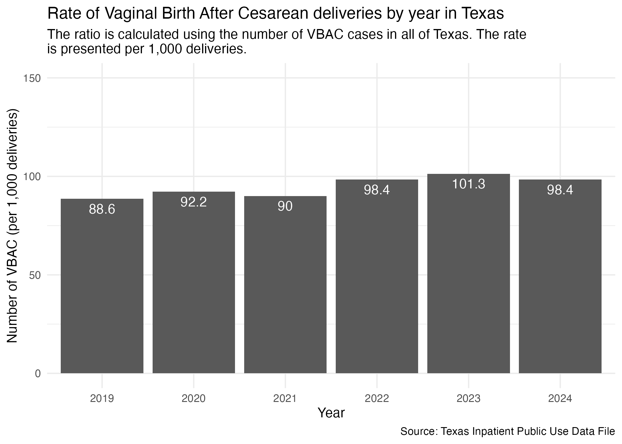
ahrq_vbac_rate_txNow, plot.
vbac_yr_tx <- ahrq_vbac_rate_tx |>
  ggplot(aes(x = YR, y = VBAC_DEL_PER)) +
  geom_col() +
  scale_y_continuous(limits = c(0, 150)) +
  geom_text(aes(label = VBAC_DEL_PER), vjust = 1.5, color = "white") +
  labs(
    title = "Rate of Vaginal Birth After Cesarean deliveries by year in Texas",
    subtitle = str_wrap("The ratio is calculated using the number of VBAC cases in all of Texas. The rate is presented per 1,000 deliveries."),
    x = "Year", y = "Number of VBAC (per 1,000 deliveries)",
    caption = "Source: Texas Inpatient Public Use Data File"
  ) +
  theme_minimal()

ggsave("../data-published/figures/vbac/vbac-yr-tx.png")
Saved Version:
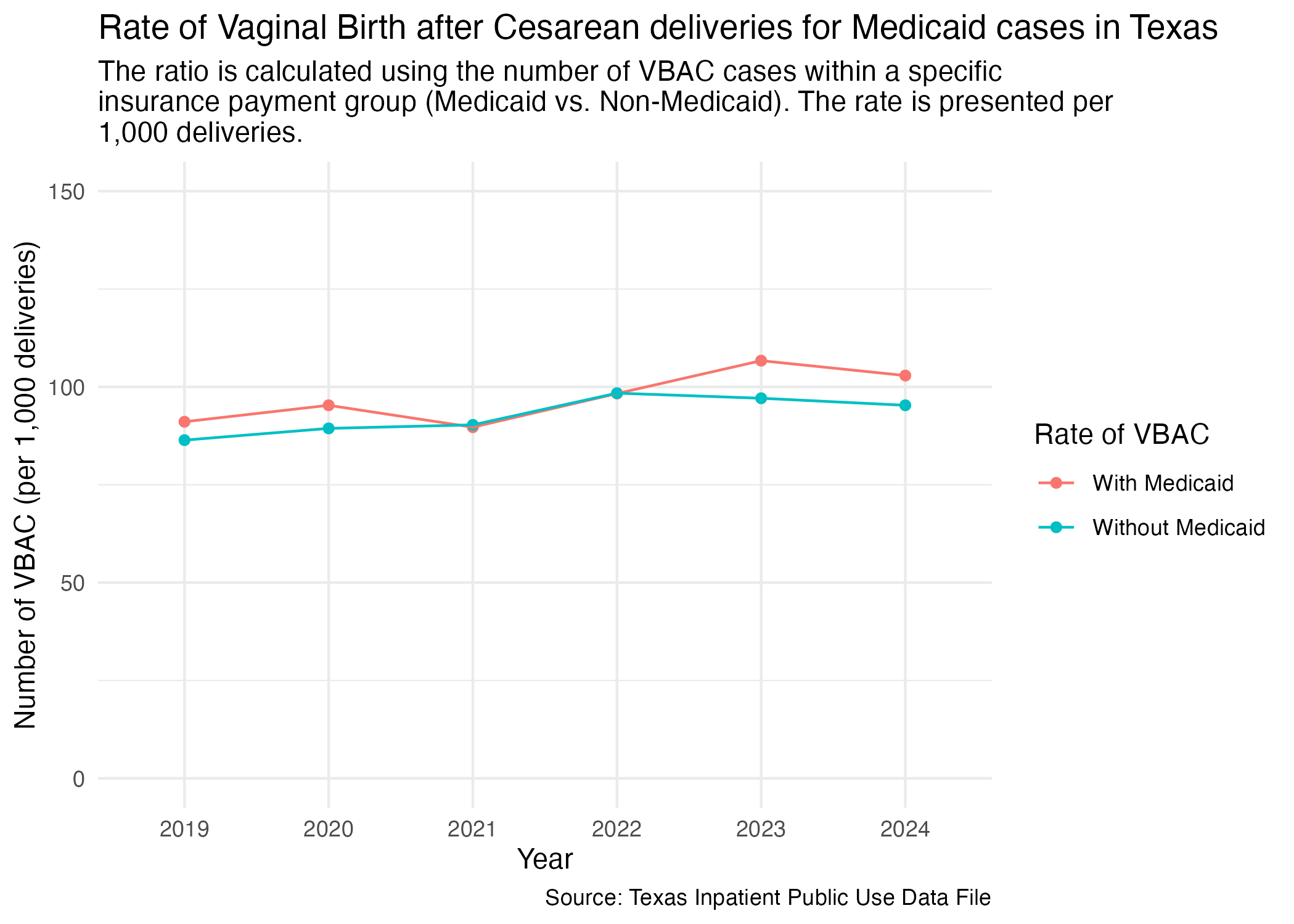
As a part of this analysis, we are interested in how Medicaid factors into these procedures. We want to see what percentage of VBACs were paid for with Medicaid in the state of Texas (and later in Harris County). First, let’s add a medicaid percentage for each year in the Texas data.
vbac_mc_tx <- tx_deliveries_vbac |>
  add_medicaid(1000)

vbac_mc_tx
Now, plot.
vbac_mc_tx_plot <- vbac_mc_tx |>
  ggplot(aes(x = YR, y = DEL_PER, group = DEL_PER_TYPE)) +
  geom_point(aes(color = DEL_PER_TYPE)) +
  geom_line(aes(color = DEL_PER_TYPE)) +
  scale_y_continuous(limits = c(0, 150)) +
  scale_color_discrete(labels = c("With Medicaid", "Without Medicaid"), name = "Rate of VBAC") +
  labs(
    title = str_wrap("Rate of Vaginal Birth after Cesarean deliveries for Medicaid cases in Texas"),
    subtitle = str_wrap("The ratio is calculated using the number of VBAC cases within a specific insurance payment group (Medicaid vs. Non-Medicaid). The rate is presented per 1,000 deliveries."),
    x = "Year", y = "Number of VBAC (per 1,000 deliveries)",
    caption = "Source: Texas Inpatient Public Use Data File"
  ) +
  theme_minimal()

ggsave("../data-published/figures/vbac/vbac-mc-tx.png")
Saved Version:
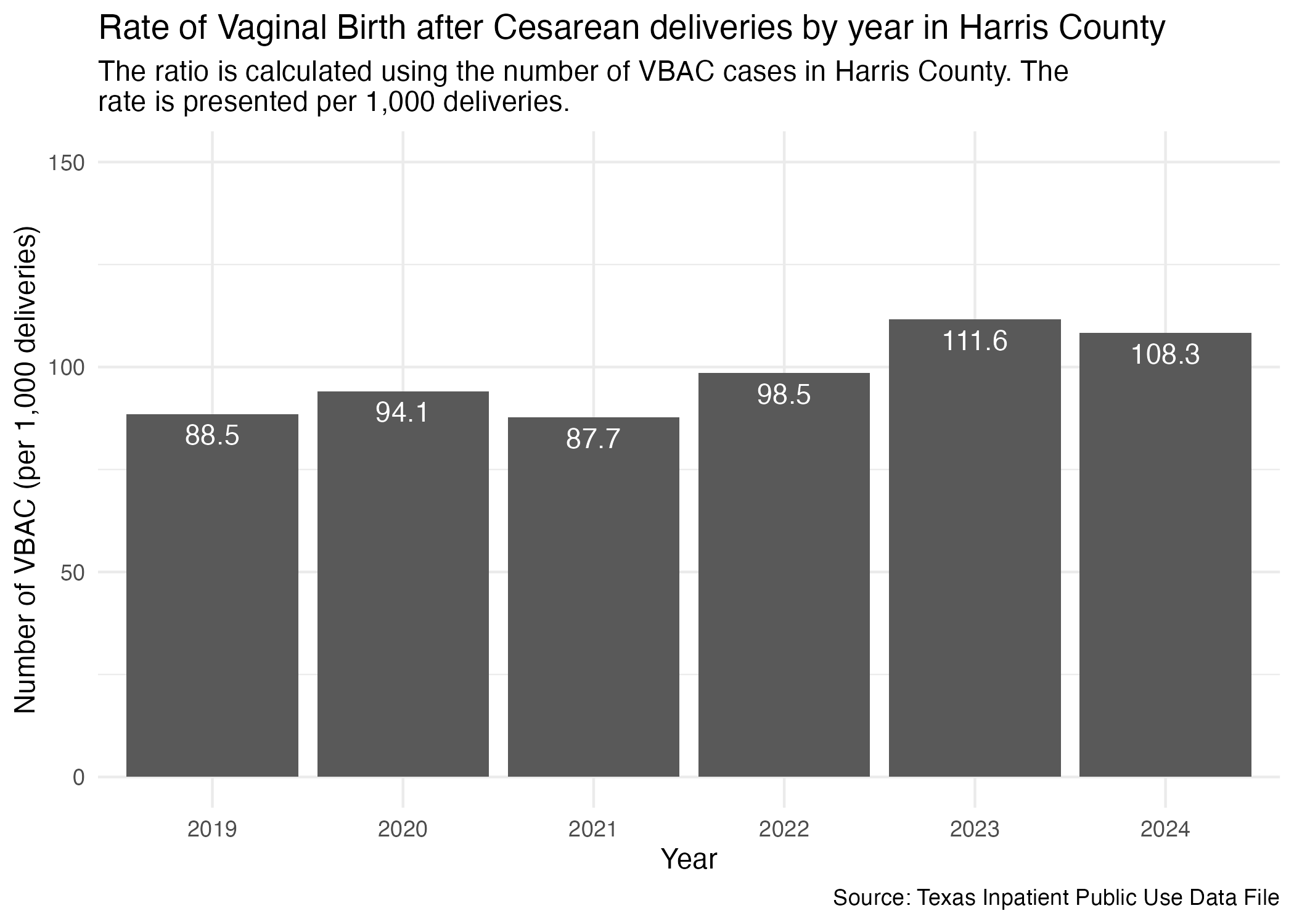
Need to limit the statewide data to just Harris County like we had done in the cleaning notebook.
ahrq_vbac_rate_harris <- tx_deliveries_vbac |>
  filter(FAC_CNTY == "Harris") |>
  group_by(YR, VBAC) |>
  add_vbac_calc(1000)

ahrq_vbac_rate_harris
We can now plot it similar to how we did statewide.
vbac_yr_harris <- ahrq_vbac_rate_harris |>
  ggplot(aes(x = YR, y = VBAC_DEL_PER)) +
  geom_col() +
  scale_y_continuous(limits = c(0, 150)) +
  geom_text(aes(label = VBAC_DEL_PER), vjust = 1.5, color = "white") +
  labs(
    title = "Rate of Vaginal Birth after Cesarean deliveries by year in Harris County",
    subtitle = str_wrap("The ratio is calculated using the number of VBAC cases in Harris County. The rate is presented per 1,000 deliveries."),
    x = "Year", y = "Number of VBAC (per 1,000 deliveries)",
    caption = "Source: Texas Inpatient Public Use Data File"
  ) +
  theme_minimal()

ggsave("../data-published/figures/vbac/vbac-yr-harris.png")
Saved Version:
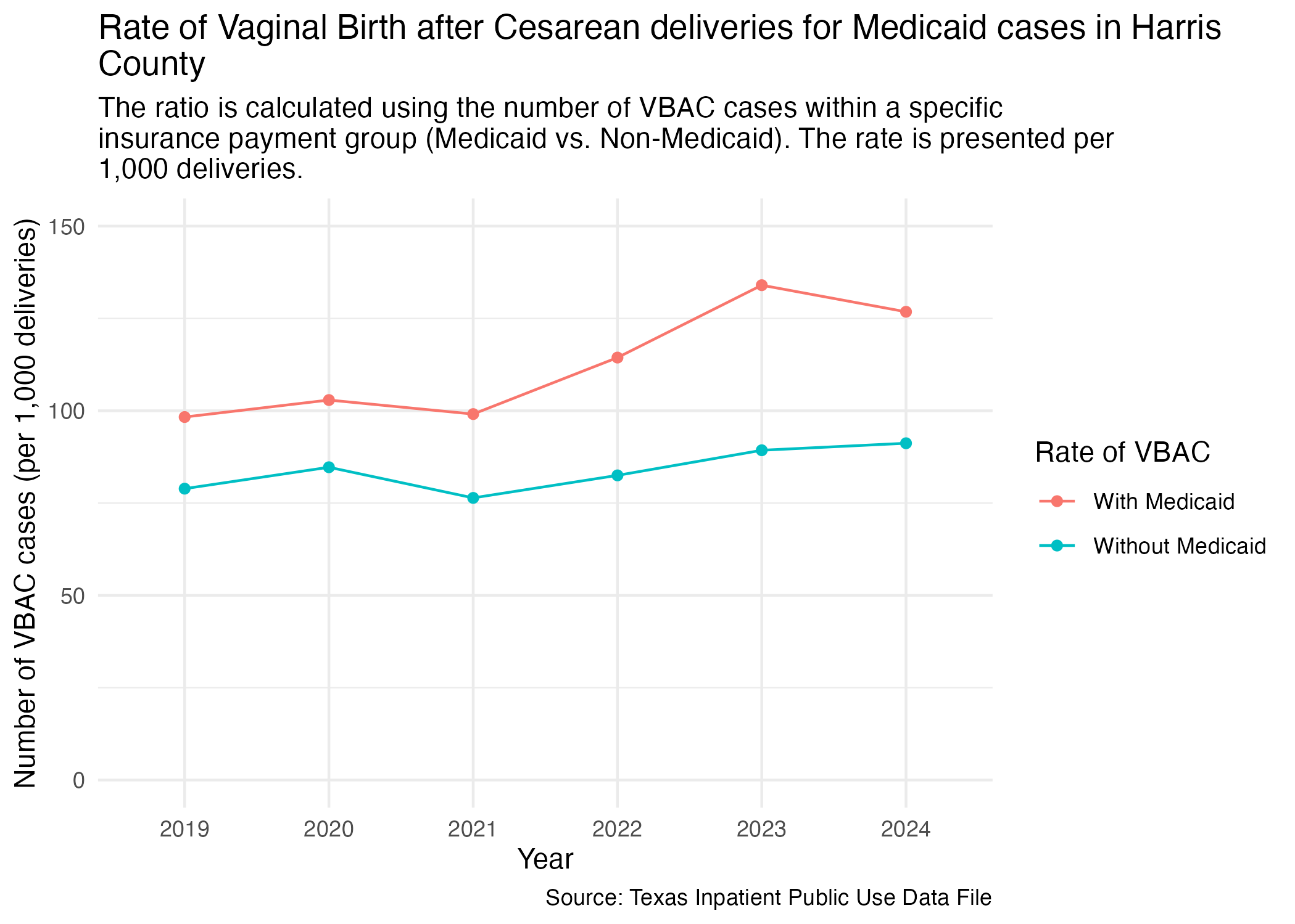
We are interested in the same analysis of the percentage of VBAC deliveries paid for with Medicaid for the state of Texas but specifically for Harris County. First, we need to filter for just Harris County.
vbac_mc_harris <- tx_deliveries_vbac |>
  filter(FAC_CNTY == "Harris") |>
  add_medicaid(1000)

vbac_mc_harris
Now, plot.
vbac_mc_harris_plot <- vbac_mc_harris |>
  ggplot(aes(x = YR, y = DEL_PER, group = DEL_PER_TYPE)) +
  geom_point(aes(color = DEL_PER_TYPE)) +
  geom_line(aes(color = DEL_PER_TYPE)) +
  scale_y_continuous(limits = c(0, 150)) +
  scale_color_discrete(labels = c("With Medicaid", "Without Medicaid"), name = "Rate of VBAC") +
  labs(
    title = str_wrap("Rate of Vaginal Birth after Cesarean deliveries for Medicaid cases in Harris County"),
    subtitle = str_wrap("The ratio is calculated using the number of VBAC cases within a specific insurance payment group (Medicaid vs. Non-Medicaid). The rate is presented per 1,000 deliveries."),
    x = "Year", y = "Number of VBAC cases (per 1,000 deliveries)",
    caption = "Source: Texas Inpatient Public Use Data File"
  ) +
  theme_minimal()

ggsave("../data-published/figures/vbac/vbac-mc-harris.png")
Saved Version:
NOTE: Splitting up the cases by hospitals means that there are only hundreds of cases per hospital. Fewer cases could cause the rate to be different from the state average.
Let’s compare the VBAC delivery rate across different hospitals in Harris County. We’ll prep the data so that it includes the facility’s name and ID.
ahrq_vbac_rate_hosp <- tx_deliveries_vbac |>
  filter(FAC_CNTY == "Harris") |>
  group_by(YR, THCIC_ID, FAC_NAME, VBAC) |>
  add_vbac_calc(1000)

ahrq_vbac_rate_hosp |> datatable()
Now we can plot all of the individual hospitals into separate graphs. We’ll group up individual graphs by brand and by location.
Here are the brands of hospitals found in the Harris County data:
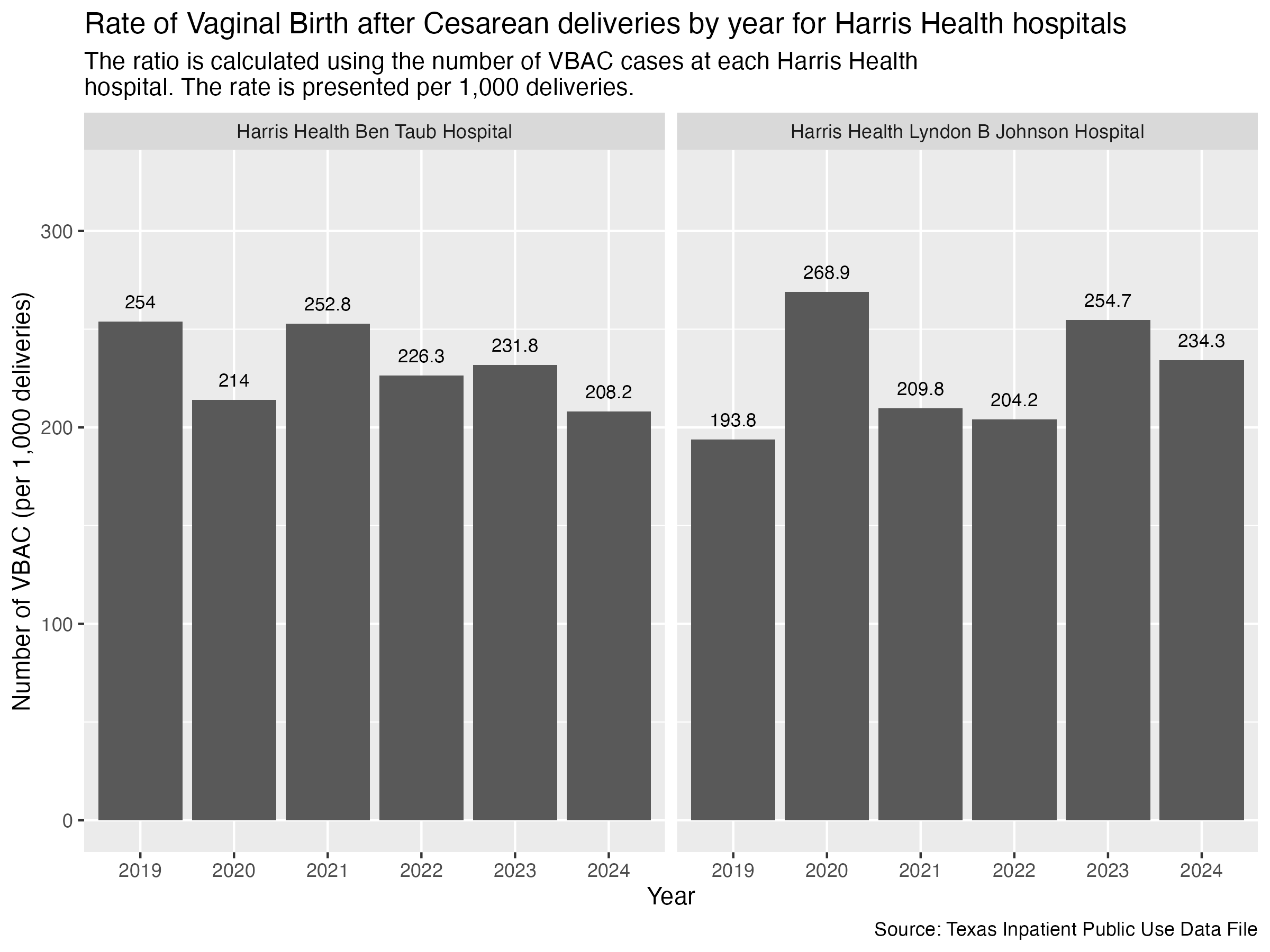
Let’s take a look at the Harris Health hospitals.
vbac_hosp_harris_health <- ahrq_vbac_rate_hosp |>
  filter(
    FAC_NAME %in% harris_health_list
    ) |>
  create_hosp_graph() +
  labs(
    title = "Rate of Vaginal Birth after Cesarean deliveries by year for Harris Health hospitals",
    subtitle = str_wrap("The ratio is calculated using the number of VBAC cases at each Harris Health hospital. The rate is presented per 1,000 deliveries."),
    x = "Year", y = "Number of VBAC (per 1,000 deliveries)",
    caption = "Source: Texas Inpatient Public Use Data File"
  )

ggsave("../data-published/figures/vbac/vbac-hosp-harris-health.png", height = 6, width = 8, units = "in")
Saved Version:
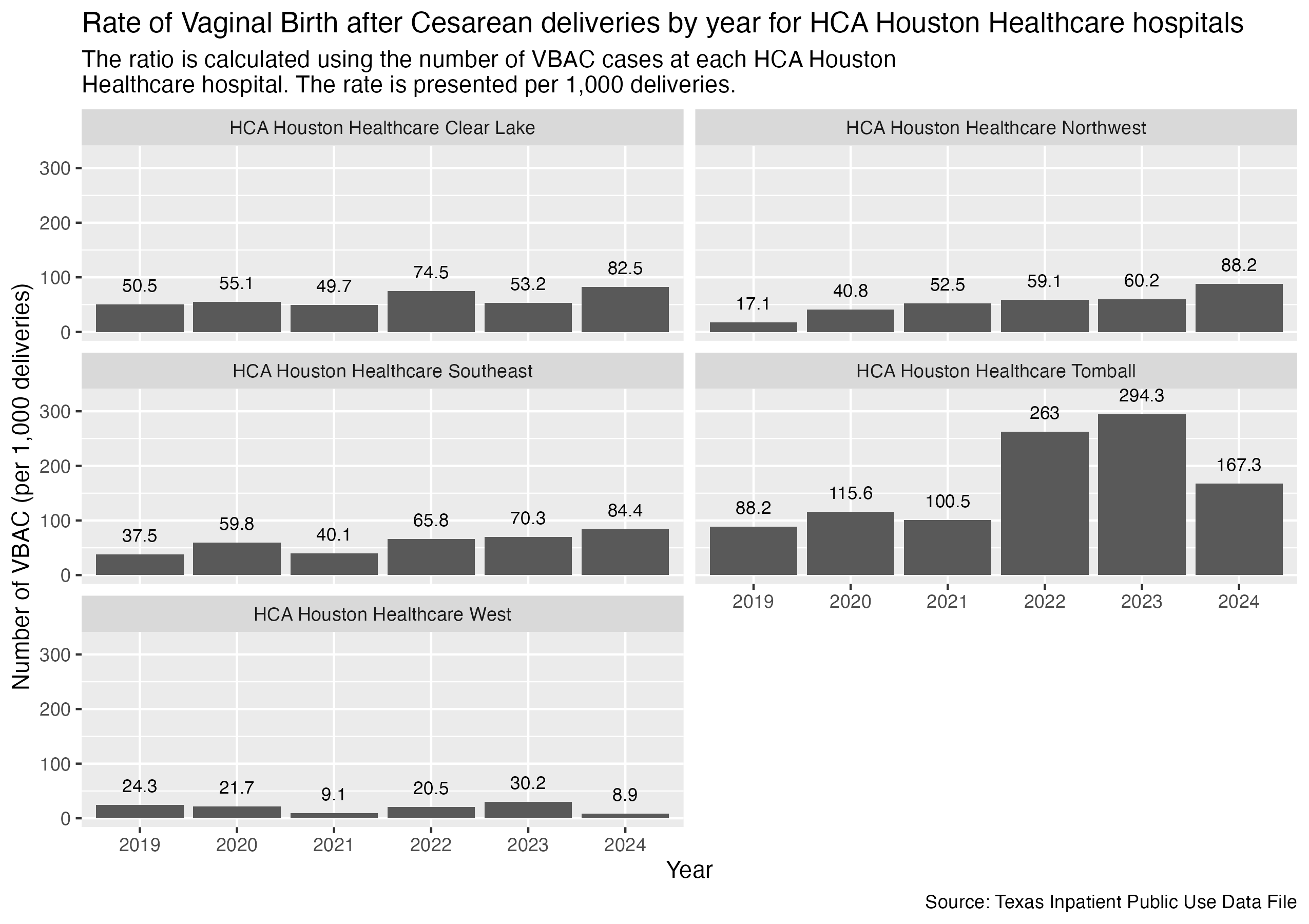
Same with HCA Houston Healthcare hospitals.
vbac_hosp_hca <- ahrq_vbac_rate_hosp |>
  filter(
    FAC_NAME %in% hca_list
    ) |>
  create_hosp_graph() +
  labs(
    title = "Rate of Vaginal Birth after Cesarean deliveries by year for HCA Houston Healthcare hospitals",
    subtitle = str_wrap("The ratio is calculated using the number of VBAC cases at each HCA Houston Healthcare hospital. The rate is presented per 1,000 deliveries."),
    x = "Year", y = "Number of VBAC (per 1,000 deliveries)",
    caption = "Source: Texas Inpatient Public Use Data File"
  )

ggsave("../data-published/figures/vbac/vbac-hosp-hca.png", width = 8.5, height = 6, units = "in")
Saved Version:
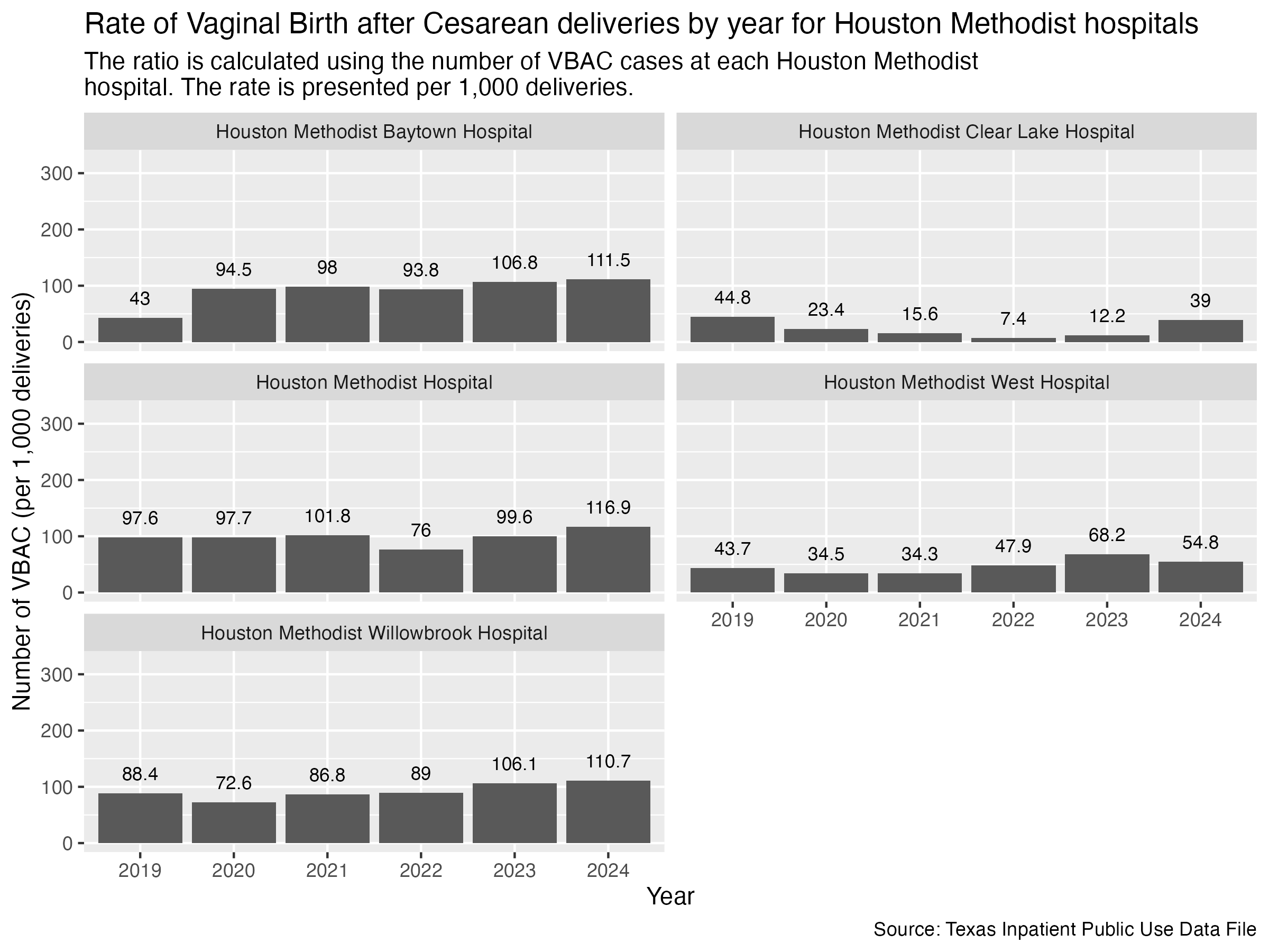
Houston Methodist hospitals next.
vbac_hosp_houston_methodist <- ahrq_vbac_rate_hosp |>
  filter(
    FAC_NAME %in% houston_methodist_list
    ) |>
  create_hosp_graph() +
  labs(
    title = "Rate of Vaginal Birth after Cesarean deliveries by year for Houston Methodist hospitals",
    subtitle = str_wrap("The ratio is calculated using the number of VBAC cases at each Houston Methodist hospital. The rate is presented per 1,000 deliveries."),
    x = "Year", y = "Number of VBAC (per 1,000 deliveries)",
    caption = "Source: Texas Inpatient Public Use Data File"
  )

ggsave("../data-published/figures/vbac/vbac-hosp-houston-methodist.png", width = 8, height = 6, units = "in")
Saved Version:
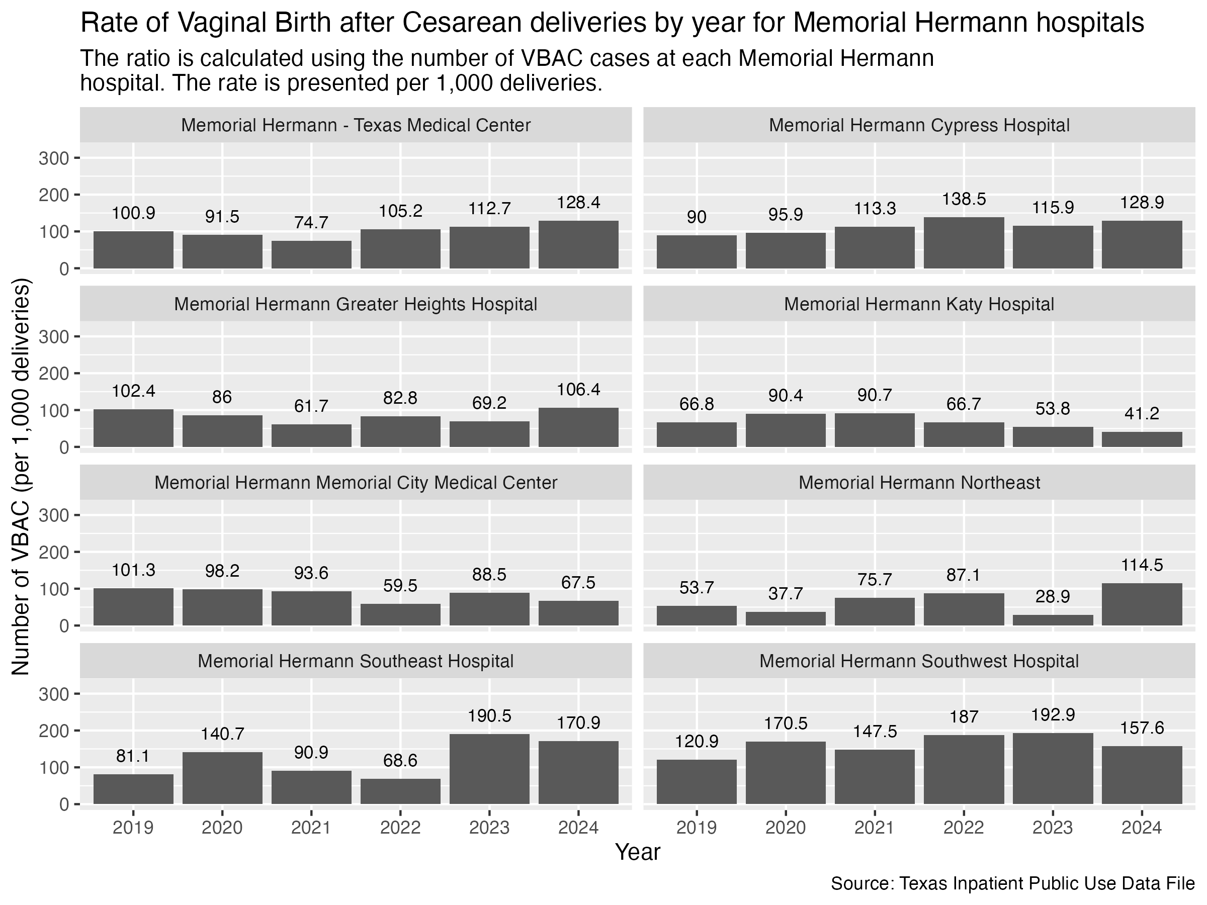
Finally, Memorial Hermann hospitals.
vbac_hosp_memorial_hermann <- ahrq_vbac_rate_hosp |>
  filter(
    FAC_NAME %in% memorial_hermann_list
    ) |>
  create_hosp_graph() +
  labs(
    title = "Rate of Vaginal Birth after Cesarean deliveries by year for Memorial Hermann hospitals",
    subtitle = str_wrap("The ratio is calculated using the number of VBAC cases at each Memorial Hermann hospital. The rate is presented per 1,000 deliveries."),
    x = "Year", y = "Number of VBAC (per 1,000 deliveries)",
    caption = "Source: Texas Inpatient Public Use Data File"
  )

ggsave("../data-published/figures/vbac/vbac-hosp-memorial-hermann.png", width = 8, height = 6, units = "in")
Saved Version:
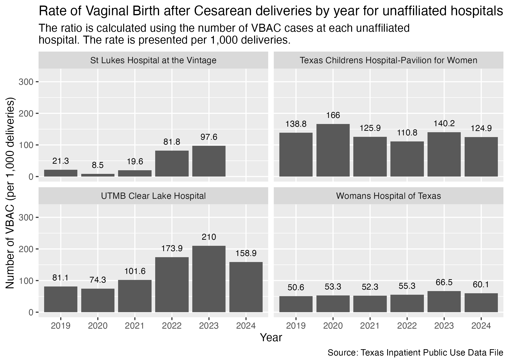
There are some hospitals in Harris County that don’t have other affiliated hospitals across the county. We will put them all into another set of graphs.
vbac_hosp_unaffiliated <- ahrq_vbac_rate_hosp |>
  filter(
    FAC_NAME %in% unaffiliated_list
  ) |>
  create_hosp_graph() +
  labs(
    title = "Rate of Vaginal Birth after Cesarean deliveries by year for unaffiliated hospitals",
    subtitle = str_wrap("The ratio is calculated using the number of VBAC cases at each unaffiliated hospital. The rate is presented per 1,000 deliveries."),
    x = "Year", y = "Number of VBAC (per 1,000 deliveries)",
    caption = "Source: Texas Inpatient Public Use Data File"
  )

ggsave("../data-published/figures/vbac/vbac-hosp-unaffiliated.png")
Saved Version:
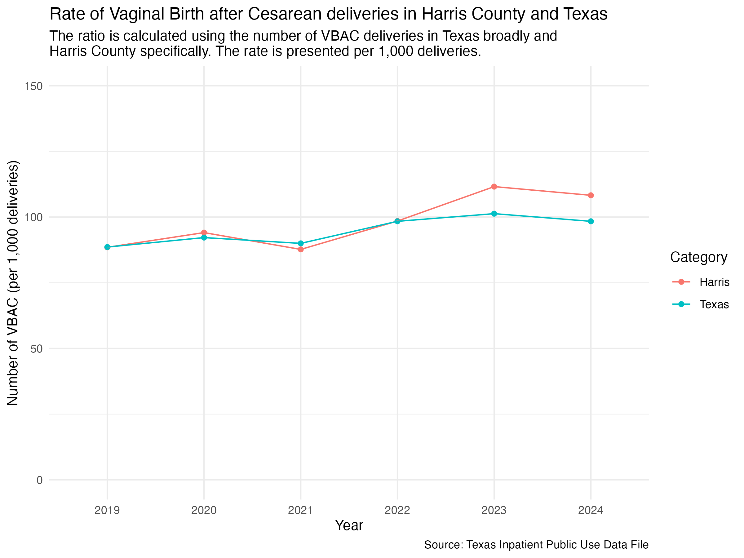
If we want to look at the data for Harris and Texas in one graph, we can plot Harris and Texas as two separate lines.
First, we need to put the Texas and Harris data into one data frame.
ahrq_vbac_rate_combined <- ahrq_vbac_rate_harris |>
  add_column(CATEGORY = "Harris") |>
  bind_rows(ahrq_vbac_rate_tx) |>
  # at this point, any unfilled category entry is a Texas entry
  mutate(
    CATEGORY = if_else(is.na(CATEGORY), "Texas", CATEGORY)
  )

ahrq_vbac_rate_combined
Now we can plot with the grouping being determined by the DEL_PER_TYPE value.
vbac_harris_tx <- ahrq_vbac_rate_combined |>
  ggplot(aes(x = YR, y = VBAC_DEL_PER)) +
  geom_point(aes(color = CATEGORY)) +
  geom_line(aes(color = CATEGORY, group = CATEGORY)) +
  scale_y_continuous(limits = c(0, 150)) +
  scale_color_discrete(name = "Category") +
  labs(
    title = str_wrap("Rate of Vaginal Birth after Cesarean deliveries in Harris County and Texas"),
    subtitle = str_wrap("The ratio is calculated using the number of VBAC deliveries in Texas broadly and Harris County specifically. The rate is presented per 1,000 deliveries."),
    x = "Year", y = "Number of VBAC (per 1,000 deliveries)",
    caption = "Source: Texas Inpatient Public Use Data File"
  ) +
  theme_minimal()

ggsave("../data-published/figures/vbac/vbac-harris-tx.png", width = 8, height = 6, units = "in")
Saved Version:
We are interested in comparing how Harris County and Texas’ percentage of VBAC deliveries paid for with Medicaid differs. In order to see the two in one chart, we need to first create a data frame that contains both data sets.
vbac_mc_combined <- vbac_mc_harris |>
  add_column(CATEGORY = "Harris") |>
  bind_rows(vbac_mc_tx) |>
  # at this point, any unfilled category entry is a Texas entry
  mutate(
    CATEGORY = if_else(is.na(CATEGORY), "Texas", CATEGORY)
  ) |>
  mutate(
    DEL_PER_TYPE = paste(toupper(CATEGORY), DEL_PER_TYPE, sep = "_")
  ) |>
  select(!CATEGORY)

vbac_mc_combined
Now, plot.
vbac_mc_combined |>
  ggplot(aes(x = YR, y = DEL_PER, group = DEL_PER_TYPE)) +
  geom_point(aes(color = DEL_PER_TYPE)) +
  geom_line(aes(color = DEL_PER_TYPE)) +
  scale_y_continuous(limits = c(0, 150)) +
  scale_color_discrete(labels = c("Harris County with Medicaid", "Harris County without Medicaid", "Texas with Medicaid", "Texas without Medicaid"), name = "Area + With or Without Medicaid?") +
  labs(
    title = str_wrap("Rate of Vaginal Birth after Cesarean by Medicaid in Harris County and Texas"),
    subtitle = str_wrap("The ratio is calculated using the number of VBAC deliveries within a specific insurance payment group (Medicaid vs. Non-Medicaid). The rate is presented per 1,000 deliveries."),
    x = "Year", y = "Number of VBAC (per 1,000 deliveries)",
    caption = "Source: Texas Inpatient Public Use Data File",
  ) +
  theme_minimal()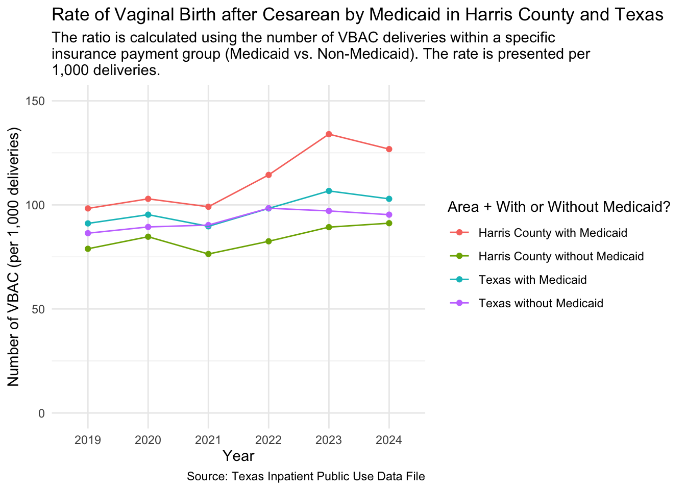
One other facet grouping we wanted to look at was Harris County hospitals in the Medical Center area versus outside of the Medical Center area. We imported this list at the top of this notebook.
Let’s create a new data frame that distinguishes whether a hospital is in the Medical Center or not.
ahrq_vbac_rate_tmc <- tx_deliveries_vbac |>
  mutate(
    TMC = if_else(FAC_NAME %in% tmc_list, T, F)
  ) |>
  group_by(YR, TMC, VBAC) |>
  add_vbac_calc(1000)

ahrq_vbac_rate_tmc
Now we can plot the comparison for VBAC delivery rate between hospitals in the Medical Center area and not in the Medical Center area.
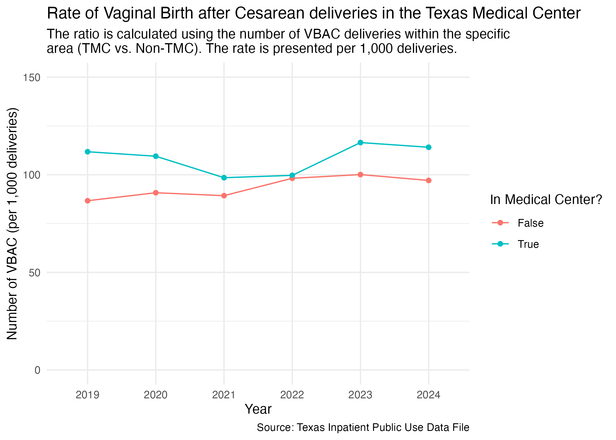
vbac_tmc <- ahrq_vbac_rate_tmc |>
  ggplot(aes(x = YR, y = VBAC_DEL_PER)) +
  geom_point(aes(color = TMC)) +
  geom_line(aes(color = TMC, group = TMC)) +
  scale_y_continuous(limits = c(0, 150)) +
  scale_color_discrete(name = "In Medical Center?", labels = c("False", "True")) +
  labs(
    title = str_wrap("Rate of Vaginal Birth after Cesarean deliveries in the Texas Medical Center"),
    subtitle = str_wrap("The ratio is calculated using the number of VBAC deliveries within the specific area (TMC vs. Non-TMC). The rate is presented per 1,000 deliveries."),
    x = "Year", y = "Number of VBAC (per 1,000 deliveries)",
    caption = "Source: Texas Inpatient Public Use Data File"
  ) +
  theme_minimal()

ggsave("../data-published/figures/vbac/vbac-tmc.png")
Saved Version:
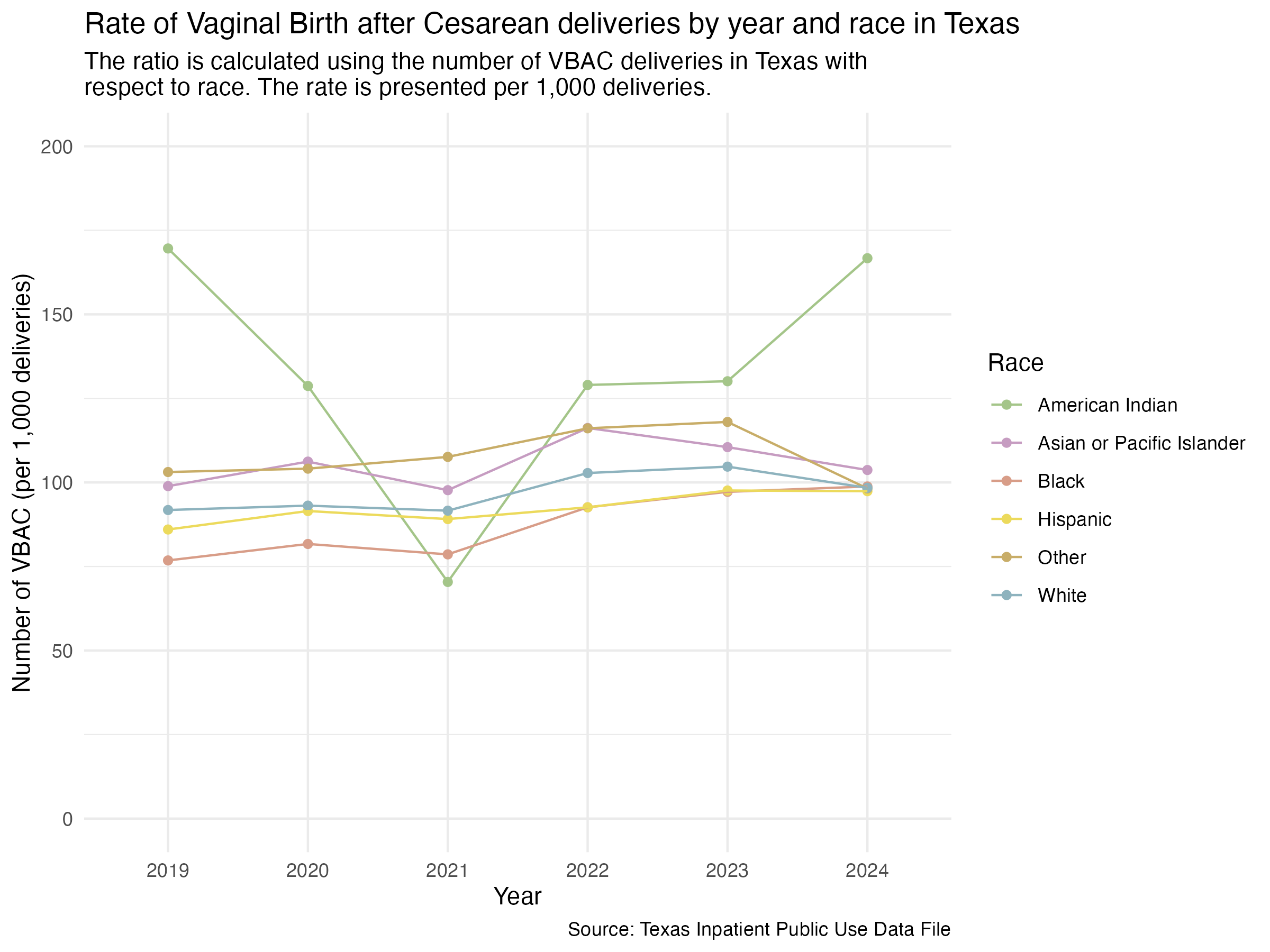
We previously redefined the MOD_RACE categories to also include the difference between Hispanic and non-Hispanic individuals. This was done in the Categorization notebook.
Prep for plotting.
ahrq_vbac_rate_tx_race <- tx_deliveries_vbac |>
  group_by(YR, MOD_RACE, VBAC) |>
  add_vbac_calc(1000)

ahrq_vbac_rate_tx_race
NOTE: American Indian has so few cases that its VBAC rate may appear higher than all other races.
Now we try to plot this.
vbac_race_yr_tx <- ahrq_vbac_rate_tx_race |>
  ggplot(aes(x = YR, y = VBAC_DEL_PER)) +
  geom_point(aes(color = MOD_RACE)) +
  geom_line(aes(color = MOD_RACE, group = MOD_RACE)) +
  scale_color_manual(values = race_colors, name = "Race") +
  scale_y_continuous(limits = c(0, 200)) +
  labs(
    title = "Rate of Vaginal Birth after Cesarean deliveries by year and race in Texas",
    subtitle = str_wrap("The ratio is calculated using the number of VBAC deliveries in Texas with respect to race. The rate is presented per 1,000 deliveries."),
    x = "Year", y = "Number of VBAC (per 1,000 deliveries)",
    caption = "Source: Texas Inpatient Public Use Data File"
  ) +
  theme_minimal()

ggsave("../data-published/figures/vbac/vbac-race-yr-tx.png", width = 8, height = 6, units = "in")
Saved Version:
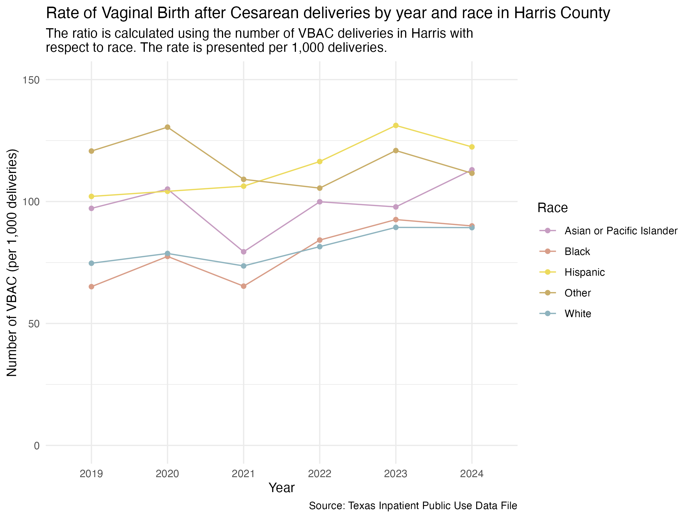
We can do a similar plot for just Harris County hospitals. First, prep the data.
ahrq_vbac_rate_harris_race <- tx_deliveries_vbac |>
  filter(FAC_CNTY == "Harris") |>
  group_by(YR, MOD_RACE, VBAC) |>
  add_vbac_calc(1000)

ahrq_vbac_rate_harris_race
Now, plot.
vbac_race_yr_harris <- ahrq_vbac_rate_harris_race |>
  ggplot(aes(x = YR, y = VBAC_DEL_PER)) +
  geom_point(aes(color = MOD_RACE)) +
  geom_line(aes(color = MOD_RACE, group = MOD_RACE)) +
  scale_y_continuous(limits = c(0, 150)) +
  scale_color_manual(values = race_colors, name = "Race") +
  labs(
    title = "Rate of Vaginal Birth after Cesarean deliveries by year and race in Harris County",
    subtitle = str_wrap("The ratio is calculated using the number of VBAC deliveries in Harris with respect to race. The rate is presented per 1,000 deliveries."),
    x = "Year", y = "Number of VBAC (per 1,000 deliveries)",
    caption = "Source: Texas Inpatient Public Use Data File"
  ) +
  theme_minimal()

ggsave("../data-published/figures/vbac/vbac-race-yr-harris.png", width = 8, height = 6, units = "in")
Note: American Indian has so few cases that it was excluded from the plot.
Saved Version:
Look at individual hospitals now also with race. First, prep the data.
ahrq_vbac_rate_hosp_race <- tx_deliveries_vbac |>
  filter(FAC_CNTY == "Harris") |>
  group_by(YR, THCIC_ID, MOD_RACE, FAC_NAME, VBAC) |>
  add_vbac_calc(1000)

ahrq_vbac_rate_hosp_raceNOTE: There are very few cases spread across each hospital. This could result in rates higher than the county or state average. Some races may not appear across hospitals due to few cases being available. “Few cases” is defined as less than 30 cases.
This section will look at all of the Harris Health hospitals with race data included.
vbac_hosp_race_harris_health <- ahrq_vbac_rate_hosp_race |>
  filter(FAC_NAME %in% harris_health_list) |>
  create_race_graph() +
  labs(
    title = str_wrap("Rate of Vaginal Birth after Cesarean deliveries by year and race for Harris Health hospitals"),
    subtitle = str_wrap("The ratio is calculated using the number of VBAC deliveries in Harris Health hospitals with respect to race. The rate is presented per 1,000 deliveries."),
    x = "Year", y = "Number of VBAC (per 1,000 deliveries)",
    caption = "Source: Texas Inpatient Public Use Data File"
  )

ggsave("../data-published/figures/vbac/vbac-hosp-race-harris-health.png", width = 8, height = 6, units = "in")
Saved Version:
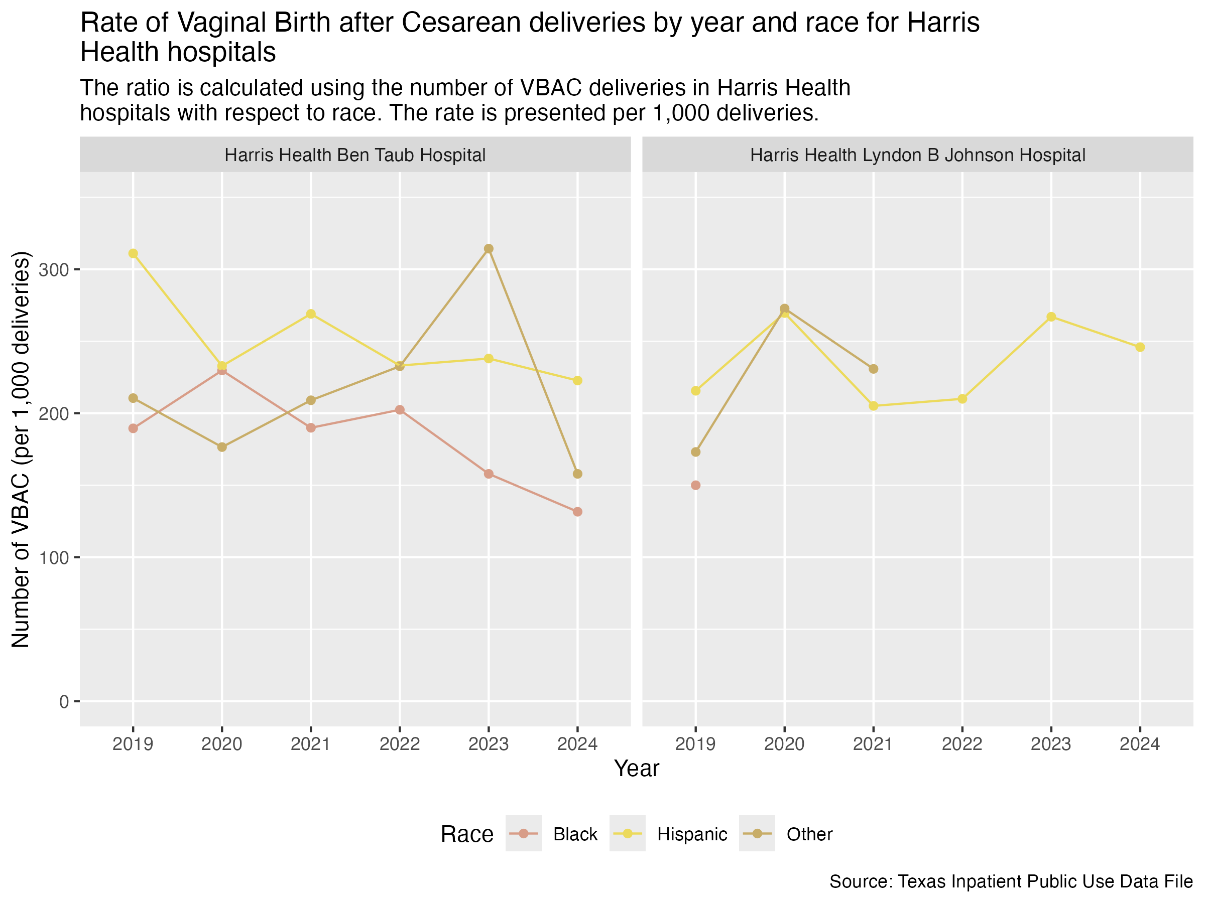
ahrq_vbac_rate_hosp_race |>
filter(FAC_NAME == "Harris Health Lyndon B Johnson Hospital" & MOD_RACE == "Black")tx_deliveries_vbac |>
filter(FAC_NAME == "Harris Health Lyndon B Johnson Hospital" & MOD_RACE == "Black") |>
group_by(YR) |>
summarize(CNT = n())Now, HCA Houston Healthcare hospitals.
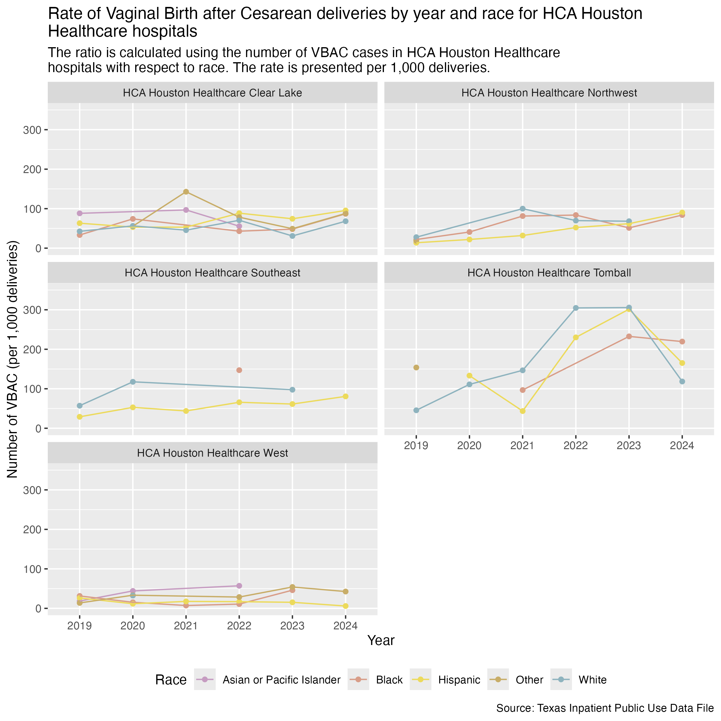
vbac_hosp_race_hca <- ahrq_vbac_rate_hosp_race |>
  filter(
    FAC_NAME %in% hca_list
  ) |>
  create_race_graph() +
  labs(
    title = str_wrap("Rate of Vaginal Birth after Cesarean deliveries by year and race for HCA Houston Healthcare hospitals"),
    subtitle = str_wrap("The ratio is calculated using the number of VBAC cases in HCA Houston Healthcare hospitals with respect to race. The rate is presented per 1,000 deliveries."),
    x = "Year", y = "Number of VBAC (per 1,000 deliveries)",
    caption = "Source: Texas Inpatient Public Use Data File"
  )

ggsave("../data-published/figures/vbac/vbac-hosp-race-hca.png", height = 8, width = 8, units = "in")
Saved Version:
Houston Methodist hospitals.
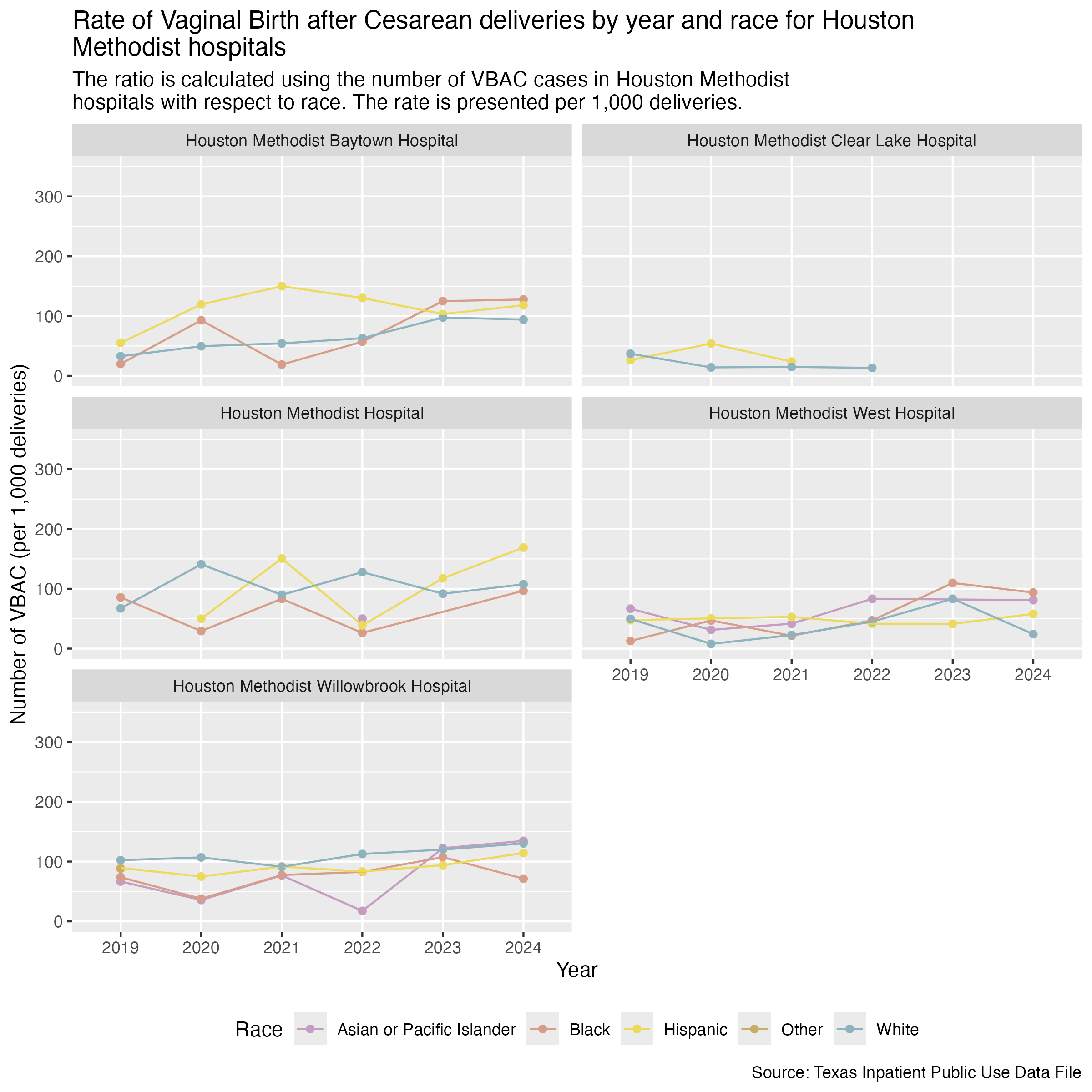
vbac_hosp_race_houston_methodist <- ahrq_vbac_rate_hosp_race |>
  filter(
    FAC_NAME %in% houston_methodist_list
  ) |>
  create_race_graph() +
  labs(
    title = str_wrap("Rate of Vaginal Birth after Cesarean deliveries by year and race for Houston Methodist hospitals"),
    subtitle = str_wrap("The ratio is calculated using the number of VBAC cases in Houston Methodist hospitals with respect to race. The rate is presented per 1,000 deliveries."),
    x = "Year", y = "Number of VBAC (per 1,000 deliveries)",
    caption = "Source: Texas Inpatient Public Use Data File"
  )

ggsave("../data-published/figures/vbac/vbac-hosp-race-houston-methodist.png", height = 8, width = 8, units = "in")
Saved Version:
Finally, Memorial Hermann hospitals.
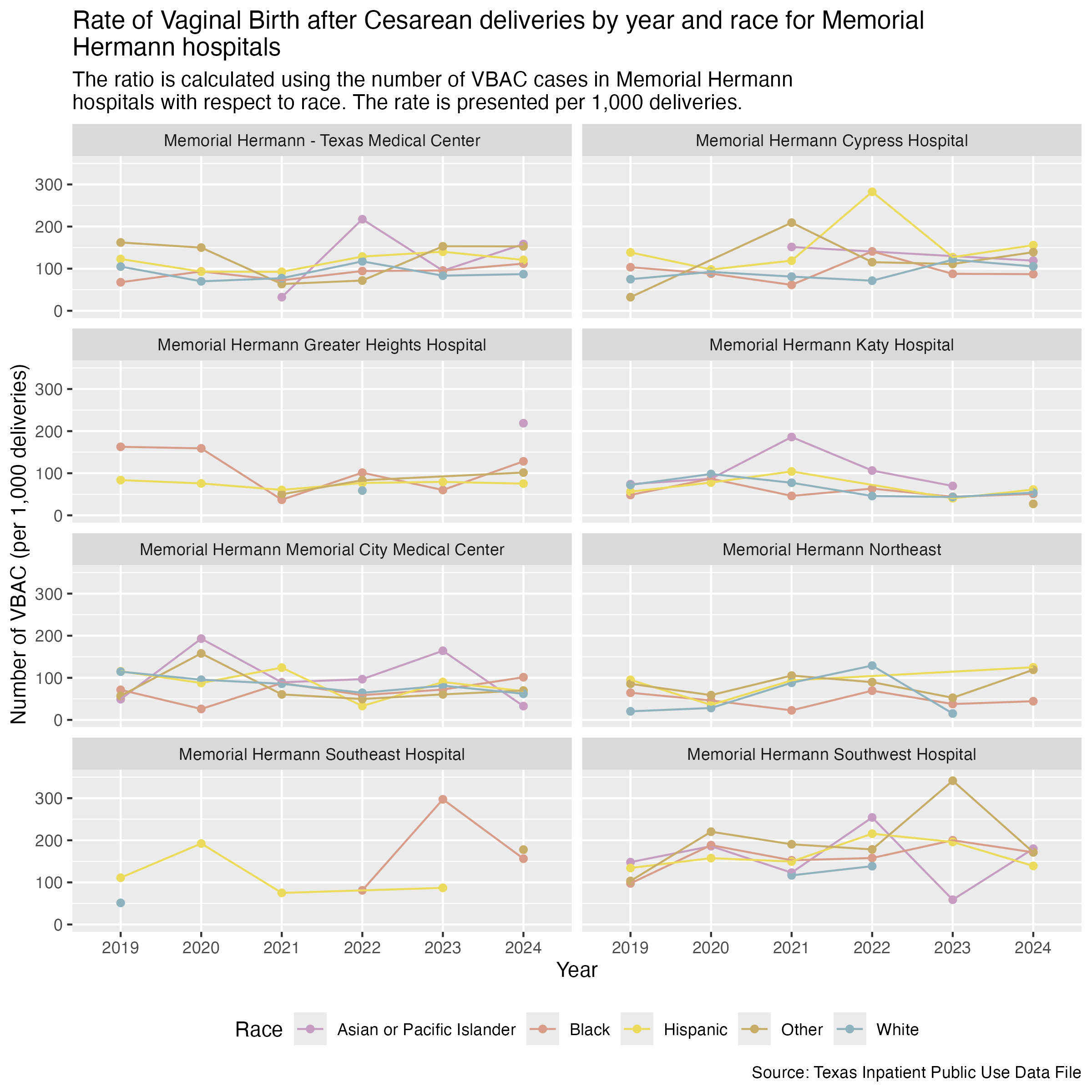
vbac_hosp_race_memorial_hermann <- ahrq_vbac_rate_hosp_race |>
  filter(
    FAC_NAME %in% memorial_hermann_list
  ) |>
  create_race_graph() +
  labs(
    title = str_wrap("Rate of Vaginal Birth after Cesarean deliveries by year and race for Memorial Hermann hospitals"),
    subtitle = str_wrap("The ratio is calculated using the number of VBAC cases in Memorial Hermann hospitals with respect to race. The rate is presented per 1,000 deliveries."),
    x = "Year", y = "Number of VBAC (per 1,000 deliveries)",
    caption = "Source: Texas Inpatient Public Use Data File"
  )

ggsave("../data-published/figures/vbac/vbac-hosp-race-memorial-hermann.png", height = 8, width = 8, units = "in")
Saved Version:
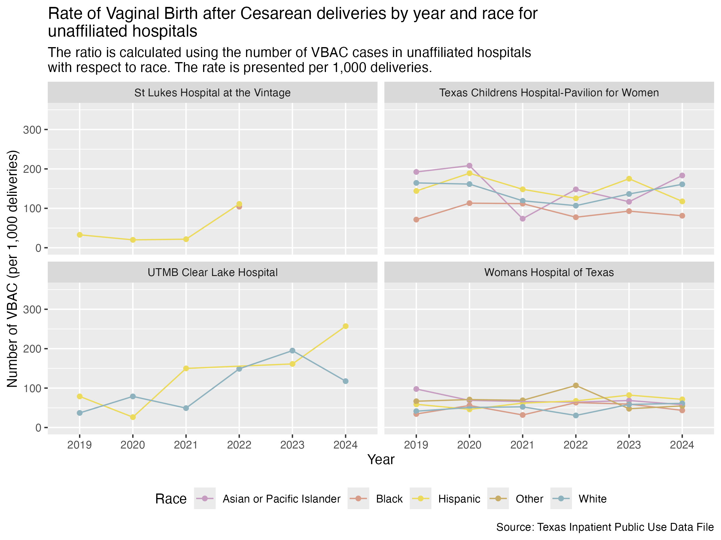
Here are the race breakdowns for all of the hospitals that don’t fall under a brand.
vbac_hosp_race_unaffiliated <- ahrq_vbac_rate_hosp_race |>
  filter(
    FAC_NAME %in% unaffiliated_list
  ) |>
  create_race_graph() +
  labs(
    title = str_wrap("Rate of Vaginal Birth after Cesarean deliveries by year and race for unaffiliated hospitals"),
    subtitle = str_wrap("The ratio is calculated using the number of VBAC cases in unaffiliated hospitals with respect to race. The rate is presented per 1,000 deliveries."),
    x = "Year", y = "Number of VBAC (per 1,000 deliveries)",
    caption = "Source: Texas Inpatient Public Use Data File"
  )

ggsave("../data-published/figures/vbac/vbac-hosp-race-unaffiliated.png", height = 6, width = 8, units = "in")
Saved Version:
We will also compare by race for the hospitals in the Medical Center area and for those outside of the Medical Center area.
First, let’s create a data frame that determines whether the hospital is in the Medical Center and include considerations of race and ethnicity.
ahrq_vbac_rate_tmc_race <- tx_deliveries_vbac |>
mutate(
TMC = if_else(FAC_NAME %in% tmc_list, T, F)
) |>
group_by(YR, TMC, MOD_RACE, VBAC) |>
add_vbac_calc(1000)
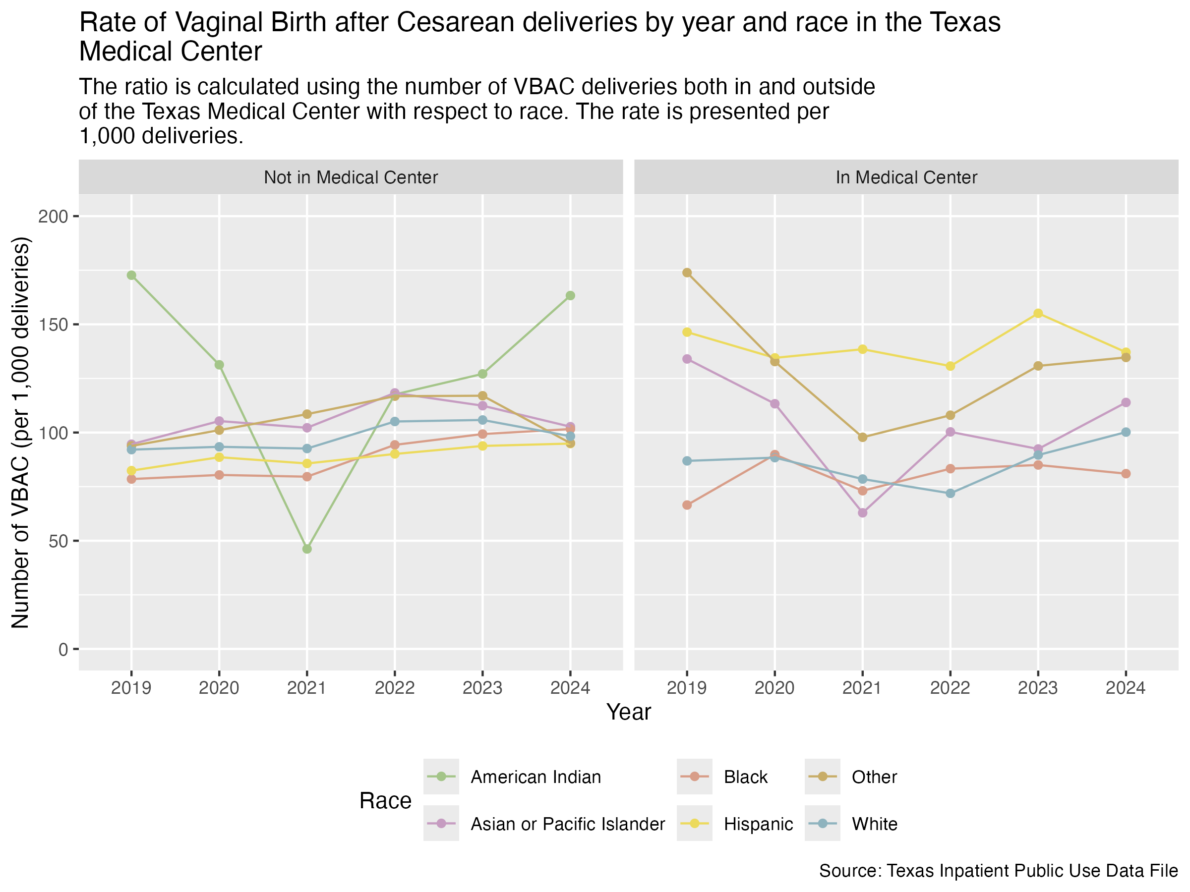
ahrq_vbac_rate_tmc_raceNow we can create two graphs side by side so that we can compare the differences for race between whether a hospital is in the Medical Center or not.
tmc_labels <- c("FALSE" = "Not in Medical Center", "TRUE" = "In Medical Center")

vbac_race_tmc <- ahrq_vbac_rate_tmc_race |>
  ggplot(aes(x = YR, y = VBAC_DEL_PER)) +
  geom_point(aes(color = MOD_RACE)) +
  geom_line(aes(color = MOD_RACE, group = MOD_RACE)) +
  scale_color_manual(values = race_colors, name = "Race") +
  scale_y_continuous(limits = c(0, 200)) +
  facet_wrap(~ TMC, labeller = as_labeller(tmc_labels)) +
  labs(
    title = str_wrap("Rate of Vaginal Birth after Cesarean deliveries by year and race in the Texas Medical Center"),
    subtitle = str_wrap("The ratio is calculated using the number of VBAC deliveries both in and outside of the Texas Medical Center with respect to race. The rate is presented per 1,000 deliveries."),
    x = "Year", y = "Number of VBAC (per 1,000 deliveries)",
    caption = "Source: Texas Inpatient Public Use Data File"
  ) +
  theme(
    legend.position = "bottom"
  )

ggsave("../data-published/figures/vbac/vbac-race-tmc.png", width = 8, height = 6, units = "in")
Saved Version: