18 Components
We’re going to explore many parts of the Bootstrap documentation, using Components, Content and Utilities classes to build a very generic single-page website.
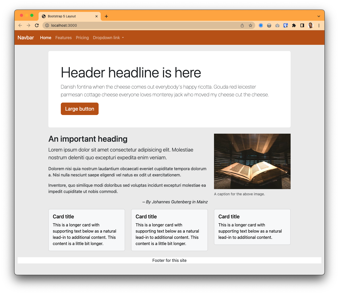
Here is our goal, a page like this:
We’ll be pulling code from Bootstrap documentation and examples to build these pages. In some cases we aren’t even updating the example text, we’re just getting the components on our pages.
We’ll start at the top of the page with a very common element to almost every website: Navigation.
18.1 Navs and navbars
Navigation is separated into two parts in Bootstrap Navs and tabs and Navbars. Navs are the links, and navbars are the containers that can hold them.
To build a navigation bar for our site we’ll poke around the Bootstrap documentation until we find something close to what we want and then copy that code and change it for our needs.
In our case we want the Navbars documentation. We want something with dropdows just so you can see that code for later.
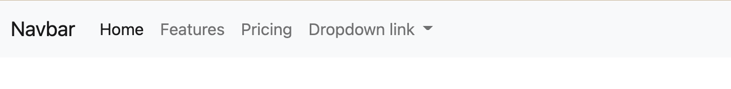
- Go to the Navbars docs.
- Scroll through the examples until you find the one that has dropdown links but not a search bar. The text right before the code starts with “You can also use dropdowns in your navbar.” It is right before the “Forms” section.
- Use the Copy link to get the code.
- Paste this code right after the opening
<body>tag in our index.
This will add a nice navigation bar to our site:
As you copy and paste code into your index.html file, you may have to adjust the indents of some rows. Make your indents so your code is nice and pretty and shows properly the parent-child relationships of items. You’ll thank me later when you are trying to figure out what goes with what. That, and it is part of your grade, because I want to build good habits.
18.1.2 Review how nav works on mobile
This navbar code includes CSS and JavaScript that collapse links into a menu. By adding the navbar-expand-lg class here we control when those links expand to show across the page. Since that menu and the link dropdowns take JavaScript to work properly, testing those features is a good way to make sure Bootstrap is set up properly.
- Use your DevTools Inspector or change your window width to mobile to see the menu button.
- Click on it to make sure it works!

You should look over the other code within the navs, especially the list items classed as nav-item and the a tags within them classed as nav-link. These are your actual links. Where they have href="#" you’ll update # to the path to your HTML pages.
I also want to point out here in the example the Home nav-link, which has two important classes because it represents the “Current” page on the site.
- The class
activehere makes that item bold in the navigation bar to give the reader a visual clue you that you are viewing that specific page from the navigation menu. - The attribute
aria-current="page"denotes to screen readers this is the active link and is important for those who can’t “see” the visual clue that theactiveclass gives us.
When building web sites, you should update page navigation to reflect both of those for each pages.
18.2 A Jumbotron site header
Once upon a time (like 2021) Bootstrap had a special header component called a Jumbotron. With Bootstrap 5’s release in May 2021 they got rid of it because you can build a similar display with their existing utility classes, which allows us to introduce Bootstrap examples along with content and utilites classes.
First let’s take a look at what we are talking about.
- Go to the Bootstrap Examples page. You can get this from any Bootstrap Docs page in the navigation item called Examples.
Now, these examples aren’t quite as easy to use as the Component documentation. To see how they work you have to either download the examples (which gets you all of them) or view the source code of each page (In Chrome, View > Developer > View Source.)
Instead, we are just going to build this bit-by-bit. But I did want you to see the examples so you know our goal.
- After your nav, add a new
divwith aclass="container". - Inside that a semantic
<header>element. - Inside the header add an
h1tag and aptag and put some text in both. You can use VS Code lorem or maybe try a little cheese ipsum.
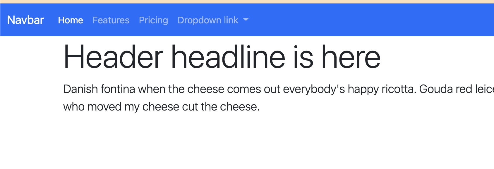
It should be something like this:
<div class="container">
  <header>
    <h1>Header headline is here</h1>
    <p>Danish fontina when the cheese comes out everybody's happy ricotta. Gouda red leicester parmesan cottage cheese everyone loves monterey jack who moved my cheese cut the cheese.</p>
  <header>
</div>
Let’s talk about that container. In Bootstrap, the class “container” applies some margins and centers content in the browser. It’s an important building block with responsive design because those margins expand/contract depending on your device width.
The rest of that:
- We use the semantic
<header>tag so it describes this part of the page. We can target that element with CSS. - The
h1andptags are standard. For now. We’re about to gussy ’em up.
We will be doing a tour of Bootstrap content and utilites class as we go along.
18.2.1 Typography classes
Let’s gander at Bootstrap’s Typography documentation. These are a set of classes that can be applied to elements that give them a certain look. Because Bootstrap is customizable, it is possible to set these classes and then update them later with Sass. We’re going to stick with default styles for now.
- Look through the Display headings section to see how to apply the
display-4class and add that to yourh1within your header. - Look at the Lead section and then add that class to your
ptag within the header.
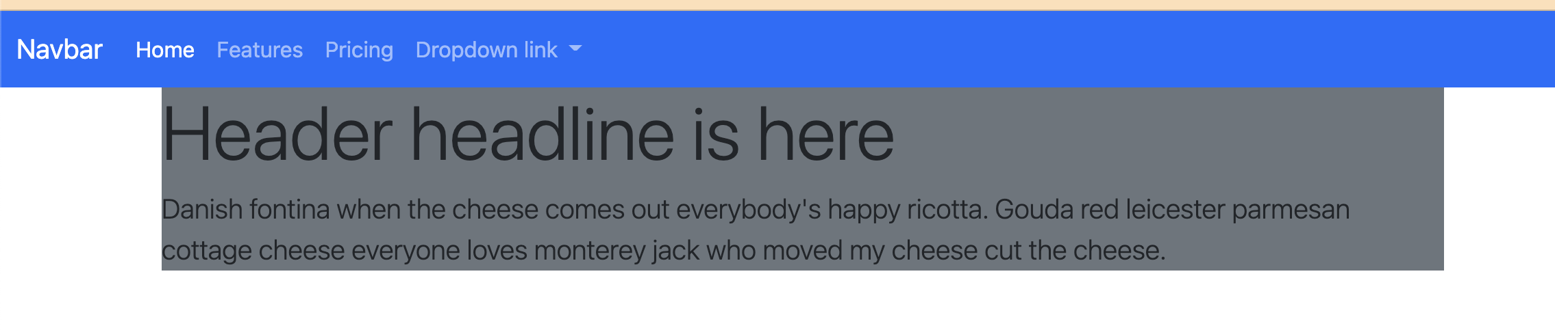
Your code should look like this:
  <h1 class="display-4">Header headline is here</h1>
  <p class="lead">Danish fontina when the cheese comes out everybody's happy ricotta. Gouda red leicester parmesan cottage cheese everyone loves monterey jack who moved my cheese cut the cheese.</p>
And your page should should be looking something like this:
18.2.2 Backgrounds
We’re going to add some color to our Jumbotron-like header using a background color. The Background classes are found in the Utilities part of the documentation.
- Browse through the Backgrounds docs so you can see how they are used.
- On the header div, add the class attribute to make the background our “secondary” color (the default whis is a dark gray color).
<header class="bg-secondary">That should yield a result like this:
Still ugly, but we are getting there.
18.2.3 Colors
Next on the tour are utility classes to control text colors.
- Look through the color documentation and figure out how to make white text.
- Add that class to the same div that you added the background color, so it look like this:
<header class="bg-secondary text-white">Still ugly, but you should have white text on the dark gray background.
18.2.4 Spacing classes
Next we’ll give our text some room to breathe using utility classes to control spacing between elements like margins and padding.
Basically this shorthand to build space around items (margin) and inside items (padding). While I can’t explain it better than they have, here is an abbreviated version of the shorthand:
- You use
mfor margin orpfor padding. - Following m or p you add either:
t(top),b(bottom),l(left),r(right),x(left and right),y(top and bottom), or nothing for all 4 sides. - Then, you specify sizes with a hyphen and a value of
0through5(5 being the largest amount of spacing).
So, pt-4 would be padding on the top at a value of 4.
We’ll use this on our header. Let’s add the code first then I’ll explain.
- Add these as a
class=""to the header element (If you do this one at a time you can see what each does):my-4adds a margin to top and bottom of the element, basically moving it off the navigation.p-5adds padding, the space “inside” the element between the border and the text.
Your header should look like this now:
<header class="bg-secondary text-white my-4 p-5">18.2.5 Borders
You set the color, width, style and radius of borders with various border classes. Let’s use those to add a slight radius to our header corners.
- Review the border-radius docs and add the class to your header to make the corners of the box rounded. It’s a pretty slight visual change.
18.2.6 Button component
Here we’ll dive back into the components section of the docs to get a button to add to our Jumbotron-like header. But let’s use the Search docs to find it.
- Go to any page in the Bootstrap docs.
- In the search bar at top left, type in “button”. As you do, you’ll see options pop up under the search. Choose the “Buttons / Buttons” option to get to the main Buttons page.
- If your browser window is set wide enough, you should see an additional “On this page” navigation on the right side. Click on the Sizes link there. If you don’t have that navigation, just scroll down the page until you find Sizes.
- In the Large button example, copy the first line that has
btn-primaryas part of the classes. - Add this code on a new line after the closing
ptag in the header.
With this, we have our “Jumbotron”-like header. At this point, you page should be looking like this:
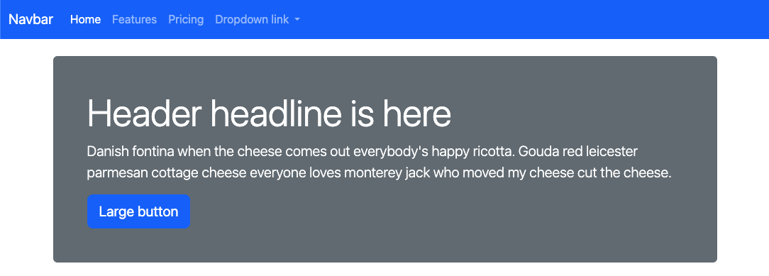
And your header code should look like this:
<header class="bg-secondary text-white my-4 p-5 rounded">
  <h1 class="display-4">Header headline is here</h1>
  <p class="lead">Danish fontina when the cheese comes out everybody's happy ricotta. Gouda red leicester parmesan cottage cheese everyone loves monterey jack who moved my cheese cut the cheese.</p>
  <button type="button" class="btn btn-primary btn-lg">Large button</button>
</header>
This might be a good time to use the git cycle to save and push your efforts to Github.