19 Grids
One of the main features that Bootstrap brings us is a Grid system to build “layouts” for your pages. The grid allows you to define column widths for different viewport widths through a series of class names. It uses a core CSS feature called “flexbox” to do this.
- Go to the Grid system documentation and look through it.
- Come back to the first example and copy the code and add it into your page after the closing of your header container.
- Save your page and you should see the three columns in your project.
We’re going to enhance this a bit by adding some background colors to each column so we can see each of the more easily.
- Add a different background color class after
colfor each column. I suggest these for a Rasta party of red, yellow and green:bg-danger,bg-warningandbg-success.
Your code should look like this:
<div class="container">
  <div class="row">
    <div class="col bg-danger">
      Column
    </div>
    <div class="col bg-warning">
      Column
    </div>
    <div class="col bg-success">
      Column
    </div>
  </div>
</div>
And your page should look like this at this point:
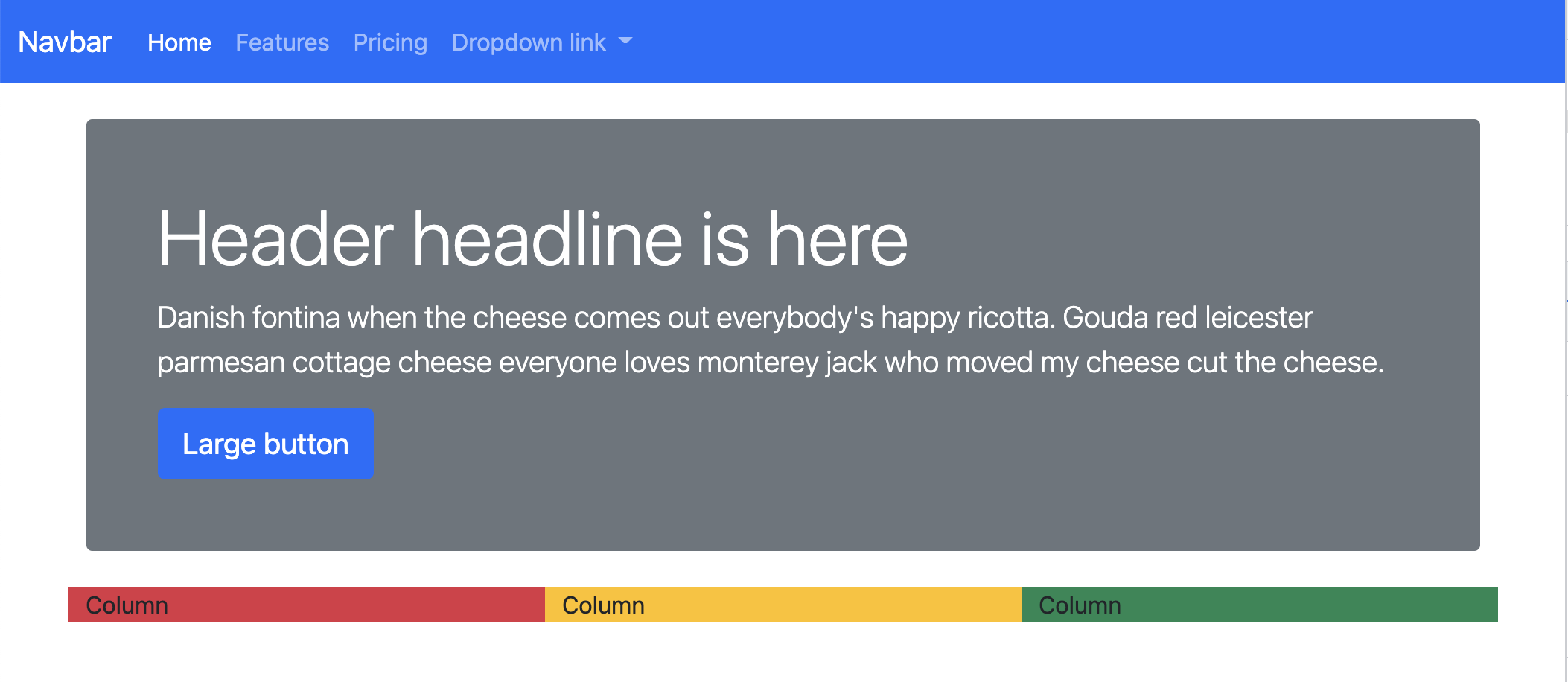
19.1 The responsive grid
These three columns are evenly distributed across the container space. Adjust your browser width smaller and wider (or use the DevTools Inspect) and you’ll see they stay that way at every width.
Our goal here is to be able to adjust how wide those columns are at different browser widths. We do this so we can control how the content displays on different devices like phones, tablets and computers.
19.1.1 The sizes
There are five “breakpoints” for Bootstrap, meaning changes can happen at 5 different widths: default (extra small), sm, md, lg, xl and xxl. They kinda work out like this:
- the default
colis for a vertical phone smis for a horizontal phone to a vertical tabletmdis for a horizontal tablet to laptoplgis for a laptop to desktop screenxlis for a large desktop screenxxlis for an even wider desktop screens
Every phone and computer screen is different, so that list above is approximate. (There are actual pixel widths set deep within the Bootstrap code and they are adjustable, but we aren’t going there.)
Looking back at our three columns, we would want content like that to stack on top of each other at extra small browser widths, like on a phone. We can adjust our code to do this.
- Change all the
colclasses to instead becol-sm. - Adjust your browser width and watch how the columns change.
Now that you’ve added a “small” sm breakpoint, the divs stack on top of each other at the default “extra small” breakpoint, as they are supposed to, but then display evenly across at small or greater widths.
Bootstrap works from smallest to largest, so once you set a grid width for col-sm, they will stay that way for wider widths unless you set another one. You can set the same div to a different number of columns at different widths. However, within a row, the columns need to add up to increments of 12 for each breakpoint if you want them to work properly.
- Adjust the three columns to be
col-sm-3,col-sm-6andcol-sm-3, respectively.
This makes the middle column wider when viewed at the “small” breakpoint or wider, but they each still show over all 12 columns when at the extra-small default breakpoint. Note that those column numbers add up to 12. If the total is greater than 12, it breaks into a new column.
Now we will make these columns all the same width for the medium breakpoint, without changing the small breakpoint.
- After the col-sm designations in the class, add a space and then this designation for the medium breakpoint:
col-md-4. Do this for all three columns.
Now adjust your browser width and see them change between the three breakpoints. Again, note that the column numbers for each size add to a factor of 12 for each breakpoint. i.e, the sm numbers total to 12, and then the md numbers total to 12.
As a bit of a check, this part of our code should look like:
<div class="container">
  <div class="row">
    <div class="bg-danger col-sm-3 col-md-4">
      Column
    </div>
    <div class="bg-warning col-sm-6 col-md-4">
      Column
    </div>
    <div class="bg-success col-sm-3 col-md-4">
      Column
    </div>
  </div>
</div>
This is how your page should behave at the default xs, the sm and md breakpoints:
19.1.2 xs
At the default size (xs), the columns are stacked.
19.1.3 sm
At the sm size, the middle column is wider.
19.1.4 md
At the md size, the columns are even.
Now that we’ve learned a little about columns, we’ll tear this apart and build something useful.
19.2 Using our grid system
Now we’ll work on the part of our site that will look like this:
We’ll call this our “highlight” section. We’ll delete the container we just made and replace it with the highlight section below.
- Remove the last container div and content that we added.
- Add the code below in its place. Save your page and make sure it isn’t broken.
<section class="container">
<div class="row">
<div class="col-md-6">
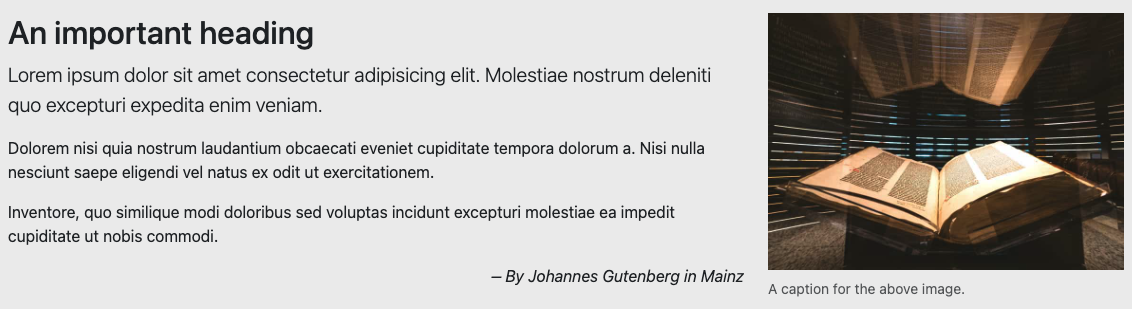
<h2>An important heading</h2>
<p class="lead">Lorem ipsum dolor sit amet consectetur adipisicing elit. Molestiae nostrum deleniti quo excepturi expedita enim veniam.</p>
<p>Dolorem nisi quia nostrum laudantium obcaecati eveniet cupiditate tempora dolorum a. Nisi nulla nesciunt saepe eligendi vel natus ex odit ut exercitationem.</p>
<p>Inventore, quo similique modi doloribus sed voluptas incidunt excepturi molestiae ea impedit cupiditate ut nobis commodi.</p>
<p>– By Johannes Gutenberg in Mainz</p>
</div>
<div class="col-md-6">
Column 2
</div>
</div>
</section>Instead of using <div class="container">, we used the semantic <section> element. It works just like a div so we can apply the same bootstrap classes to it.
19.2.1 Processing photos
We want to add a photo and caption in the next column, but we don’t have one to use yet. This allows us to talk about an important feature of this project template rig.
When we run gulp or gulp dev a script runs takes all the photos inside the src/img/ folder and processes them for the web, reducing the dpi and compression, before it moves the copy into src/docs/. So, if we use a 2MB jpeg photo in our source folder, it ends up being less than 100k when it is used for our site.
This makes our site much faster since the browser doesn’t have to download that huge image. It doesn’t hurt to size down your original source photos anyway, just make sure they are large enough for the widest measure (usually 1200px at 72 dpi is fine unless it’s for a huge display.)
The sizing process doesn’t run continuously so we have to launch gulp or gulp dev to process new photos. This is all to say we need to download a photo for our project and restart gulp:
- Download this Gutenberg Bible at the Harry Ransom Center photo and put it inside your
src/imgfolder. - Stop the gulp dev watch process (Cntl+C in your Terminal window) and then restart it using
gulp dev. This will process the photo and make it available in the docsimgfolder. It’s an important step as photos are only processed whengulp devstarts up.
19.2.2 Fluid images
We’re going to put Figure code into the second column here to get us a photo and caption, but I don’t want you to pull the example code from Bootstrap Documentation because I need to explain how some of it works and that is easier if we build it up ourselves.
Replace the text “Column 2” with the following code:
<figure class="figure">
  <img src="img/gutenberg.jpeg" class="figure-img" alt="Guetenberg Bible">
  <figcaption class="figure-caption">A caption for the above image.</figcaption>
</figure>
Now save your HTML page and look at the result in your browser.
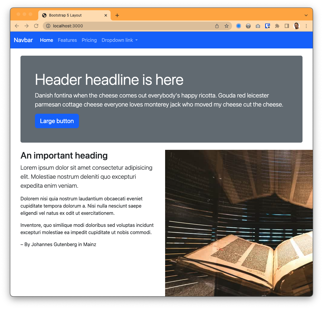
Photo blows container The photo blows out of the second column because it is “bigger” than the column it is inside. If you change the width of browser window the photo will always stay that size, which doesn’t work well for us. There is a cool feature to fix this.
Update your code to add the class
img-fluidto the image element, so it saysclass="figure-img img-fluid".What this
img-fluidclass does is adjust the width of the photo to the width of its parent element. Your page should look like this now: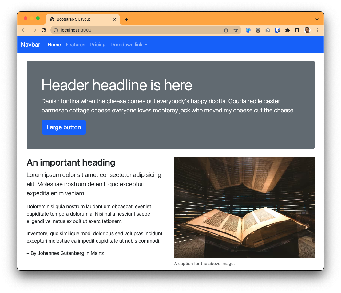
Responsive image with img-fluid
This gives us great flexibility in building our responsive website because the photo will shrink and grow to fit the right space!
19.2.3 Add a breakpoint
As the page gets a little wider, we want give the text a little more space than the photo.
- Add
lgsizes to your two columns. Set the first one at 8 columns and the second one at 4 columns. - Save and check the results. You should see your columns change at the medium and large widths.
We’ve finished building this part of the pages for now. Next we’ll add the cards to our page.