23 Bootstrap mastery
You are going to build a three-page project using a Bootstrap development rig. There are screenshots of what I’m looking for below.

23.1 Resources
While you are building this from scratch, you do have the icj-bootstrap-template development environment to set up Sass, etc. You also have your practice repo to look at for guidance.
You’ll want to use the Bootstrap documentation for your code and styles.
- Go to Bootstrap site and click on the Docs link. Most of what you need is under Components on the left-hand navigation. Utilities has some useful information as well. Use the search bar there to help you.
- The are many Bootstrap 5 tutorials on the web, including Tutorial Republic and W3 Schools. If you prefer video tutorials, Net Ninja’s Bootstrap 5 Crash Course is pretty good.
23.2 Project template
- Create a new, empty folder in your
icj/folder calledyourname-bootstrap-mastery. - In VS Code, open a new window and open your new folder.
- Open the Integrated Terminal.
- Run
$ degit utdata/icj-bootstrap-templateto download the files. - Run
$ npm installto install the node packages. - Run
$ git initto intilize git. - Run
$ git add .to add the files. - Run
$ git commit -m "first commit"to commit the files. - Go to Github and create a repository of the same name.
- Use the “or push an existing repository from the command line” commands from Github to sync the repos.
23.2.1 Adding the images
I have images for you to use for this assignment, but you have to set them a specific way for them to work in the development environment:
- Download this compressed folder of images: pirate-photos.zip.
- Find the zip on your hard drive and uncompress it.
- Move the contents (the photos only) into the
src/imgfolder in your project. The photos should be loose inside that folder. - Run
gulp devto process the photos and run your development server. (If you hadgulp devrunning already, quit it with CTRL + C and then restartgulp devagain so the photos will be processed and copied intodocs.)
23.3 Strategy
- Build the framework of the index page first. Get the main components built and figure out your content before you worry about styles.
- Once the structure is set, move onto styles and other details for the index page.
- I recommend finishing the index page before moving onto the other article and photo carousel page. (This minimizes the number of adjustments you have to make on multiple pages, though you’ll need to make some adjustments to navigation.)
Again, see example screenshots at the top to get an idea of what you are building.
23.4 The assignment
You will build three pages:
- An index page
- An article page
- A photo page using a photo carousel
The details are noted below.
23.4.1 All pages
All your pages should have the following structural components:
- A navbar with a brand (Pirate Cove) and three nav-links: Home, Article and Photos.
- The nav links should have an underline on hover only. You’ll need to write CSS to make this happen.
- The nav link for the active page (i.e., the one you are viewing) should be bold. There is a special class for this that you can find in the Bootstrap documentation in the Navbar section.
- A jumbotron treatment at the top of the site.
- The jumbotron should have a background image that works reasonably well at all sizes. This is must be done through SCSS using the background shorthand property. You will need to set the image (the url), repeat (no-repeat) and position (center). You’ll need one more style “background-size: cover;” to make it work right.
- For the background image for the jumbotron, you’ll have to reference it from the scss file. The path for this has to be relative from the compiled css file to the image, so it will be
url(../img/filename.jpg). Note the beginning../on that path is different than when you call images directly into theindex.htmlpage. (In contrast, all your other images referenced in HTML will besrc="img/filename.jpg"without the../part.) - Set the main text in the jumbotron to use a Google font of your choice.
- A footer with your name in the text.
- The footer should have a background color and the text should be centered with adequate padding.
23.4.2 Index page
Below the jumbotron you should have three “cards” that highlight different Kraken.
- The cards should work with a responsive grid so they stack on mobile but are three across at md and larger.
- Make up your own names and details about the monsters. Or use ipsum type, perhaps pirate ipsum.
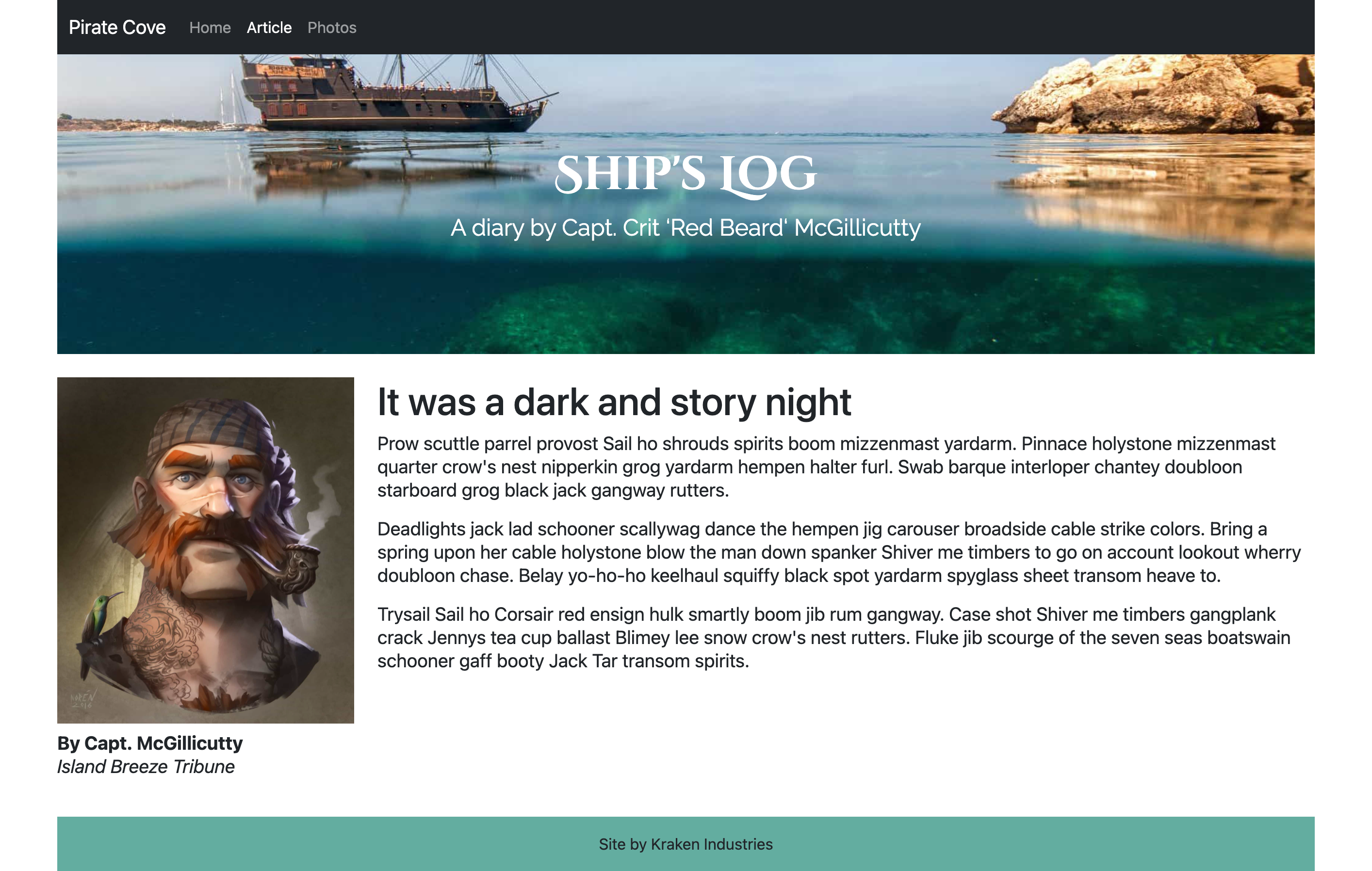
23.4.3 Article page
The article page should be a two-column responsive layout.
- The columns should stack on mobile, and be side-by-side at medium and larger. There should be different col settings for md and lg so the pirate mugshot doesn’t get too wide.
- The left column should have the pirate mugshot photo and be responsive to fit the width of the column at different sizes.
- There should be a text byline and the name and source should be different in style or font.
- The right column should a headline and “story” text in multiple paragraphs. (Text can be pirate ipsum or similar.)
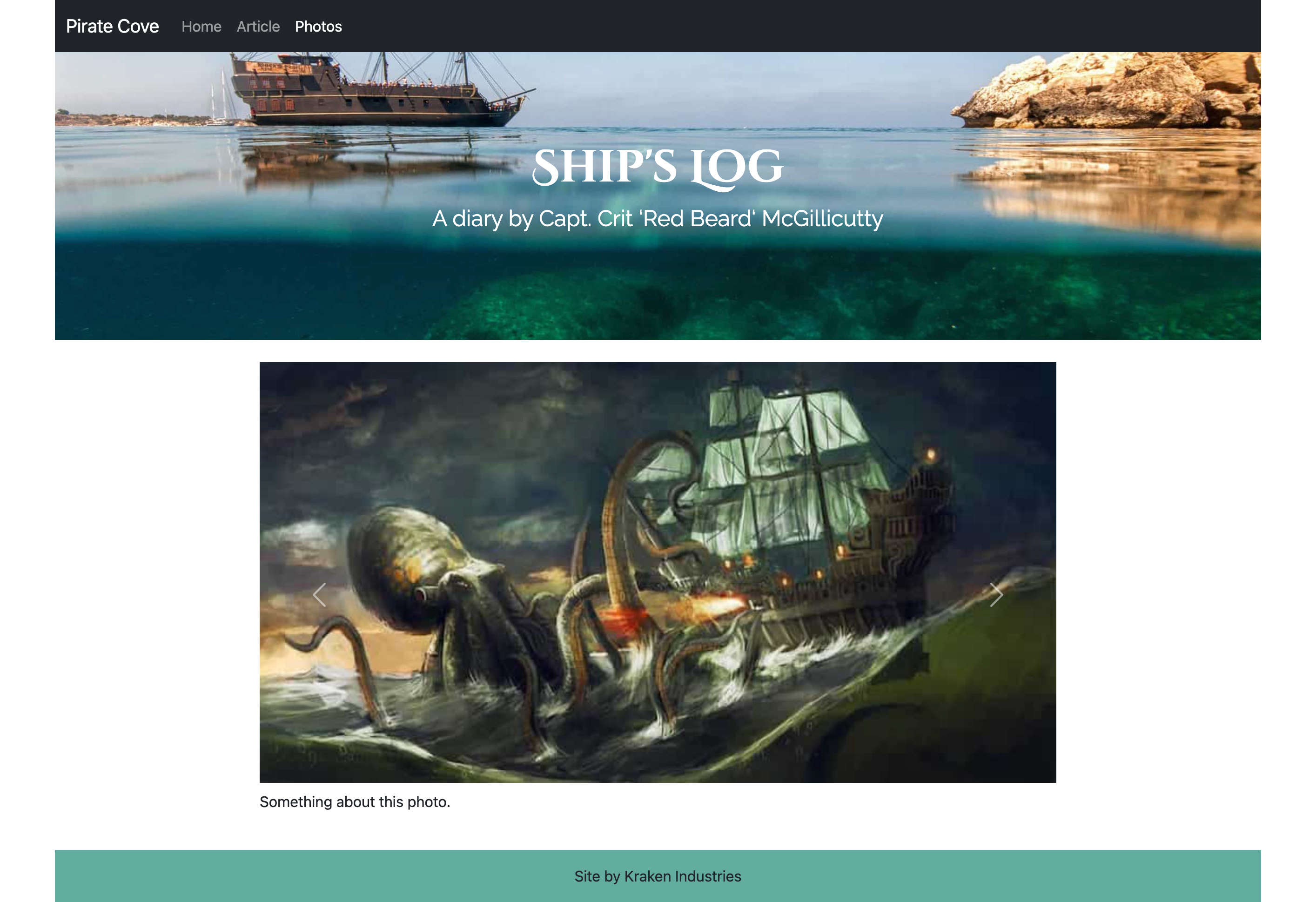
23.4.4 Photos page
On the photos page you will build a photo carousel from the three kraken photos.
- Use one of the carousel options that has controls to advance the slides.
- Add some kind of caption for each photo, either under or on top of photo (as long as it is readable).
- Set up the slideshow to use only 8 centered columns at the medium size or greater. (You can search the docs for “offset” on how to reorder columns to skip the first two.)
23.5 Extra credit
- FOR EXTRA CREDIT: Pick one other Bootstrap component to add to the site somewhere that makes sense. This is your chance to explore Bootstrap and be creative. When you turn this in, tell me your component-of-choice so I don’t have to guess.
23.6 Publishing
Publish your site using Github pages using the “main branch/docs folder” method. Add your link to the Github repo description so it is easy for me to find. Turn in your github repo link to the assignment.